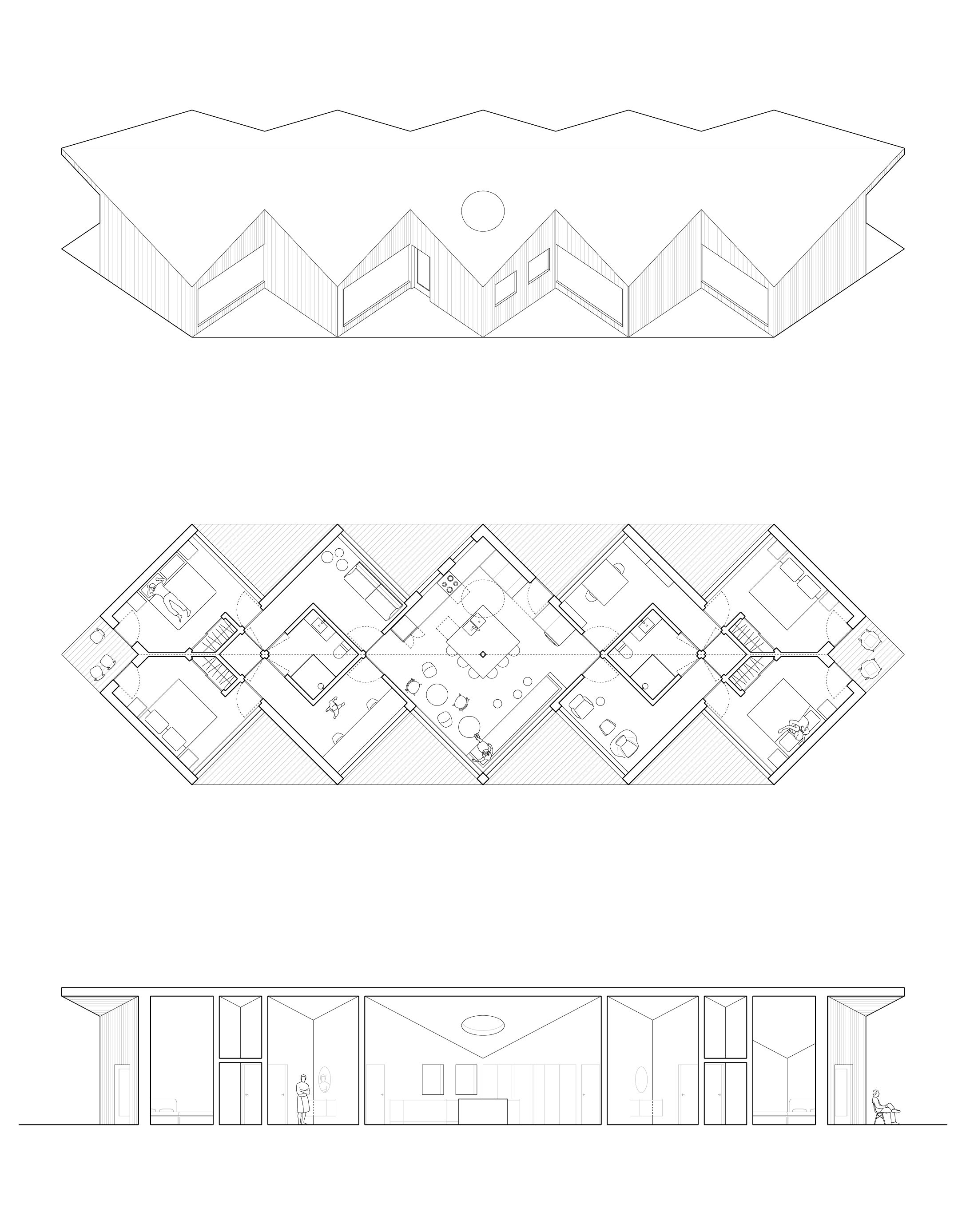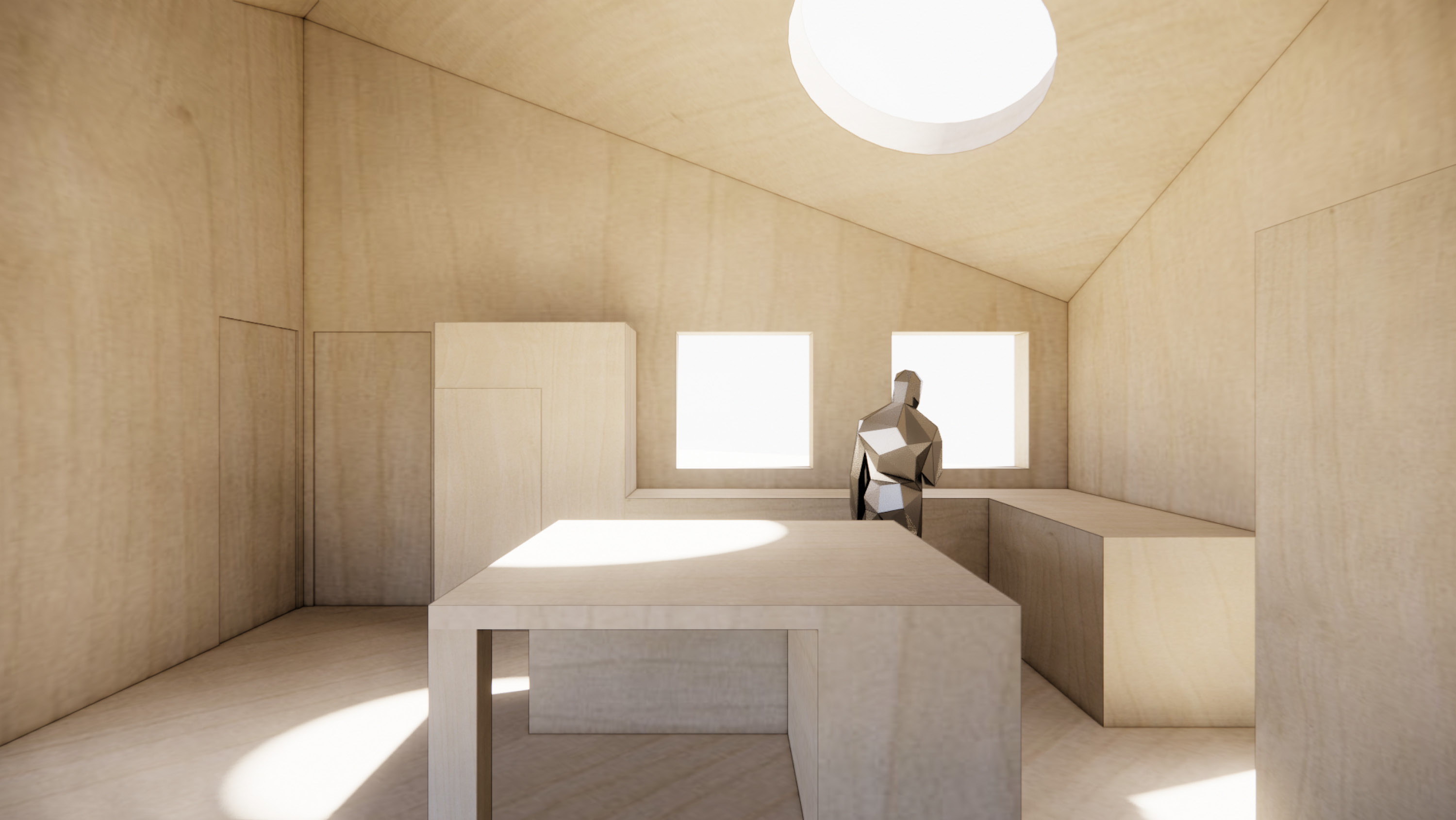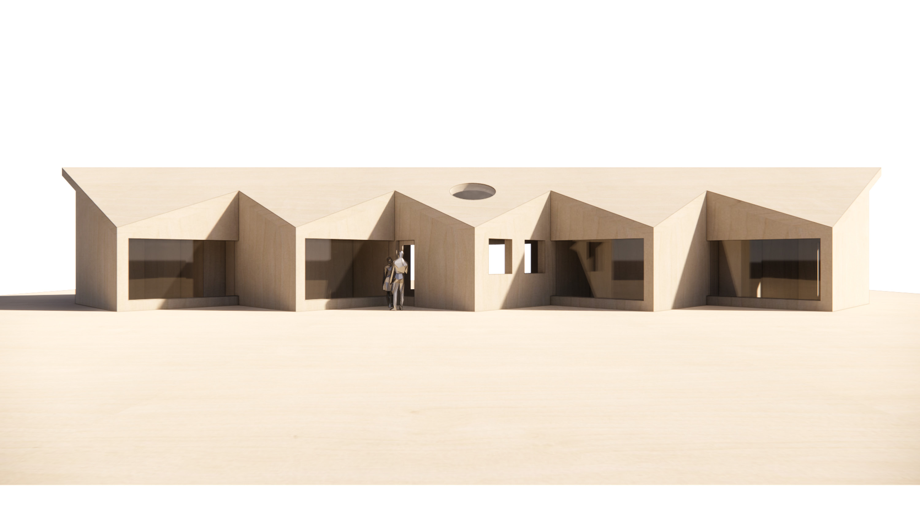
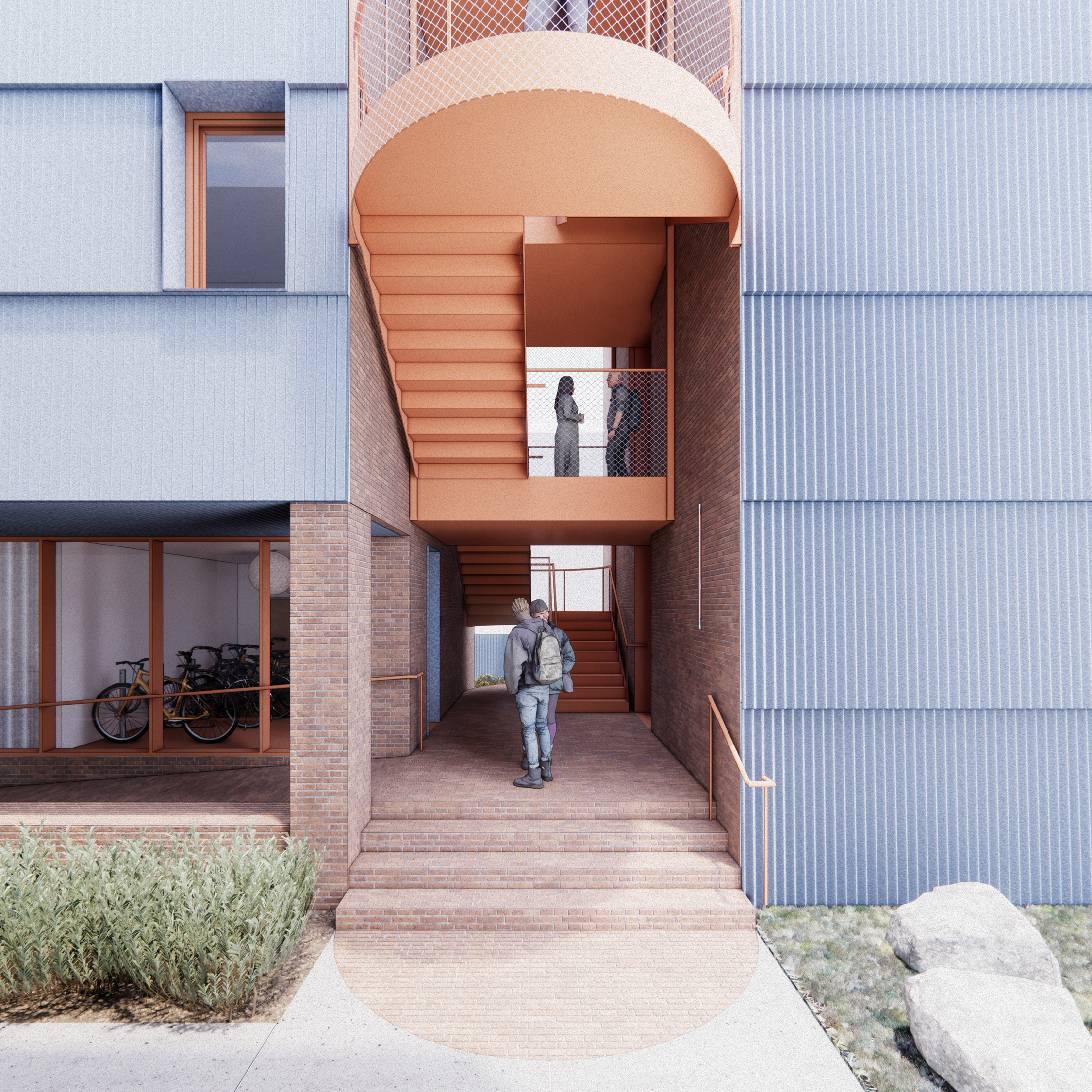
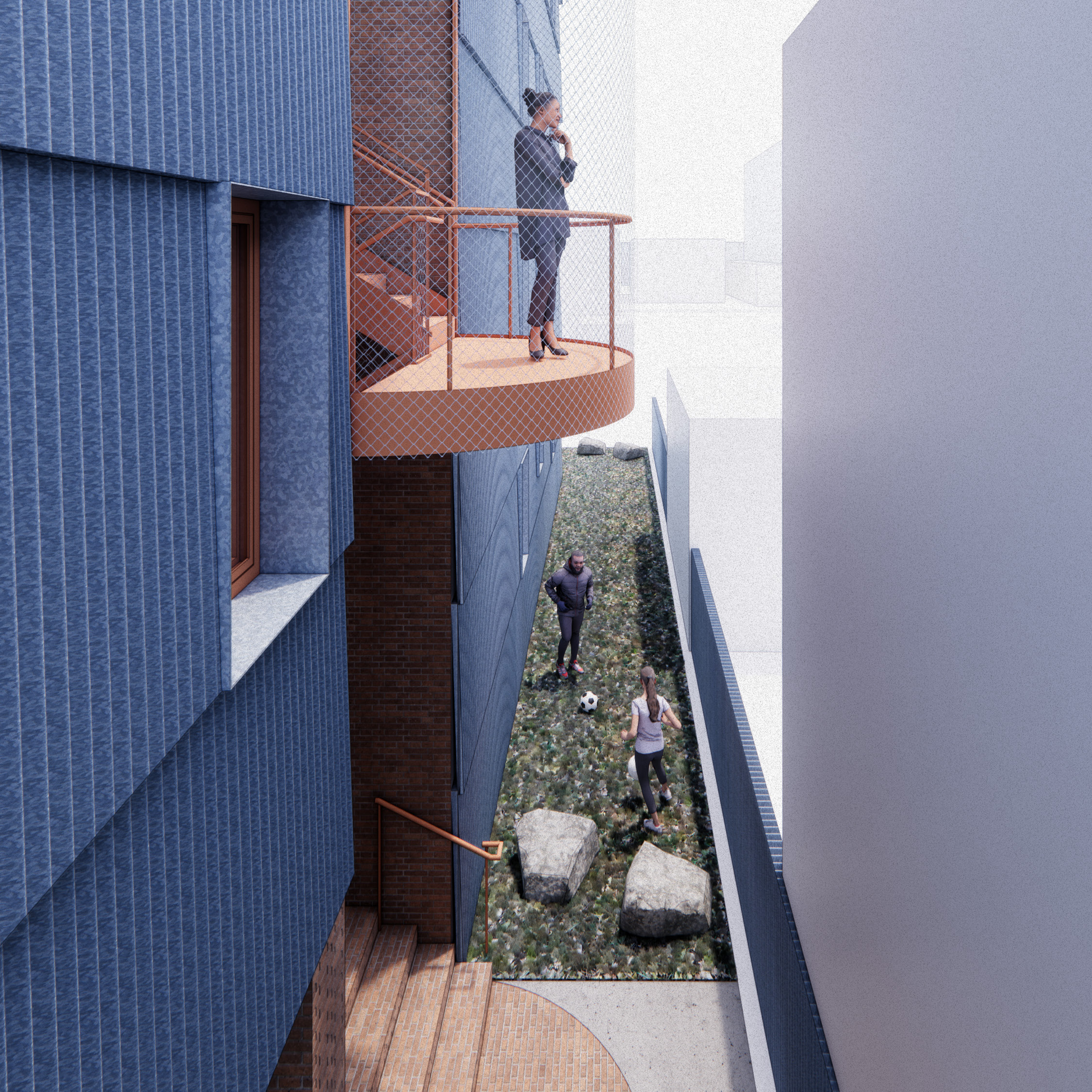
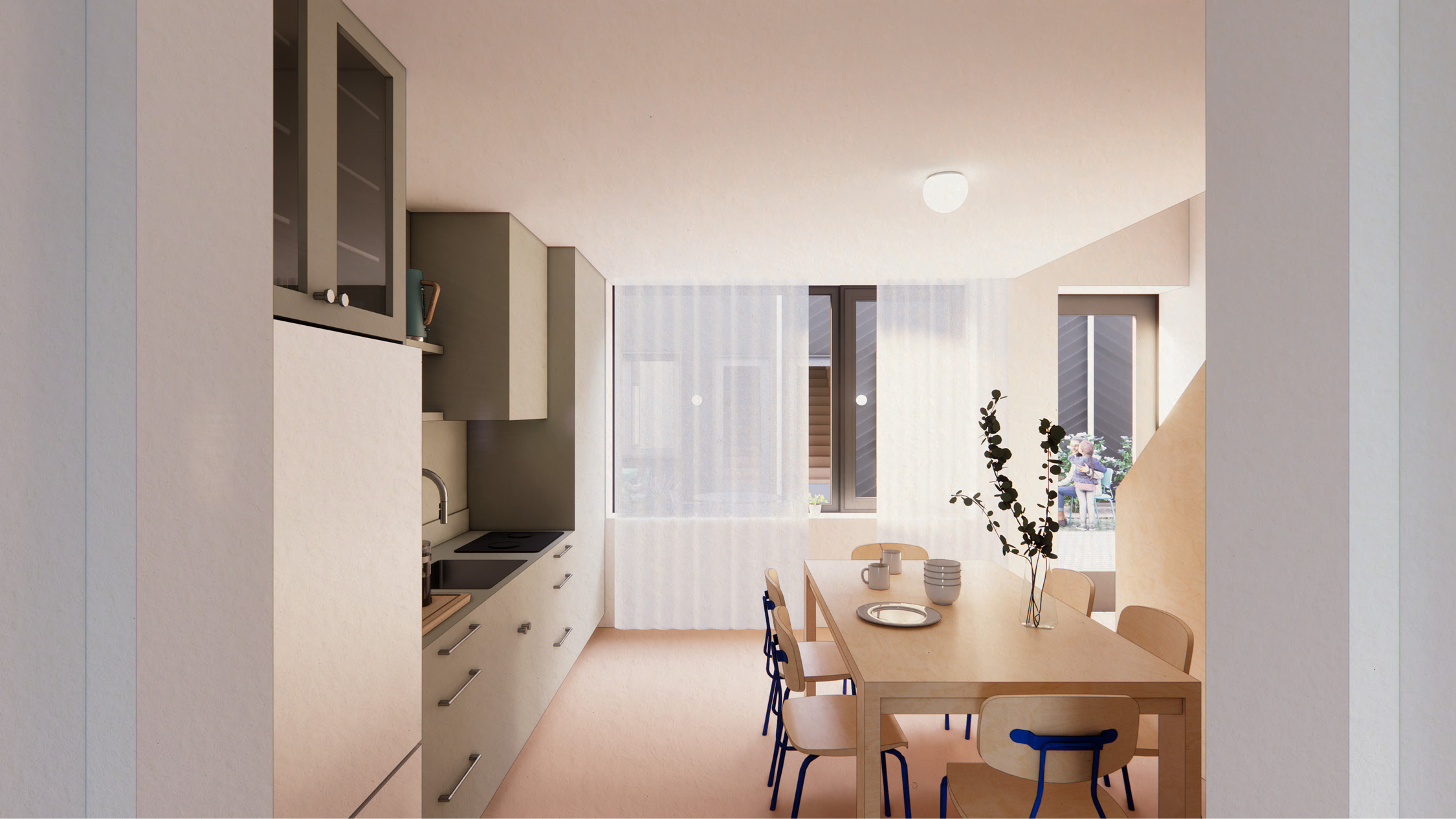
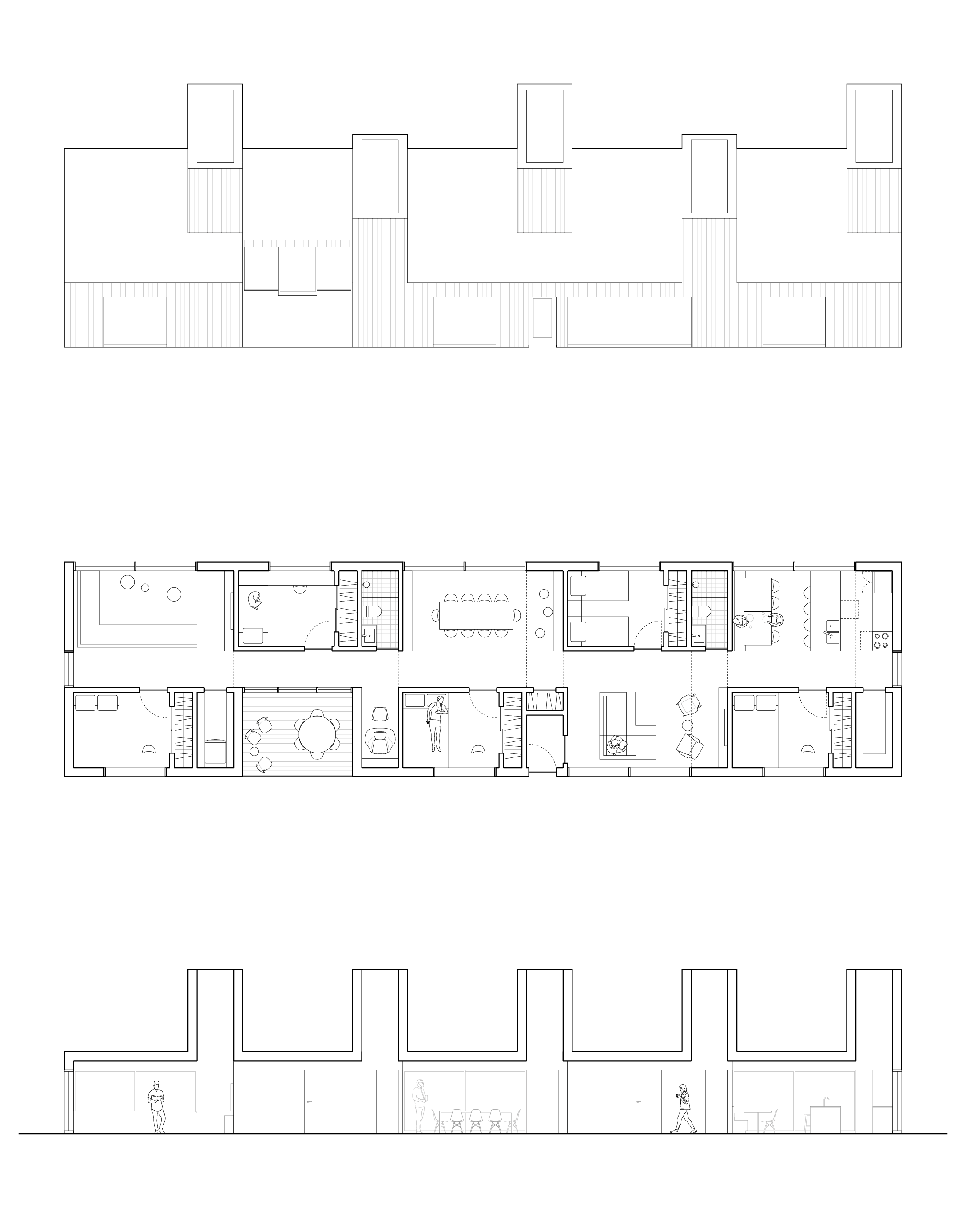
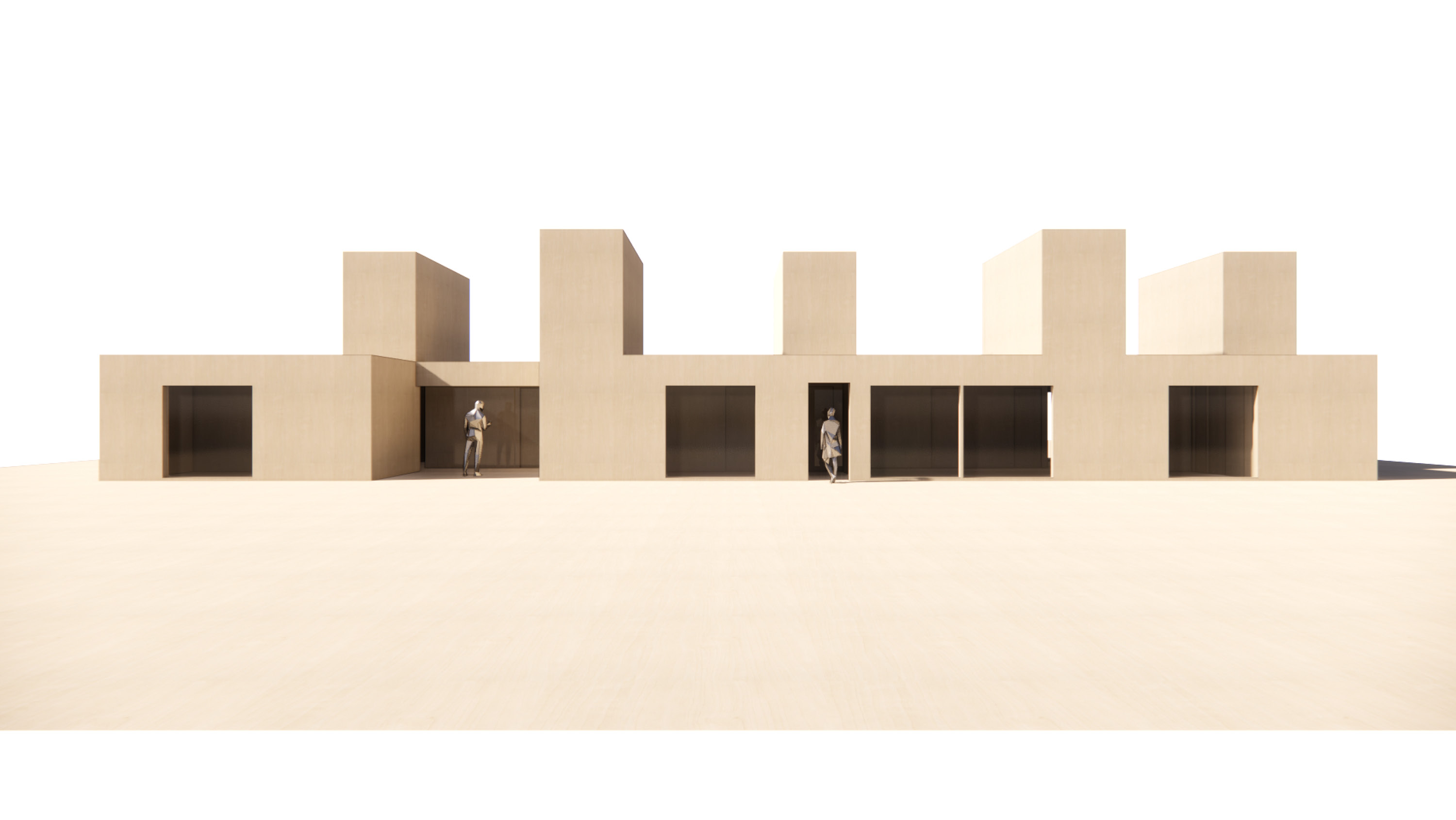
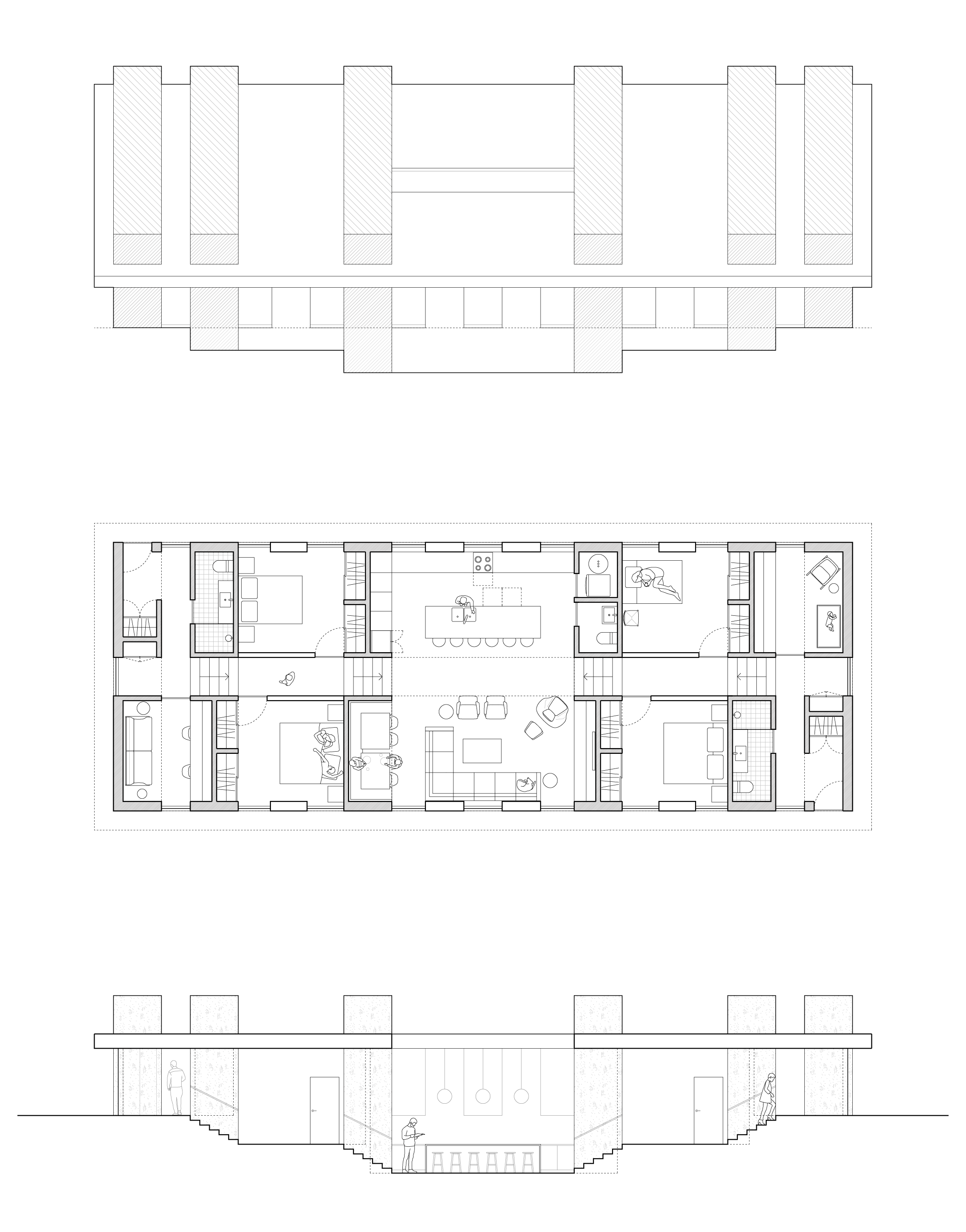
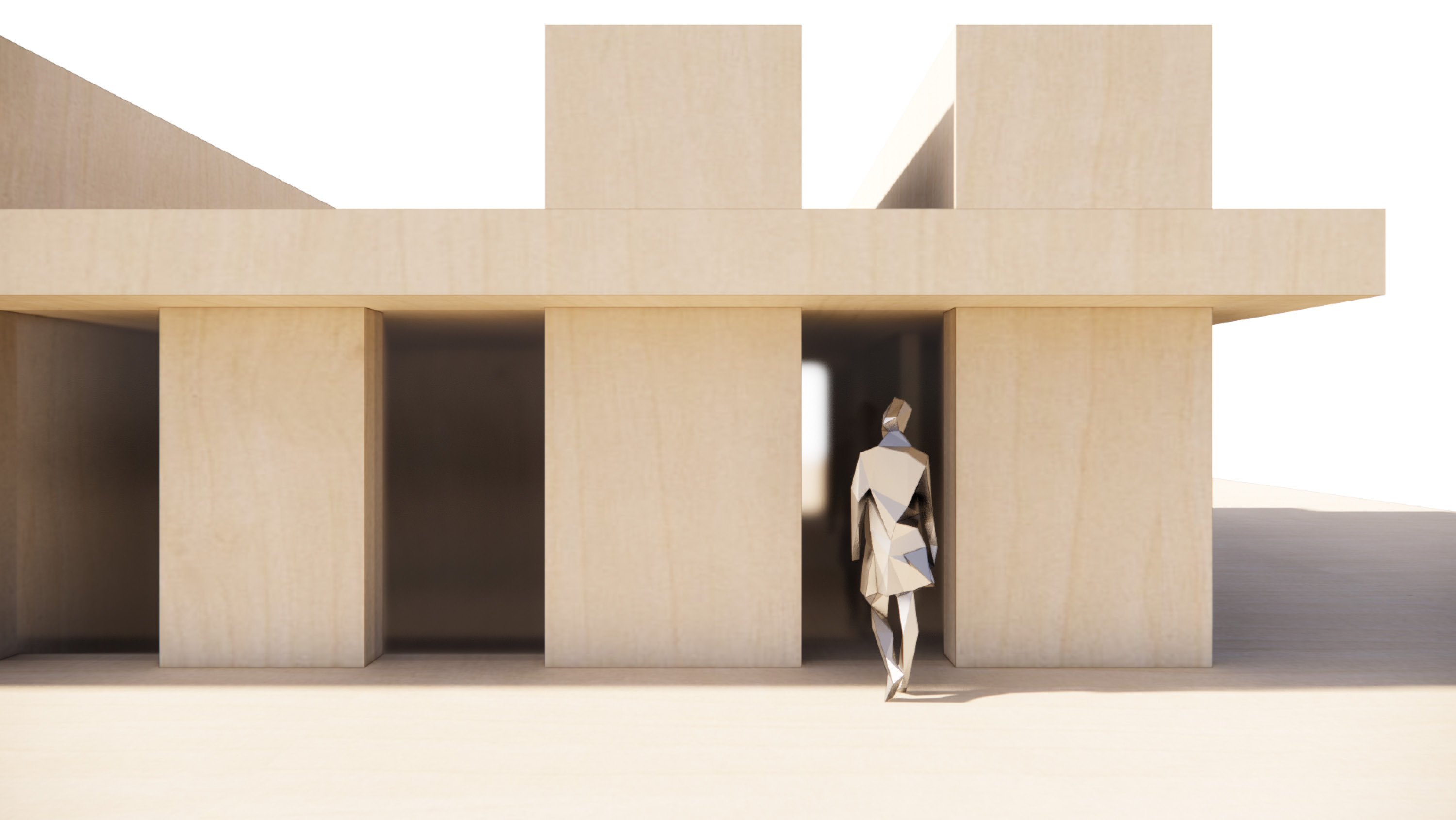
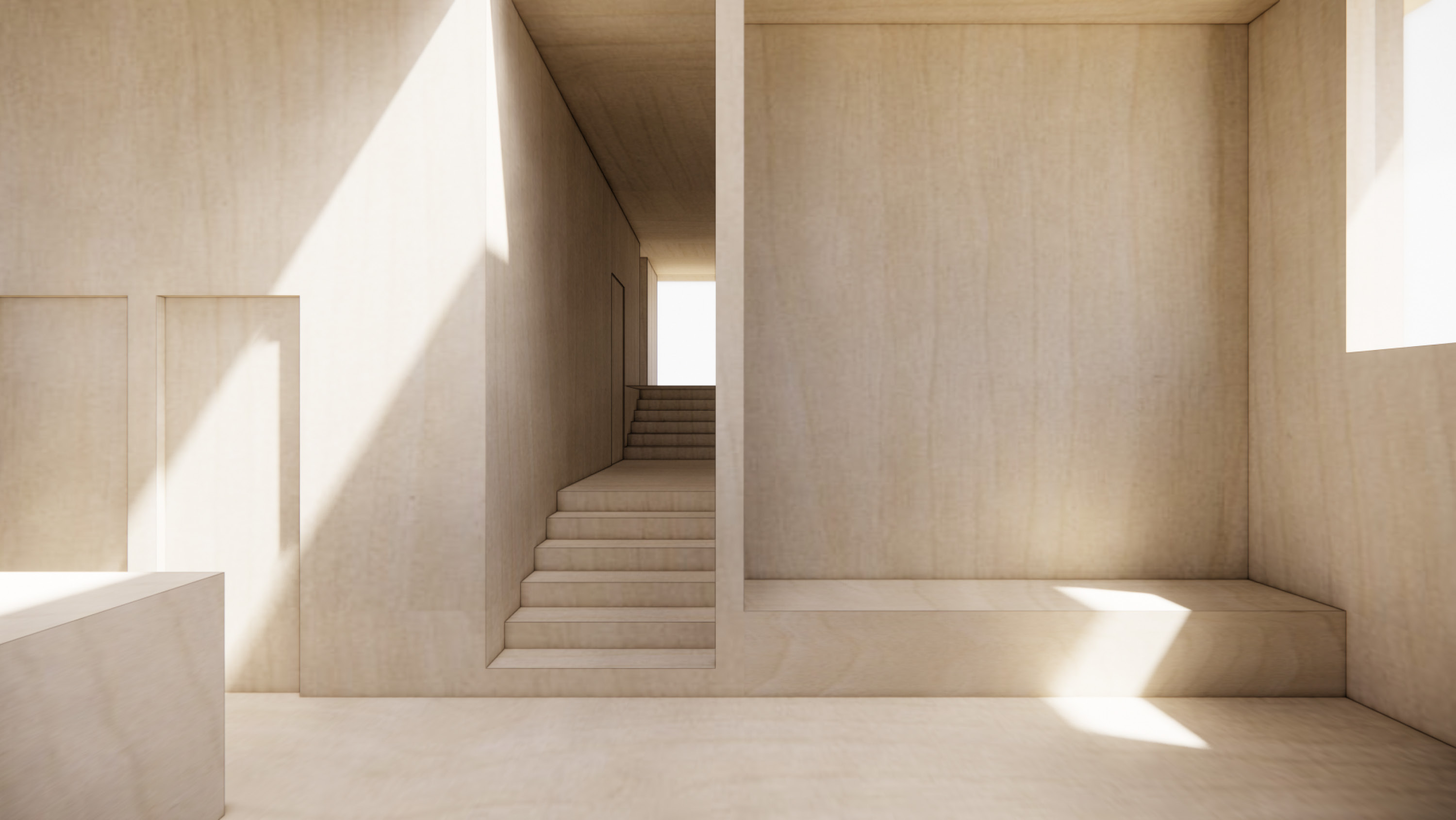
Split Switchback Housing
_Socially rich, straw-filled single-stair housing
Primary Projects + RUKA Design
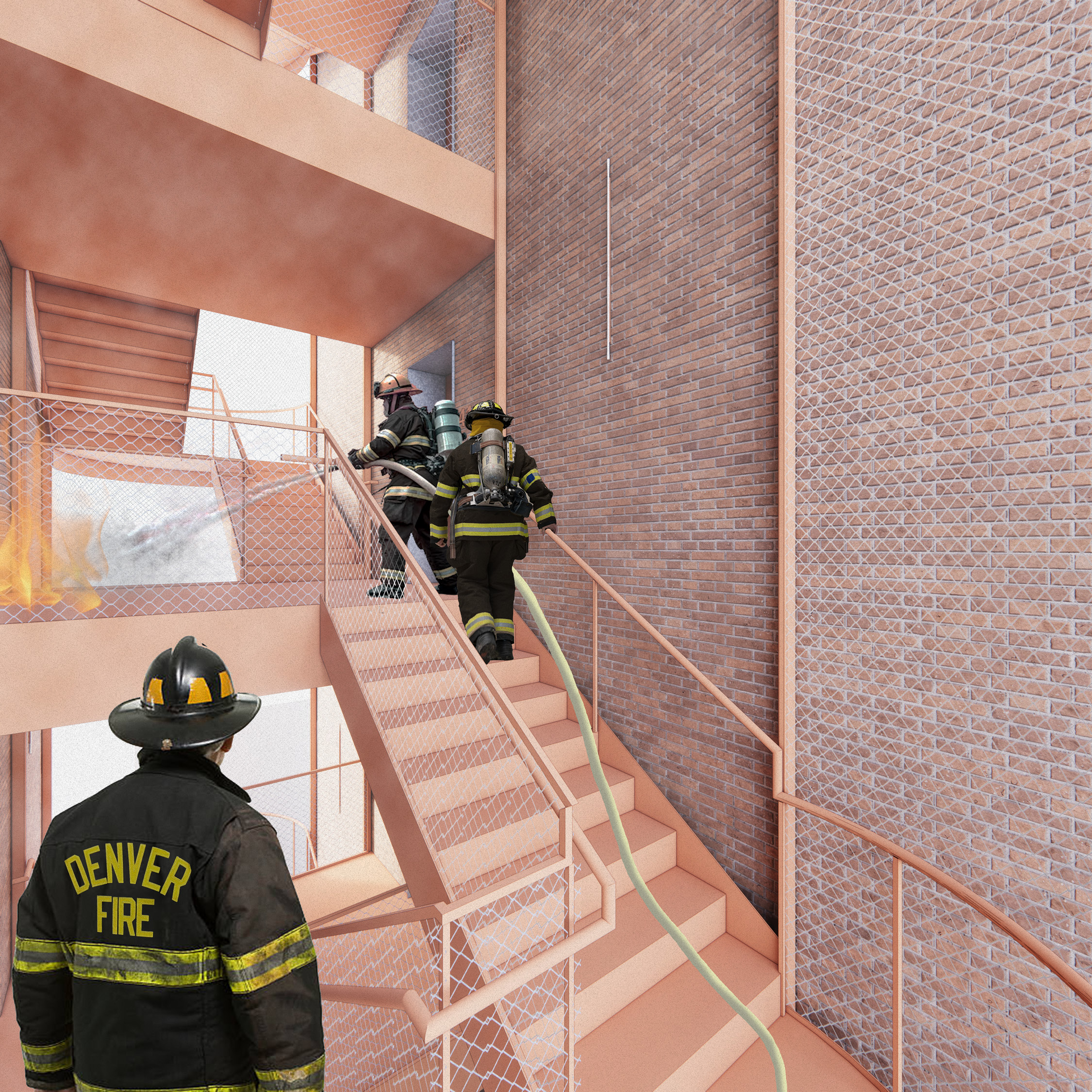
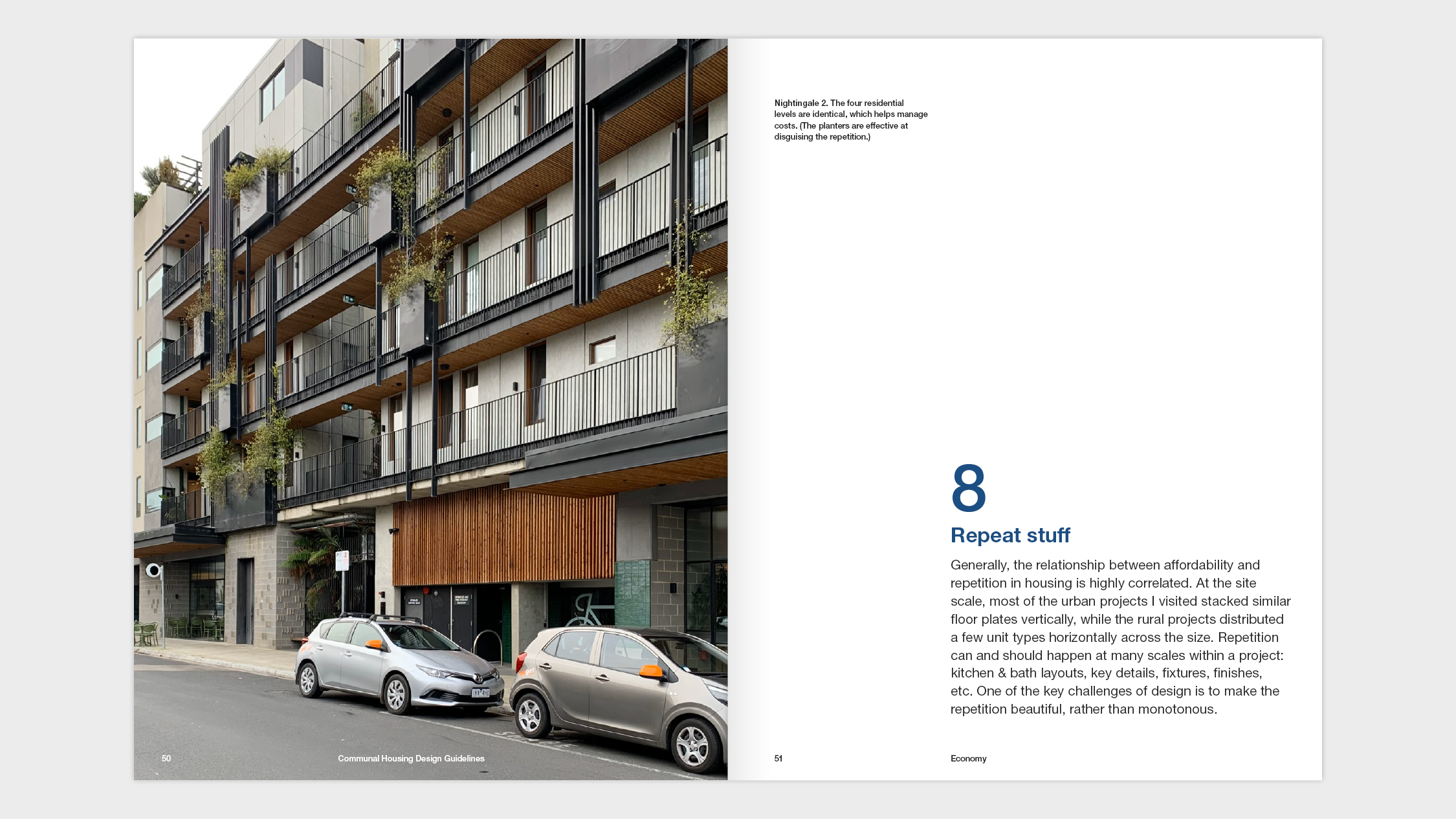
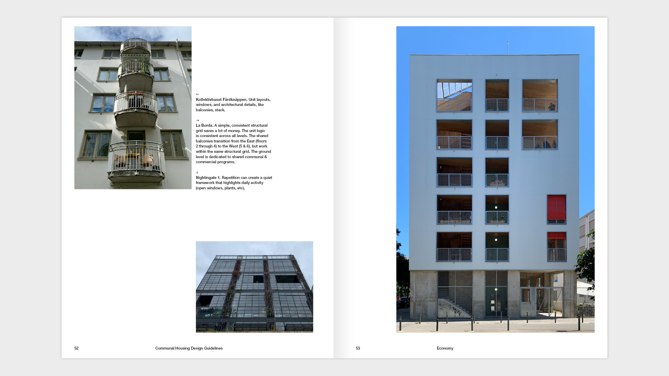
Currently, most US housing over three stories requires two means of egress. This generates hotel-style housing, where units are entered from long, dark hallways. This model has many problems. Only allowing for windows on one wall leads to inefficiently laid-out units that are ill-suited to families, hard to ventilate naturally, and more. The excess circulation—an extra set of stairs and a long hall—necessitates large rectangular plots of land, which are increasingly rare and expensive in urban settings.
The US is a global outlier, with most peer countries allowing “single-stair” buildings of eight or more stories. Because the existing codes predate the invention of fire sprinklers (and more), many municipalities are reconsidering this regulation to spur the development of infill sites and reduce housing costs. Split Switchback Housing answers Denver’s call to imagine American single-stair housing.
The US is a global outlier, with most peer countries allowing “single-stair” buildings of eight or more stories. Because the existing codes predate the invention of fire sprinklers (and more), many municipalities are reconsidering this regulation to spur the development of infill sites and reduce housing costs. Split Switchback Housing answers Denver’s call to imagine American single-stair housing.

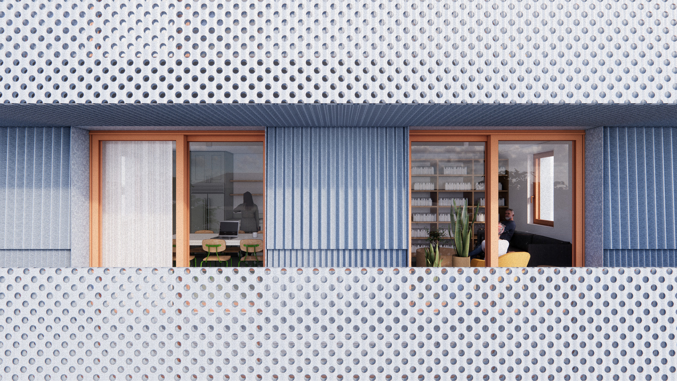
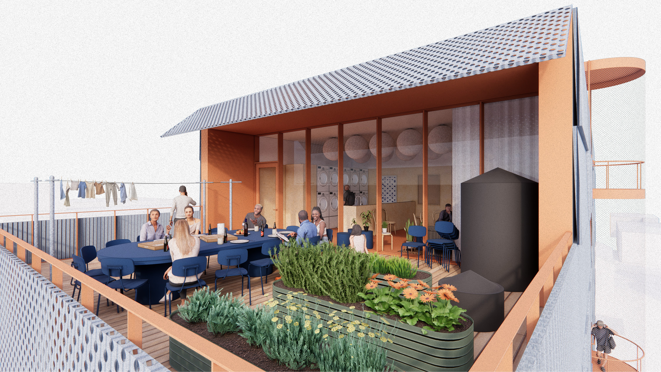
The first floor caters to residents’ daily needs with spaces for chance meetings, play dates, package deliveries, bike parking, recycling, composting, & trash disposal.
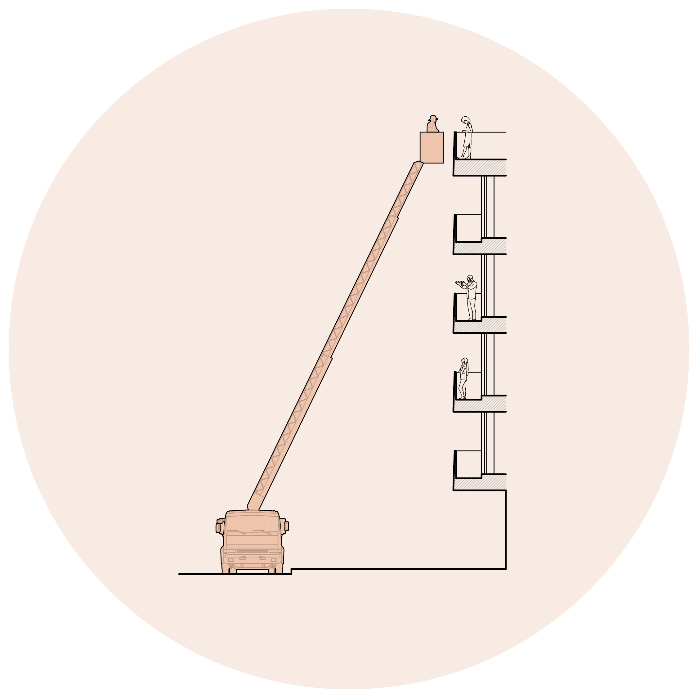
Widespread Adoption
In surveying emerging single-stair legislation across the country, firefighters’ concerns have been the biggest barrier to adoption.
Before starting we worked to understand these concerns better, using them as the foundation to our approach. Building off of Seattle’s code, the design addresses these concerns in the following ways:
(Denver’s Capitol Hill, Station 8, has a truck with a 105’ rear-mount ladder. Denver has adequate hydrant capacity and quick fire department response times. The proposed building has fire sprinklers and properly fire-separated occupancies. All of these are essential factors for taller single-stair buildings.)
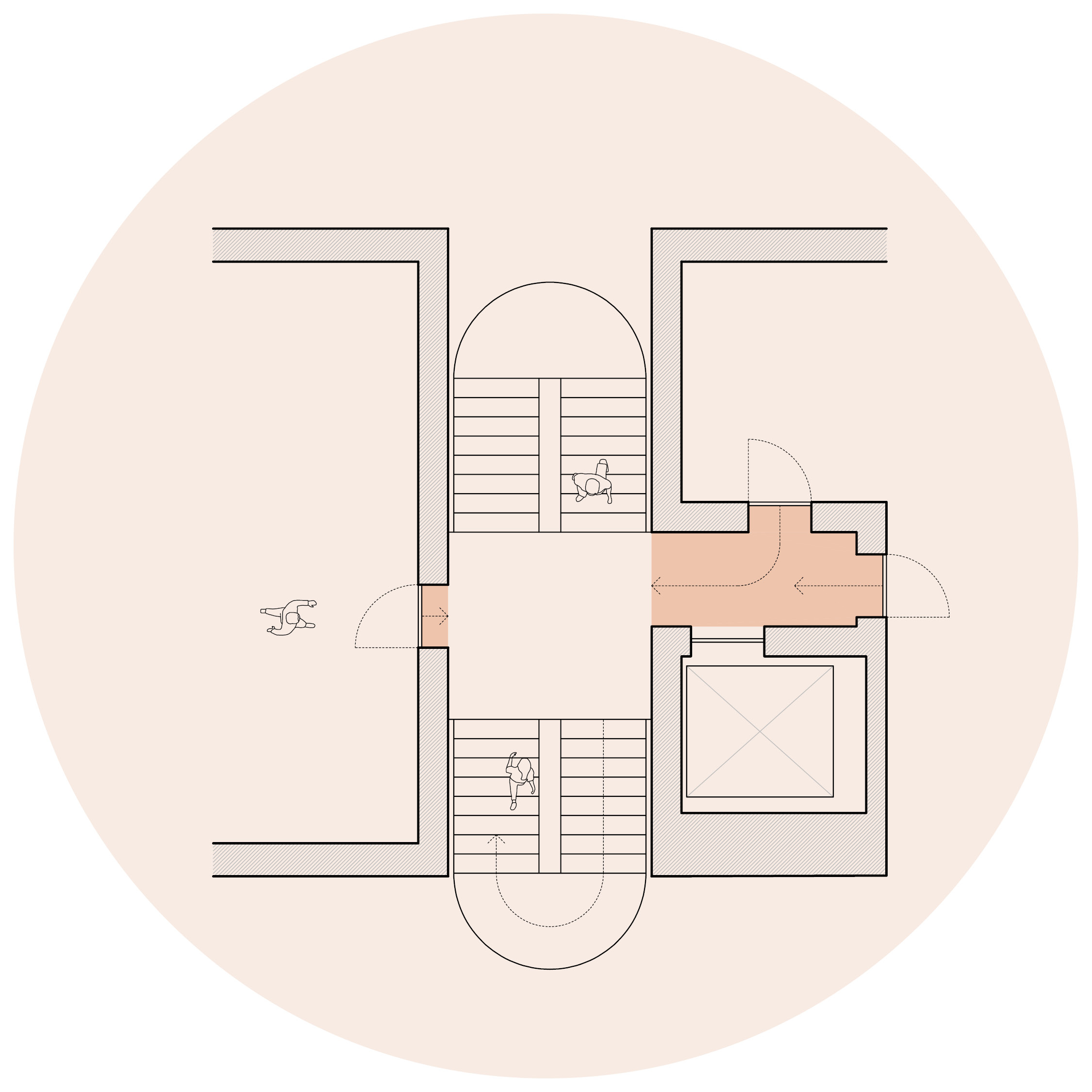
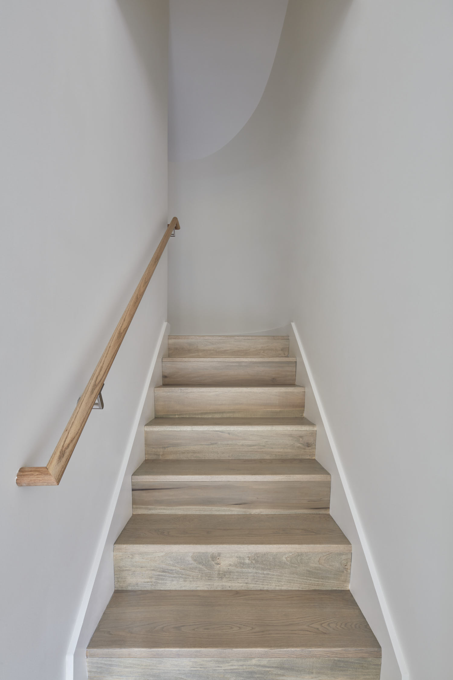
Short Travel Distances
The furthest unit is 12’ from the stair. (Also, the stair’s travel distance is equivalent to a typical switchback: 8’ across the landing.)
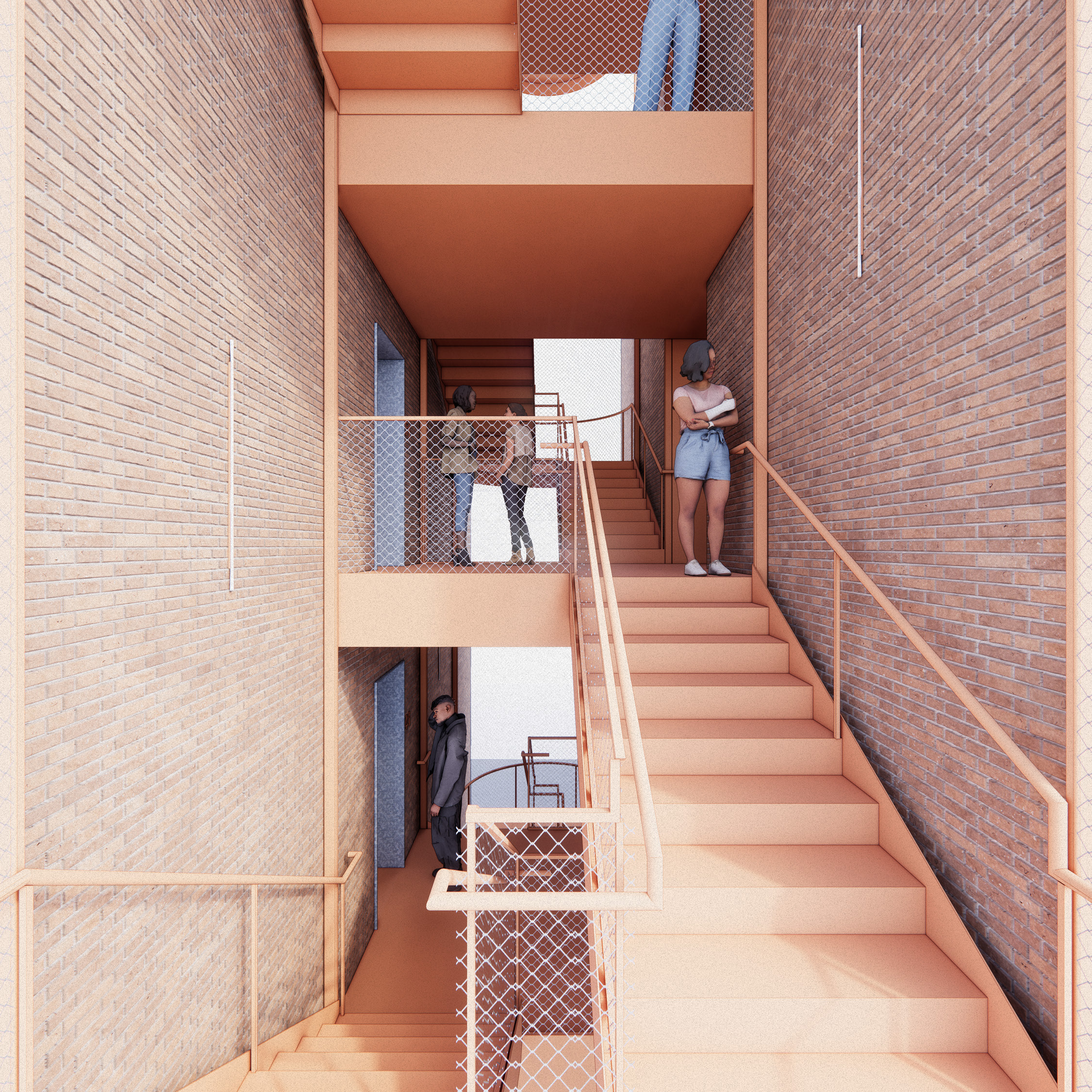
Fire-Rescue Balconies
Every unit has a balcony facing a right-of-way, allowing for easier rescue and refuge from smoke. 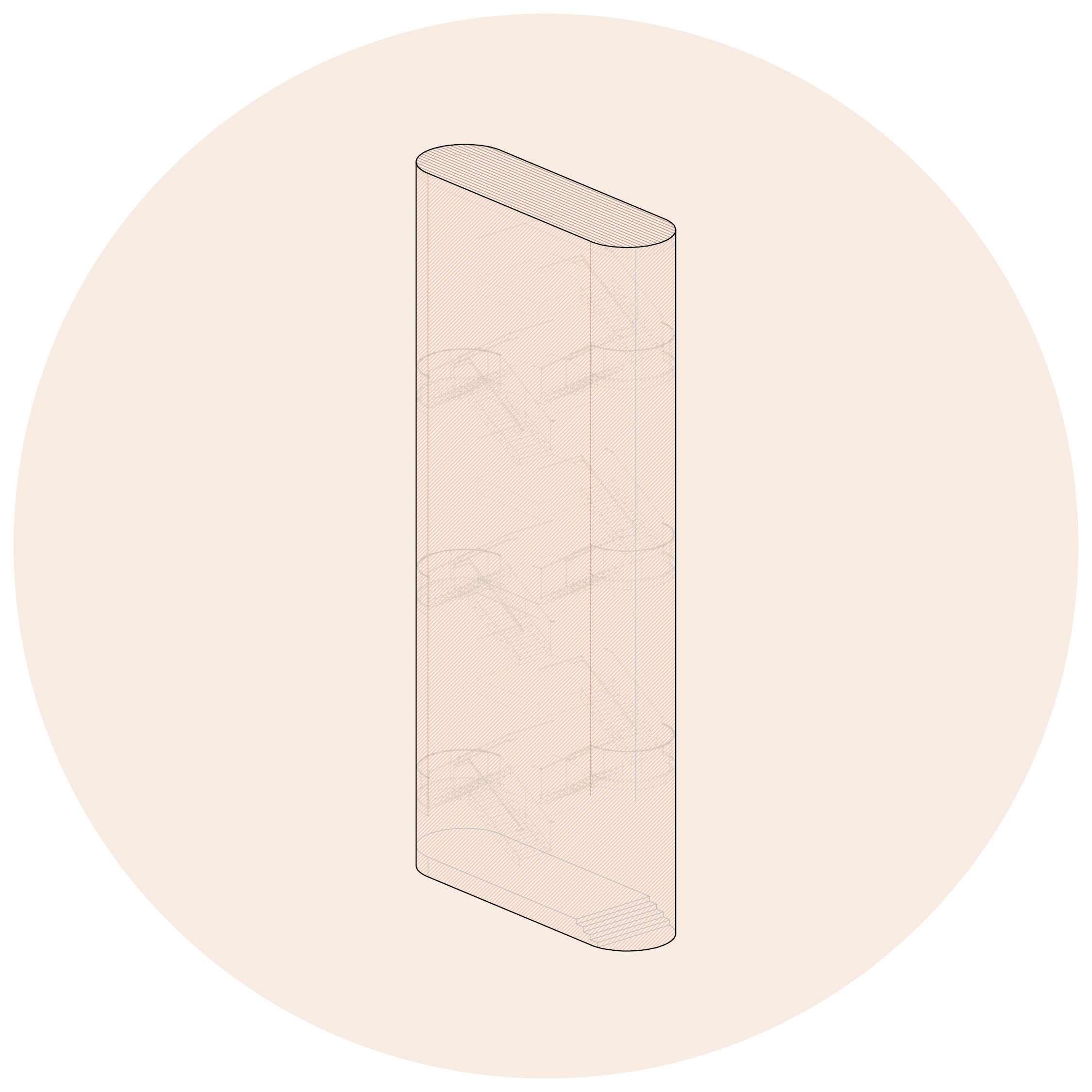
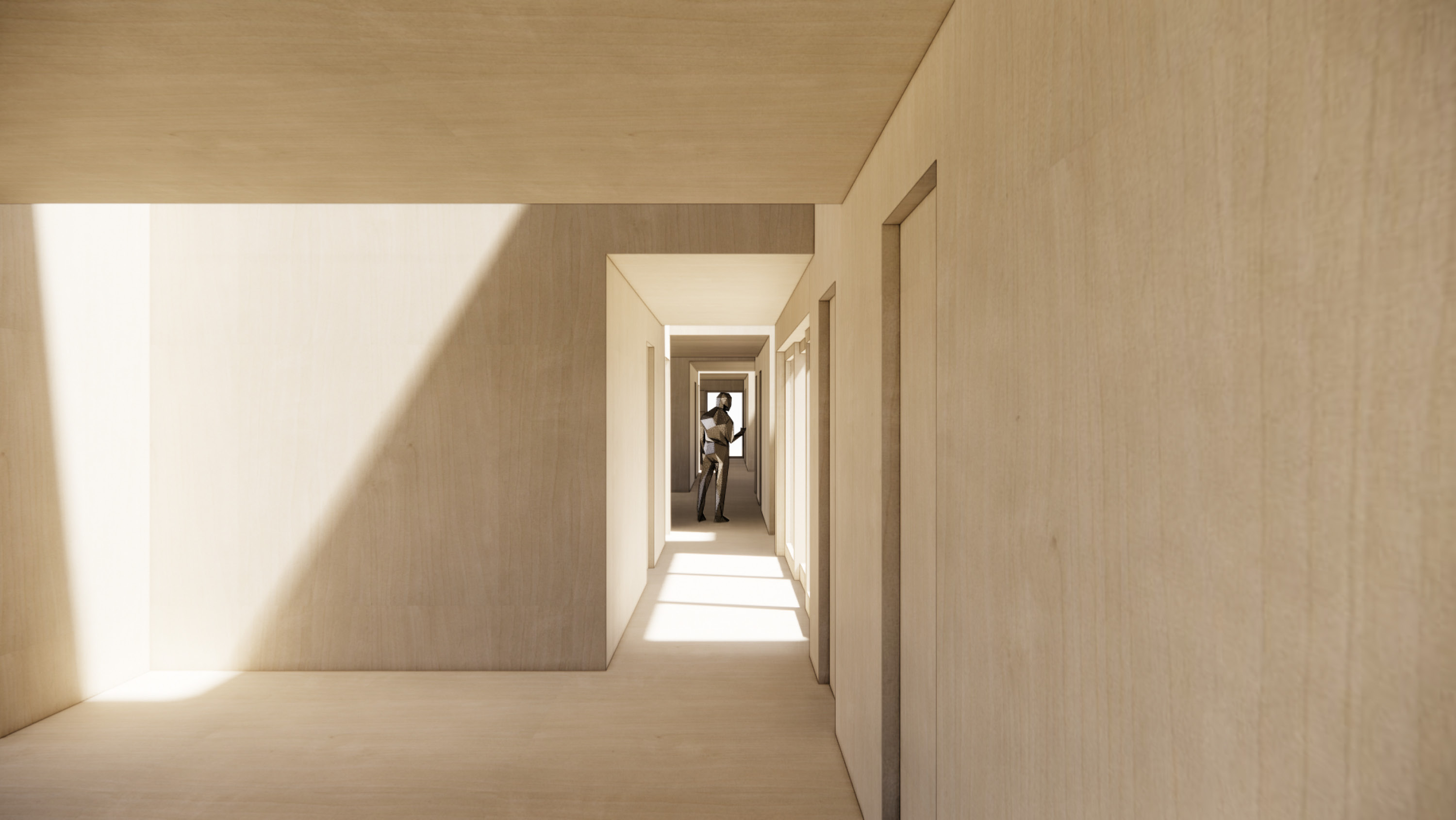
Smoke-Free Stair
The stair is covered, but open at the sides, preventing smoke build-up (and allowing more light & fresh air).
Increased Visibility
The alternating switchback increases visibility between floors (because they aren’t blocked by the level above).


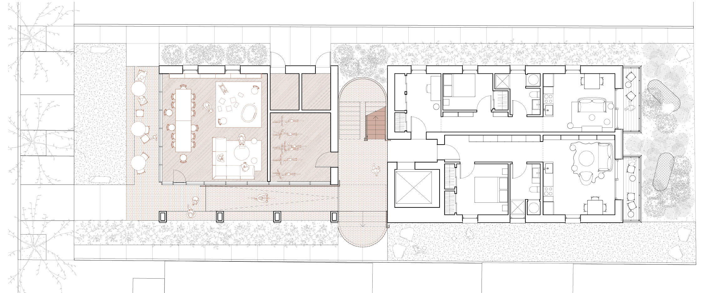
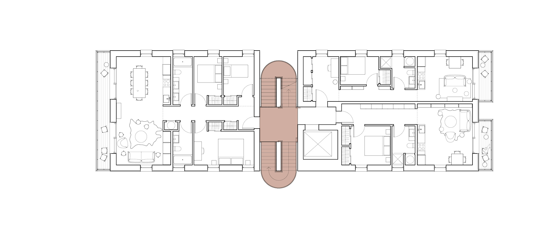


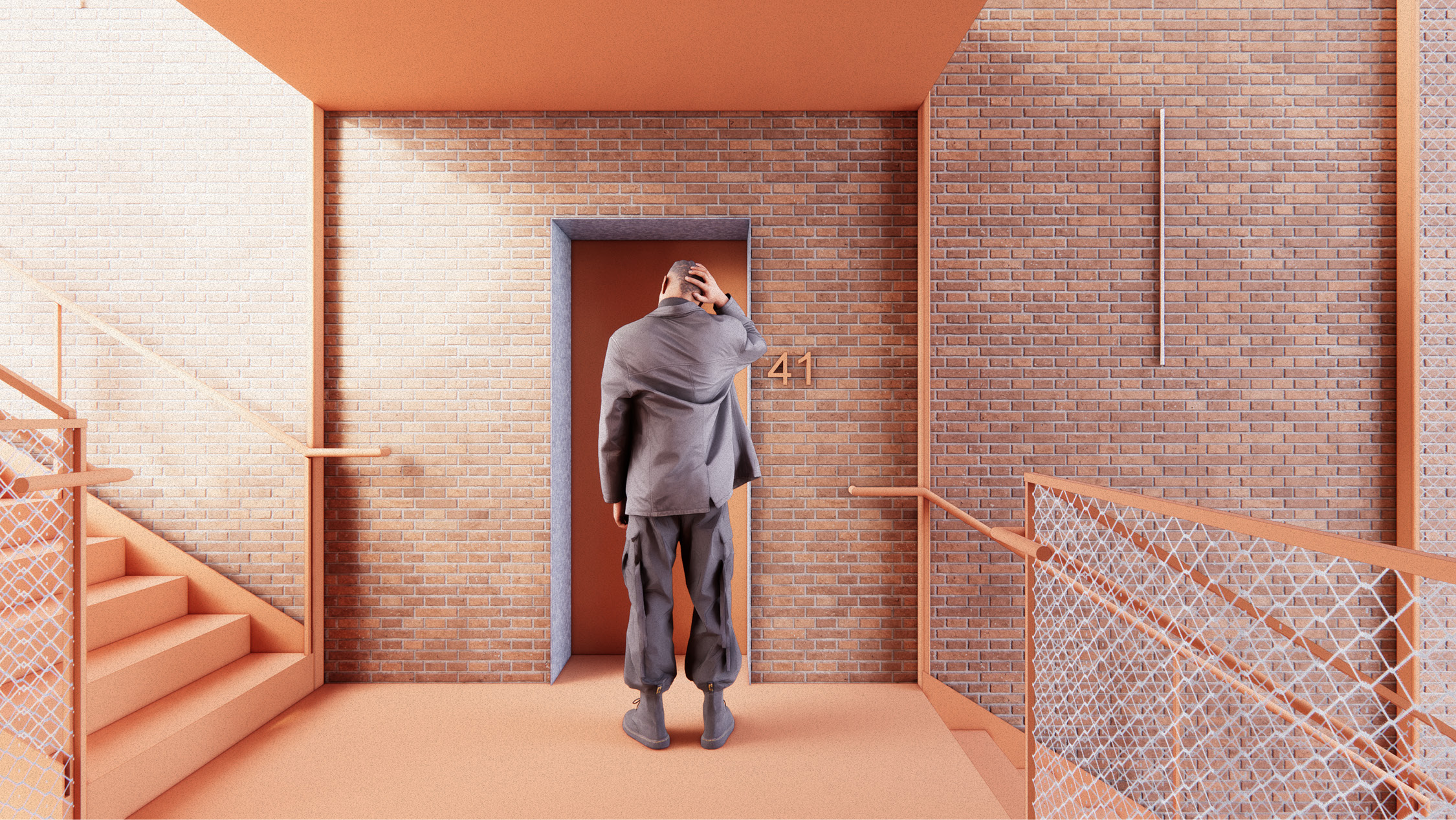
The project consists of two living blocks organized around a central stair. Conceived as a prototypical solution, the blocks can grow or shrink to fit deeper or shallower sites, as long as their inner face abuts the stair.
Click through the gallery below to learn more about the project ︎︎︎


Sponsor
Buildner and ArchDailyLocation
1338 Emerson St / Denver, CO 80218Awards
Denver Single-Stair Housing Challenge, ShortlistedStats
- 6-stories
- 16 units:
12 studios
4 three-beds - Lot Size: 5,678 sf (0.13 acres)
- Dwellings per Acre: 122.7
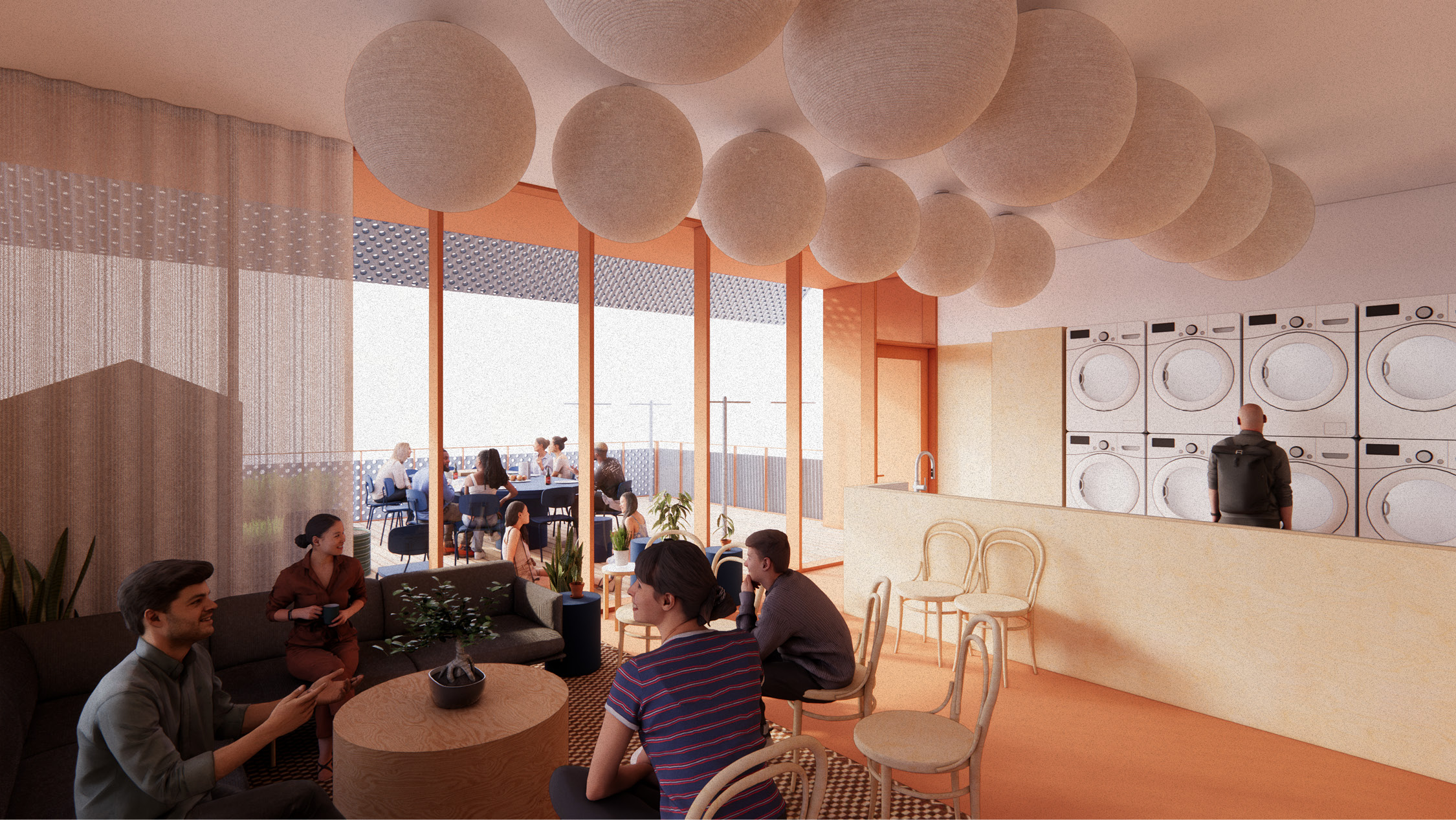
- Amenities: Covered Outdoor Cafe Seating, Community Room, Bike Room, Communal Living Room, Shared Laundry, Rooftop Deck, Social Stair
Related Work

Communal Housing Design Guidelines
_A book with 40 actionable lessons for designing more communal, affordable, and sustainable multifamily housing
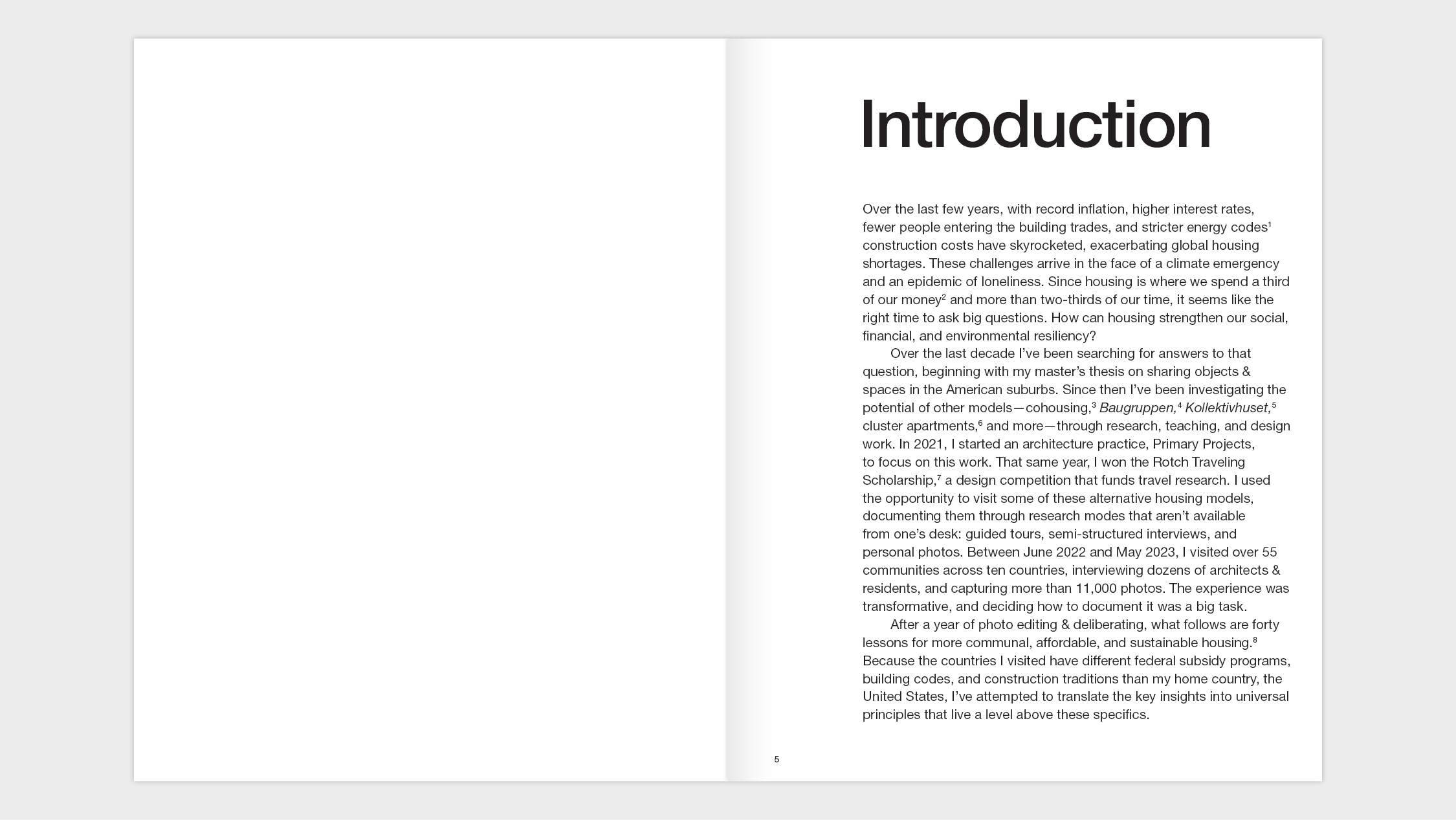
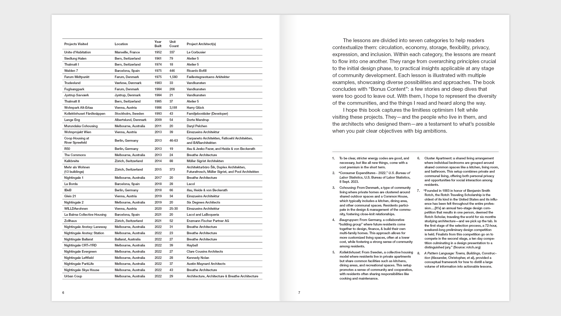
| In the face of a housing crisis, a climate emergency, and a loneliness epidemic, how can we create dwellings that foster financial, environmental, and social resilience? Over the last decade, architect Kyle Barker has sought answers to this urgent question. From a master’s thesis on sharing space in the suburban home to founding a mission-driven architecture practice, he has explored diverse housing models such as cohousing, pocket neighborhoods, and cluster apartments. In this book, the outcome of a trip to over 55 housing communities across 10 countries, he distills 40 key lessons for building more communal, affordable, and sustainable housing. Each lesson is illustrated with project photos demonstrating design solutions across the themes of circulation, economy, storage, flexibility, privacy, expression, and economy. This book is for anyone who dreams of better housing! |
Purchase your copy here ︎︎︎
If the cost is a hardship, please email us, and we’ll work something out!


Timeline
- Travel: 2022-2023
-
Writing & Editing: 2023-2024
- Publishing: 2025
Status
CompleteServices
- Graphic Design
-
Research
- Writing
Specs
-
244 pages, plus cover (270+ color photographs)
- 8” x 10” Soft Bound
Tags
Research, Book, Communal, Housing, Graphic Design
Dodge Mountain House
_A carbon smart house in rural Maine
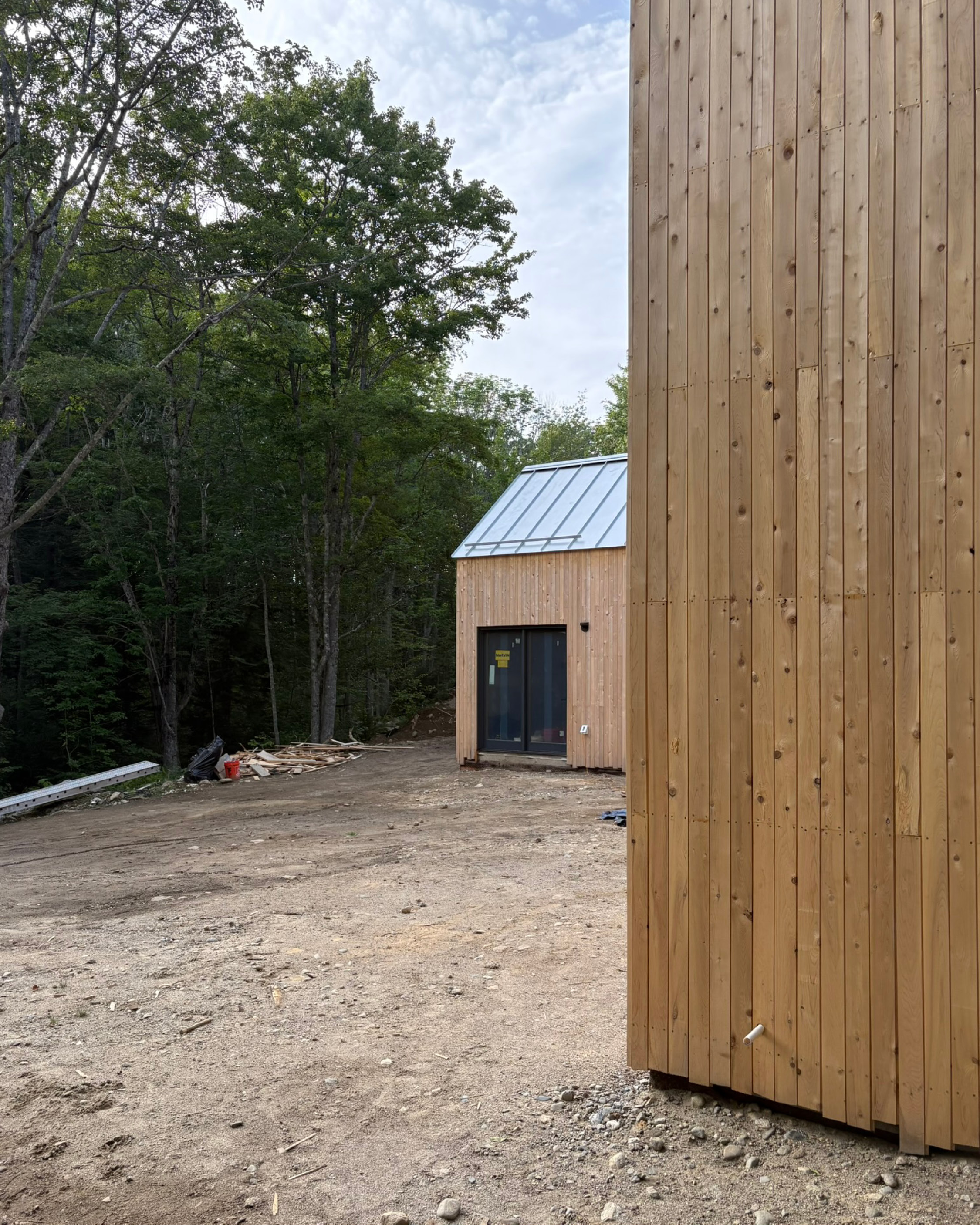
Our client—a young couple with plans for children—wanted a modestly sized, high-performance, modern house.
They purchased a forested plot with distant ocean views and reached out to us with a vision for a multi-volume house inspired by—Croft's founder, frequent collaborator, and good friend—Andrew Frederick’s nearby home.
We aimed to internalize the lessons of Andrew’s house and, if we could, build upon them for a family with different needs and site constraints.
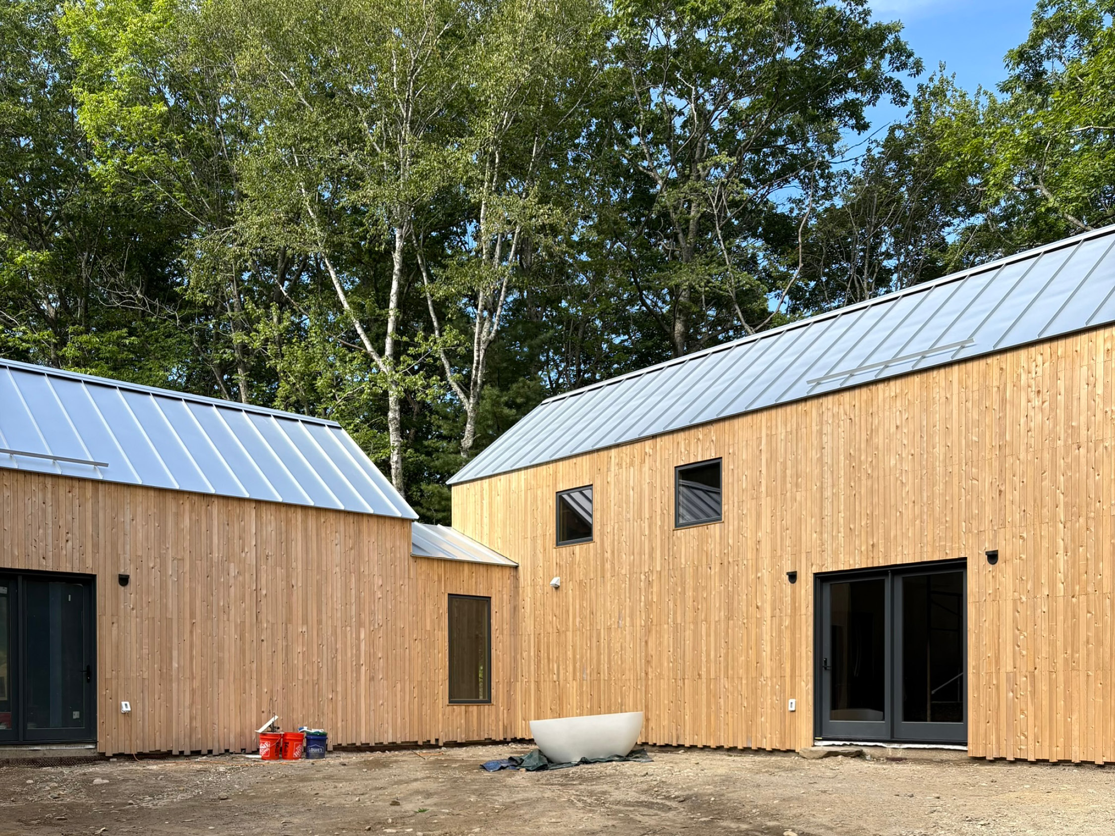
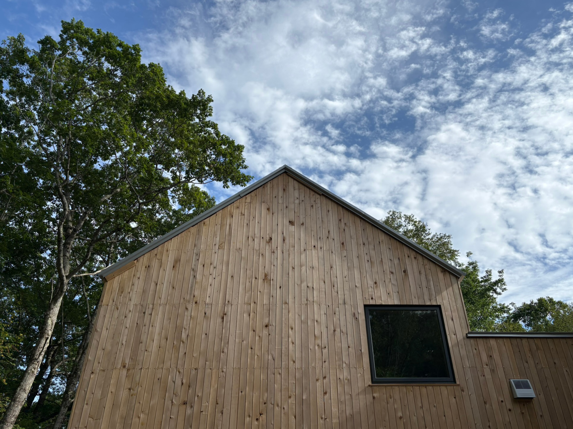
The design is composed of two gabled volumes set perpendicularly to each other: one houses the primary bed and bath, and one houses the main living spaces on the first floor and the children’s bedrooms above. A mudroom stitches them together, providing a transitional space and simplifying construction.
They purchased a forested plot with distant ocean views and reached out to us with a vision for a multi-volume house inspired by—Croft's founder, frequent collaborator, and good friend—Andrew Frederick’s nearby home.
We aimed to internalize the lessons of Andrew’s house and, if we could, build upon them for a family with different needs and site constraints.
The design is composed of two gabled volumes set perpendicularly to each other: one houses the primary bed and bath, and one houses the main living spaces on the first floor and the children’s bedrooms above. A mudroom stitches them together, providing a transitional space and simplifying construction.
Construction Photos 👷📸
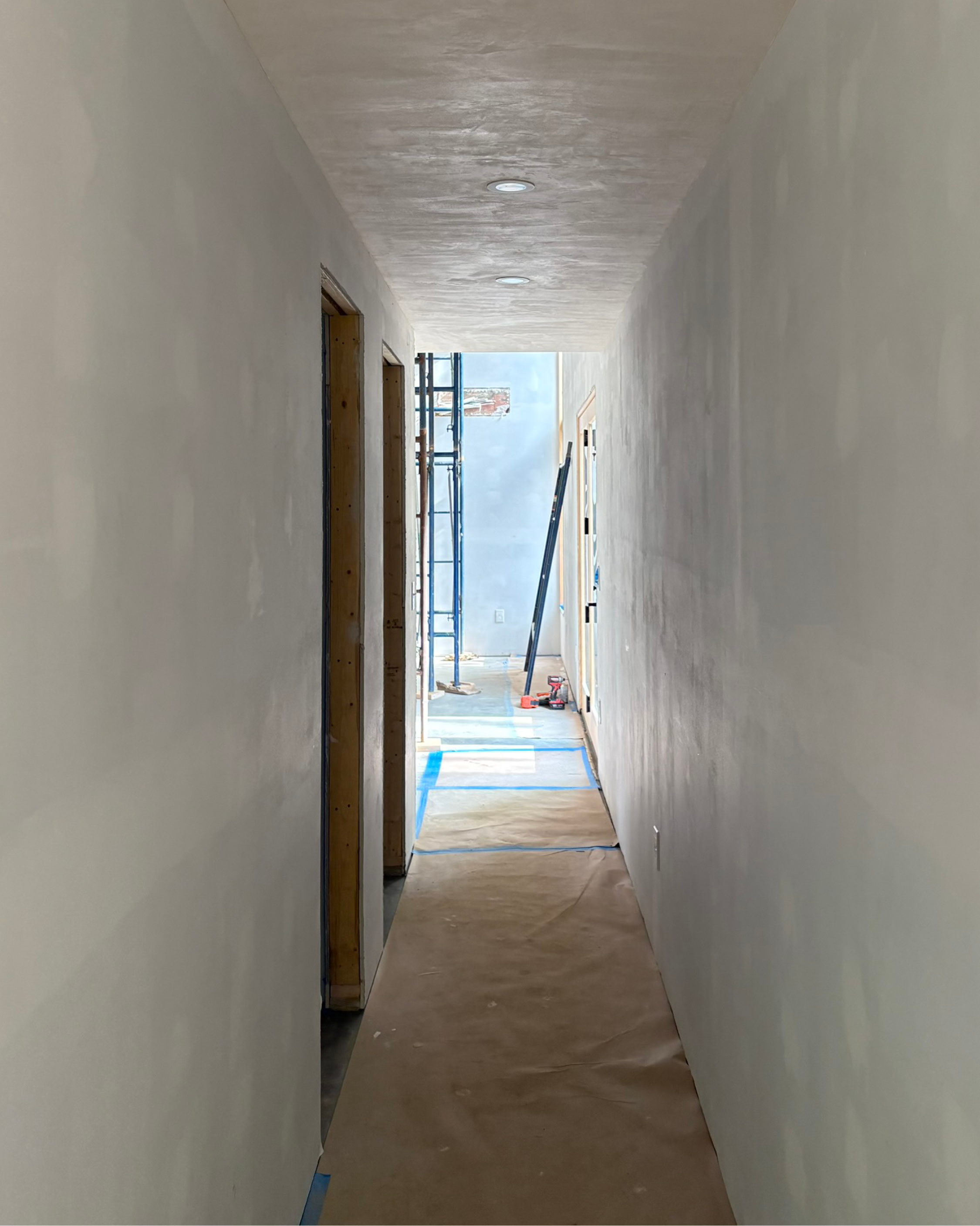
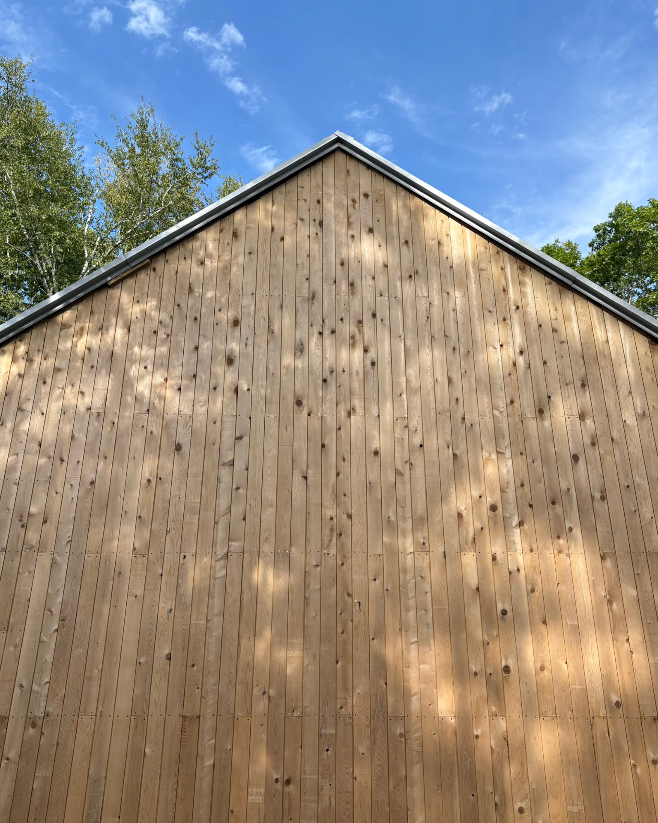
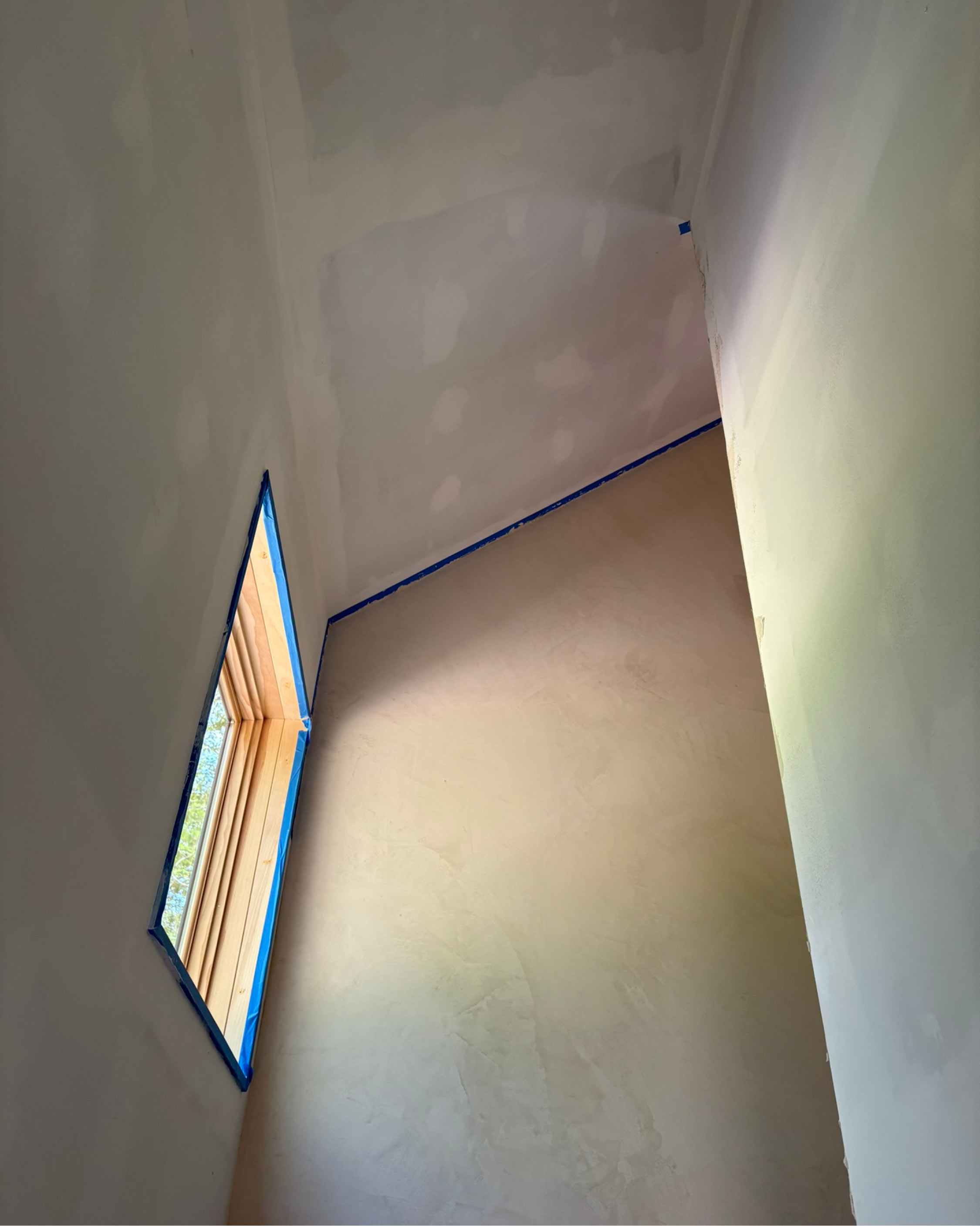
Click or tap to advance
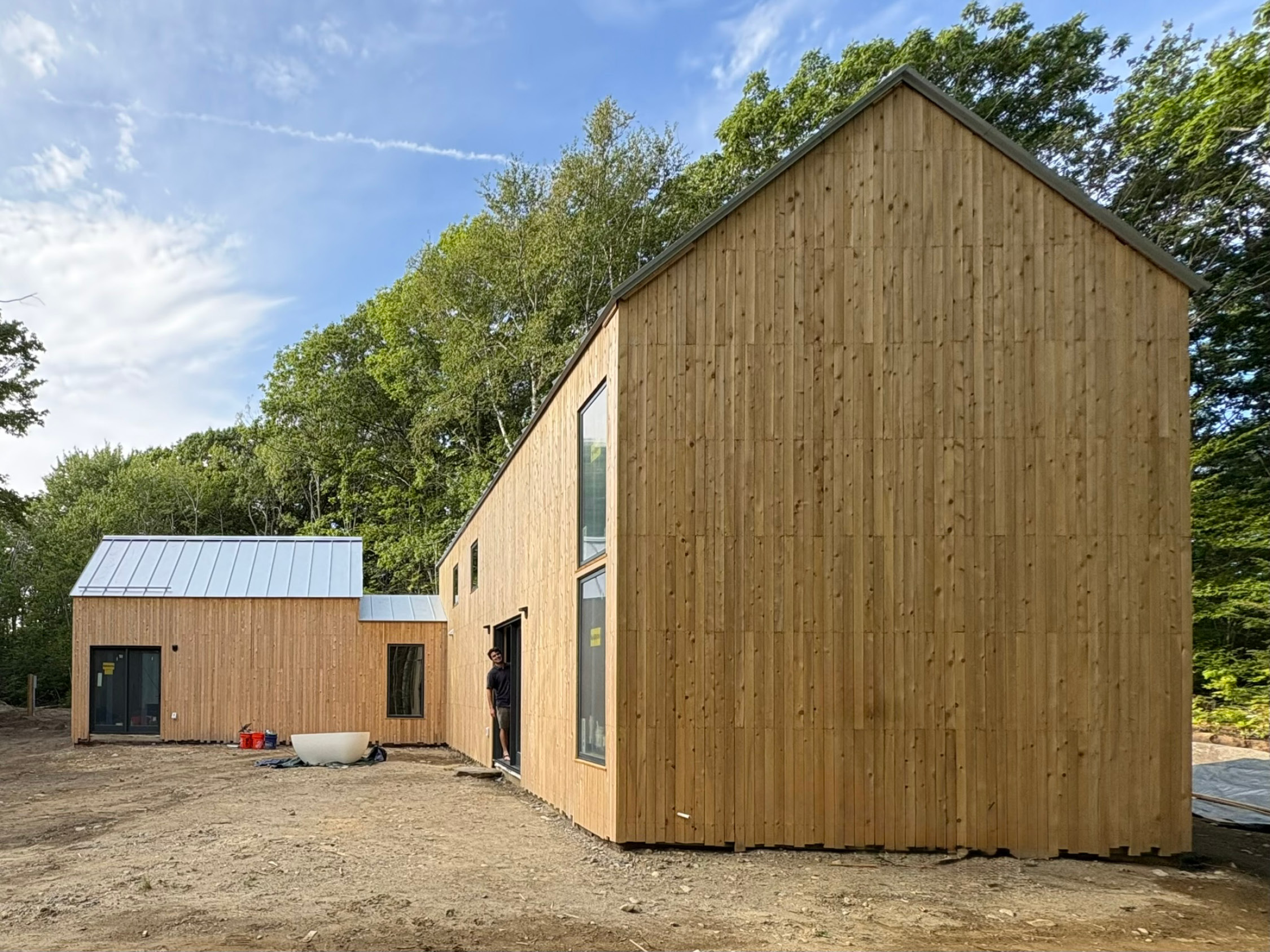
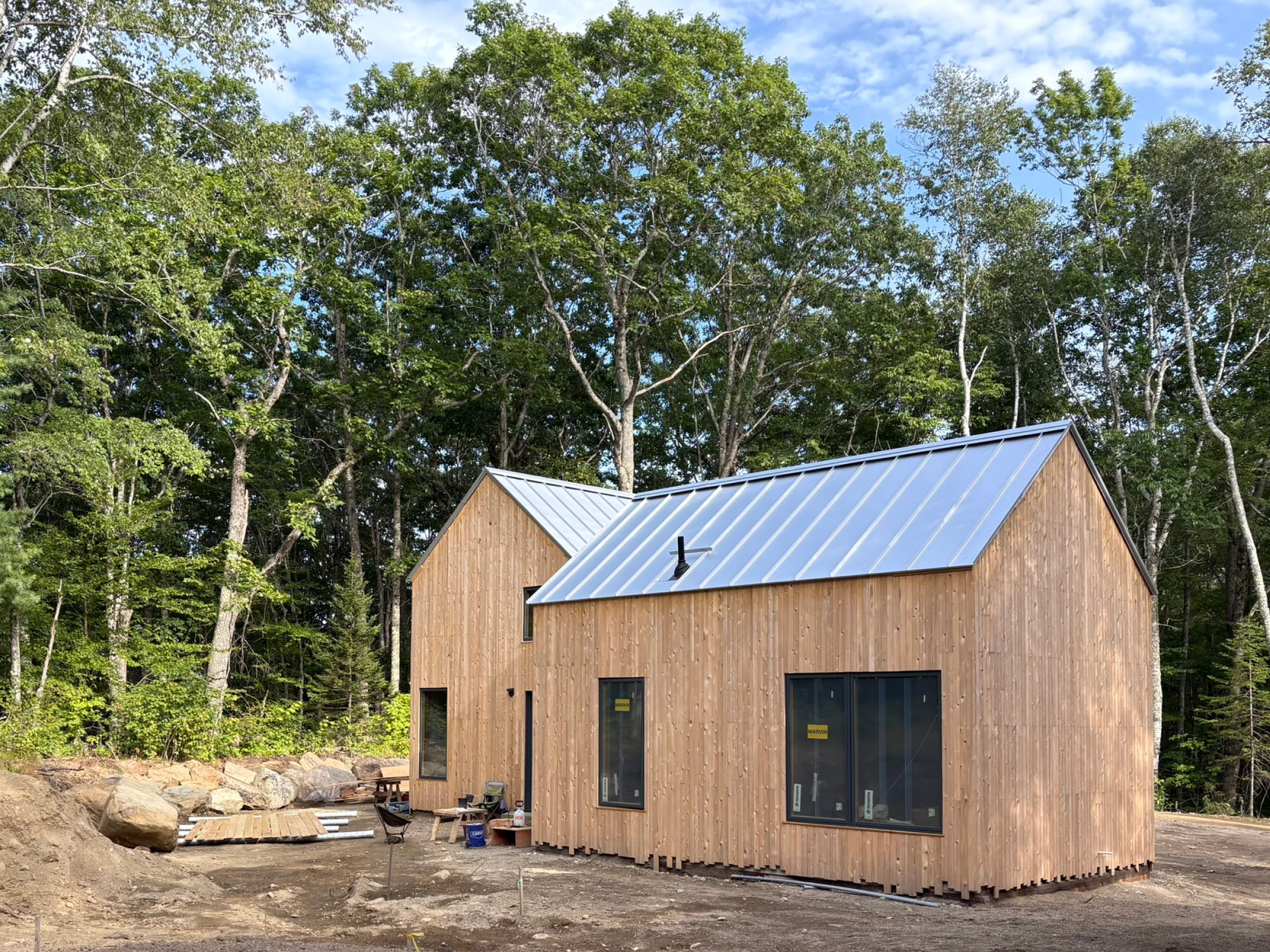

The L-shaped house is entered at the outer elbow, the junction between the volumes


The entry porch takes advantage of the morning sun


Floor Plans
First floor, from top left to bottom right:
- Primary bed & bath
- Mudroom / entry
- Family & guest bath
- Under-stair laundry & utility
- Pantry
- Kitchen
- Living Space
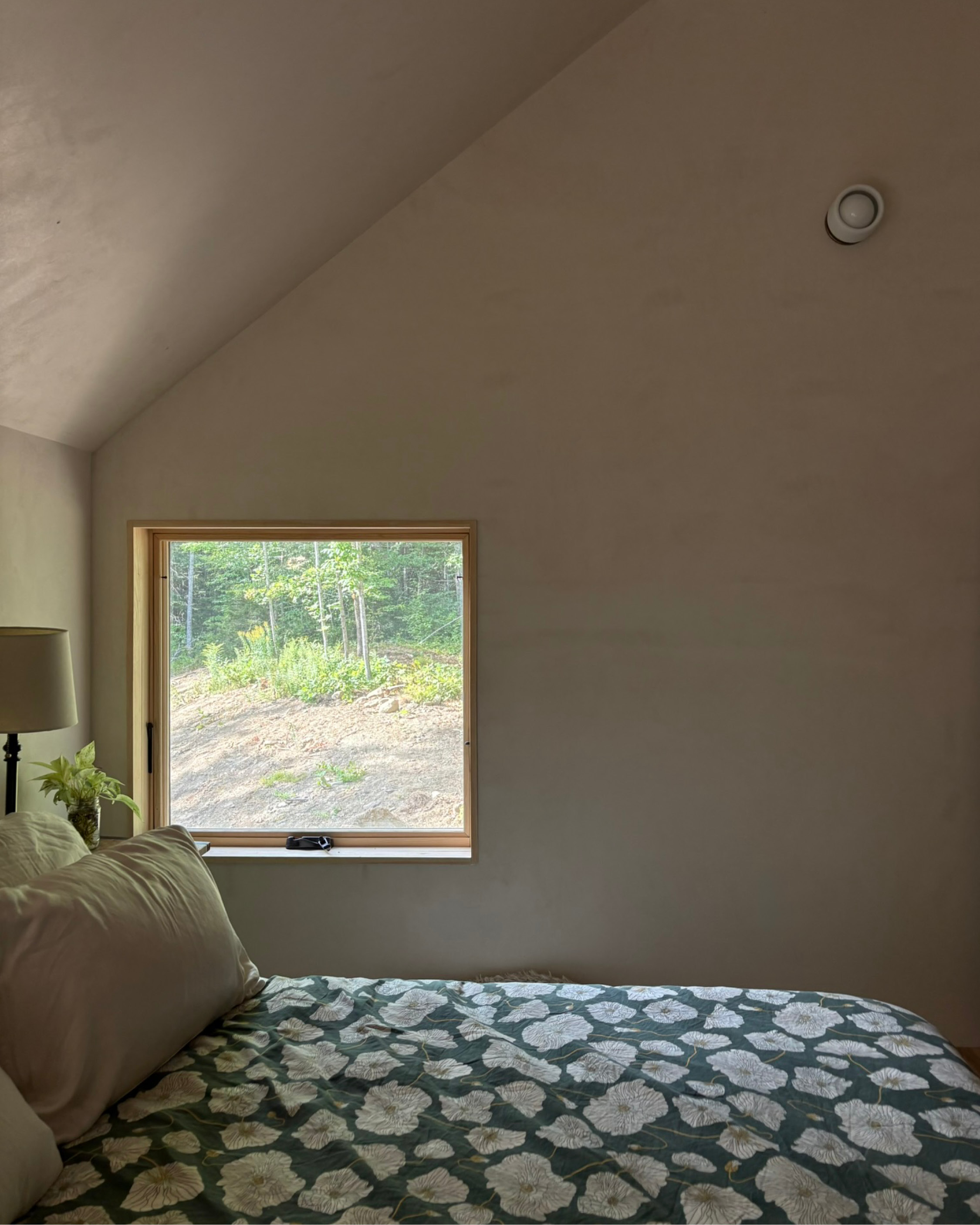
The upstairs houses two additional bedrooms and a storage loft above the primary bath
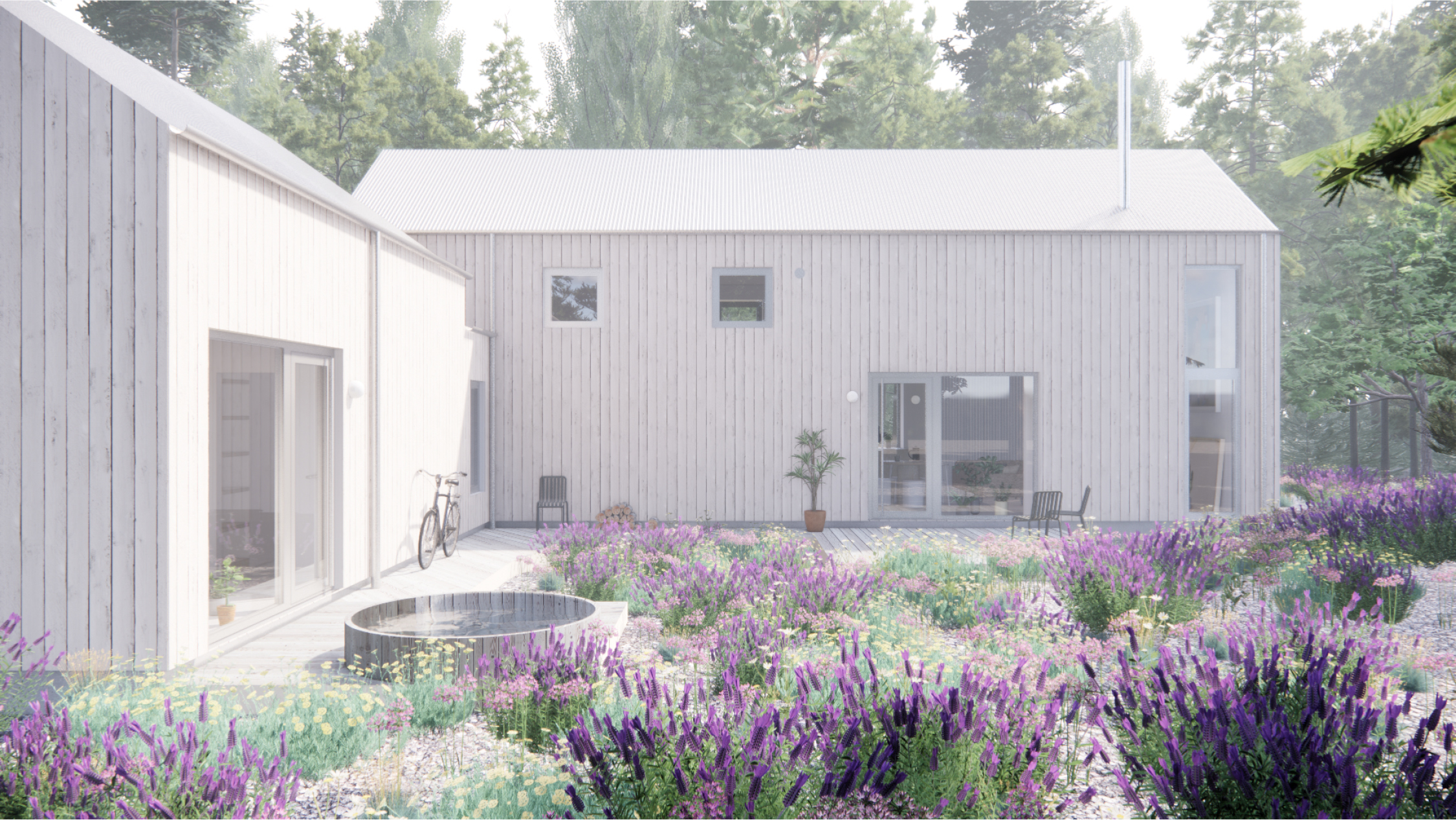
The house form creates a protected courtyard, which faces the distant ocean views
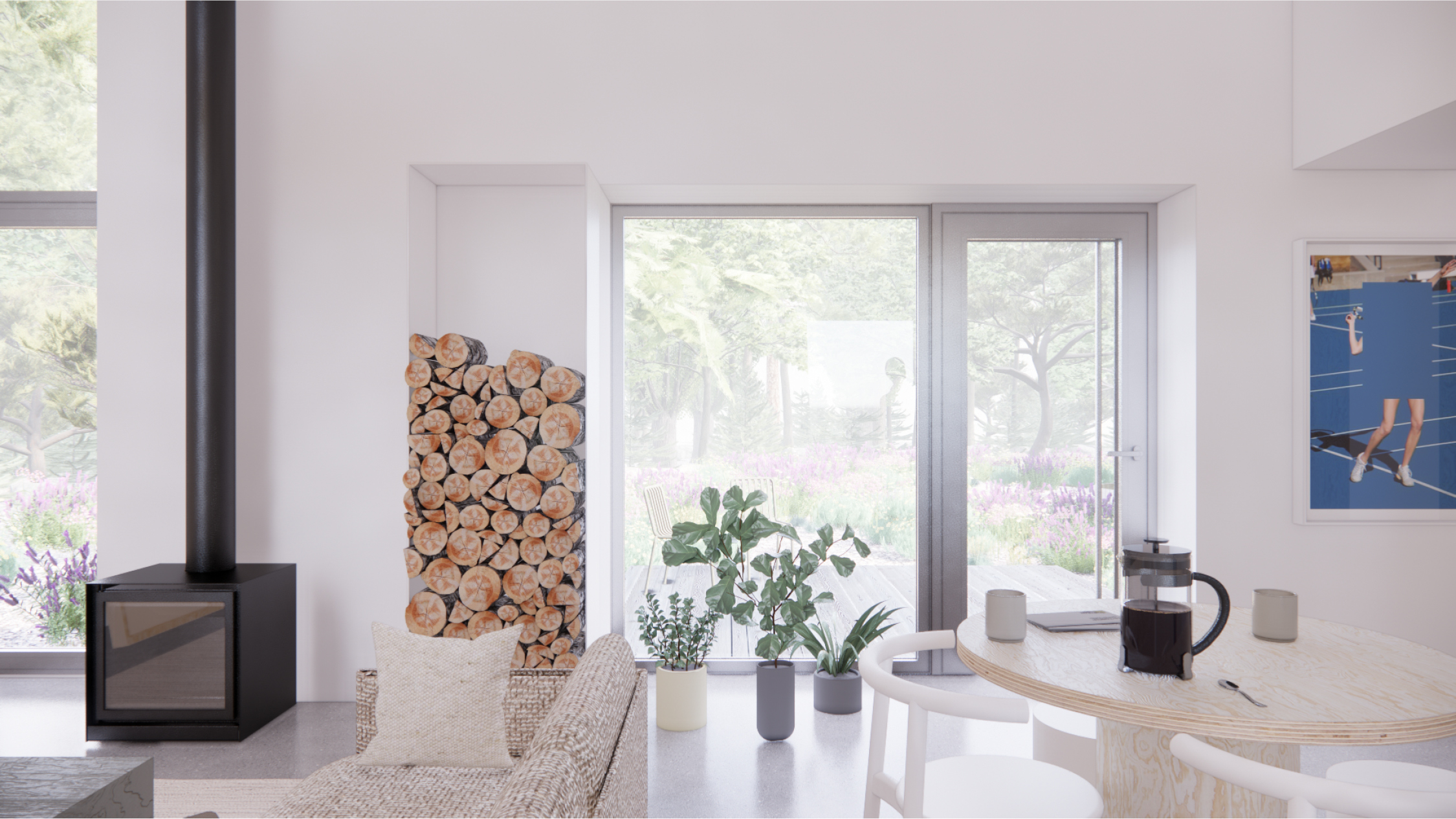
The kitchen & living space is connected to the inner courtyard through generous windows & a large door

A window at the sink increases counter space, brings in light, and is a killer spot for bird-watching

The ceiling height - driven by the upstairs bedrooms - makes the modest living room feel spacious

The hall (left) creates a distinction between the social and private spaces of the house while doubling as an excellent art gallery

A window / door pair on the inner courtyard side of the primary bedroom makes it feel like you’re sleeping outside

A view from the storage loft to the primary bed

The entry hall to the primary bed provides the homeowner with an additional layer of privacy

The cedar decking changes orientation as it wraps around the elbow. We get excited about simple moves that feel special without adding cost

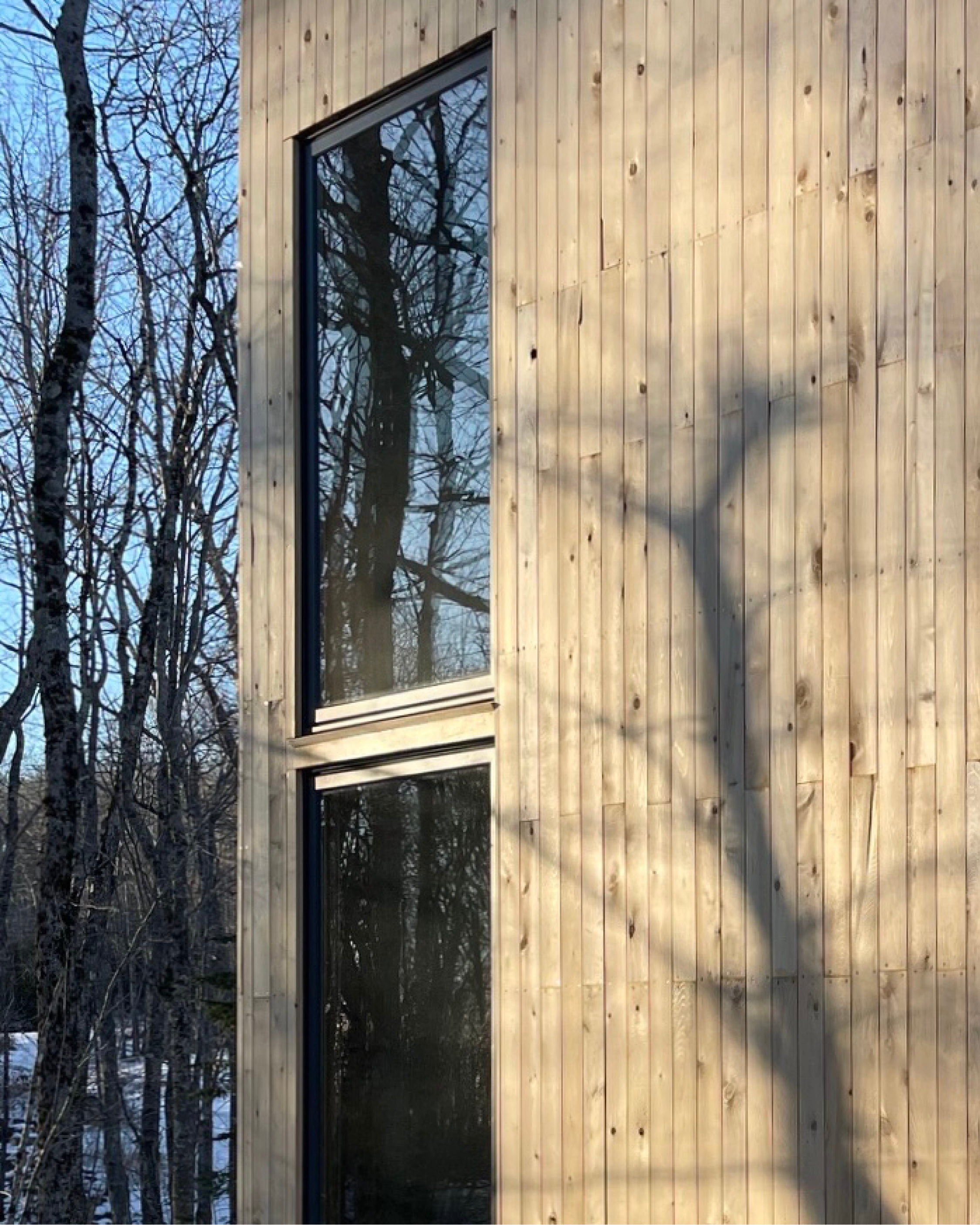
Although the house only has a few openings, they are often located across from one another - like the kitchen, shown here - to give the space an airy feel

Locating windows at the corners simplifies prefab panelization and encourages light to bounce as it enters the home
Client
PrivateStatus
Under ConstructionLocation
Rockland, MaineServices
- Architectural Design
- Furniture Selection
-
Interior Design
Credits
- Croft,
Collaborator
Tags
House, Carbon Smart, PrefabRelated Work

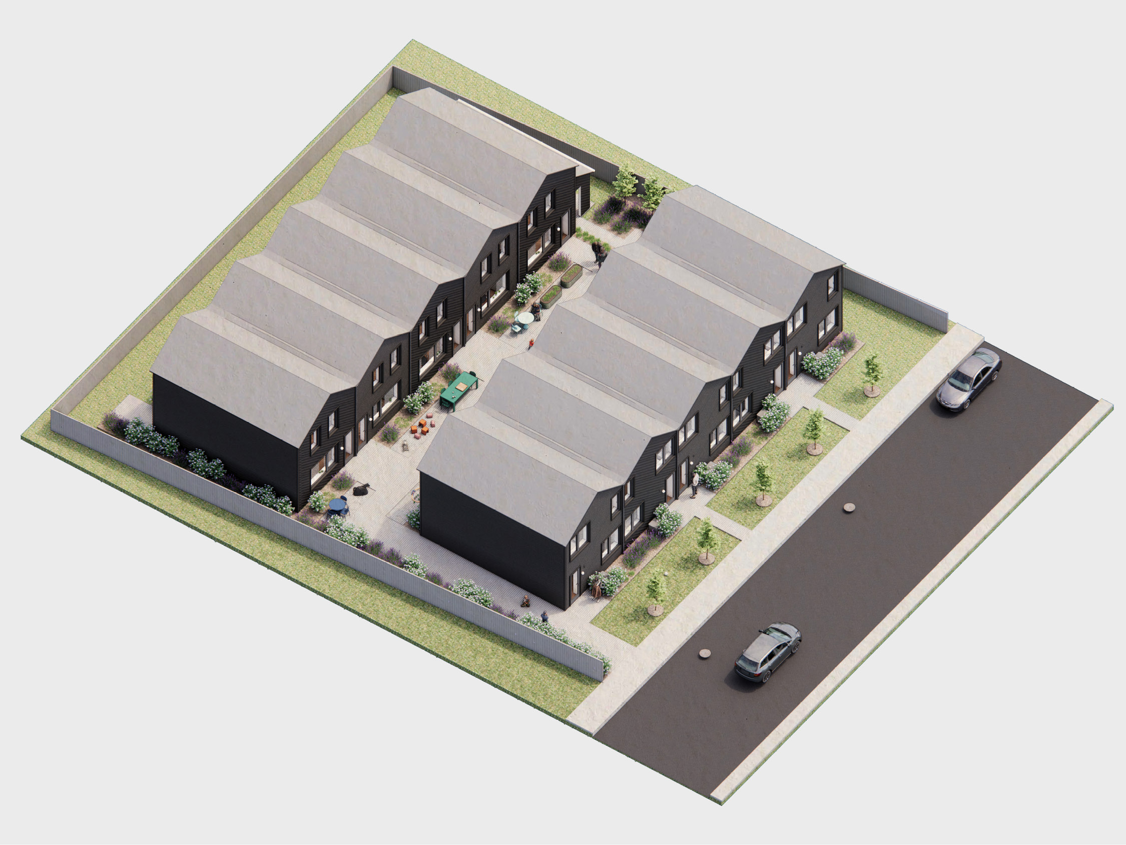
Courtyard Rowhomes
_Affordable missing middle housing for the city
Compact in size and high in quality. The Courtyard Rowhomes are carbon-banking, energy-conserving, community-supporting, adaptable houses that allow for as many living arrangements as their residents can imagine.
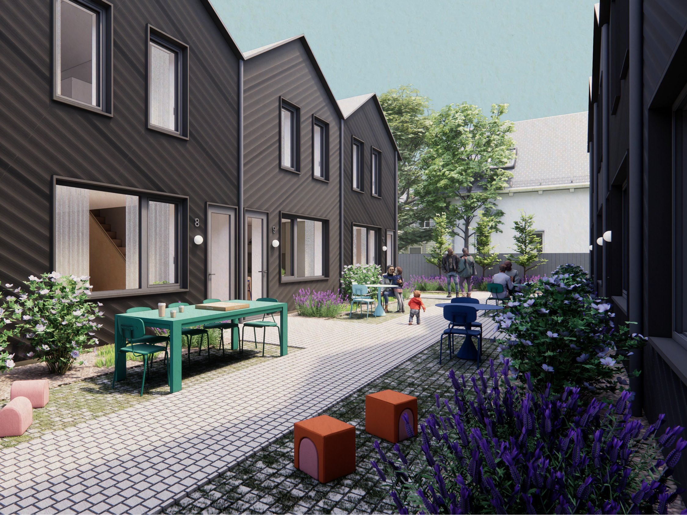
Two rows of five homes orient toward a shared courtyard. The courtyard is broken into several bands that facilitate circulation, social connection, and privacy. The central band allows feet and wheels to move freely. It's bracketed by each unit's dedicated outdoor space. These patios activate the courtyard and create a series of resident-defined possibilities: shared meals, playtime, group fitness, and more. Planters between the buildings and the patios keep neighbors at a comfortable distance and screen views.
Two rows of five homes orient toward a shared courtyard. The courtyard is broken into several bands that facilitate circulation, social connection, and privacy. The central band allows feet and wheels to move freely. It's bracketed by each unit's dedicated outdoor space. These patios activate the courtyard and create a series of resident-defined possibilities: shared meals, playtime, group fitness, and more. Planters between the buildings and the patios keep neighbors at a comfortable distance and screen views.
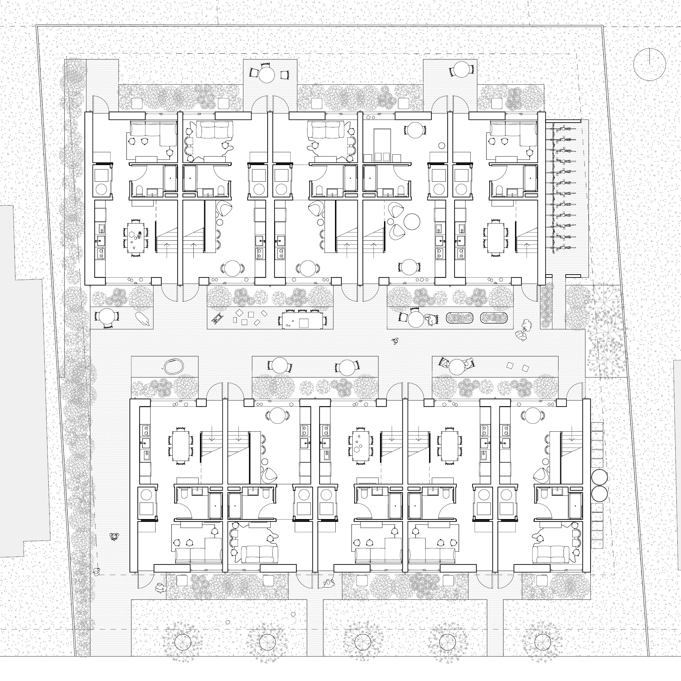
Ground Floor Plan. Ten rowhomes on two single-family lots: five on the street side and five at the rear

Second Floor Plan
All of the units can be entered from the central courtyard. Kitchens face this space to foster social connection and buffer more private spaces
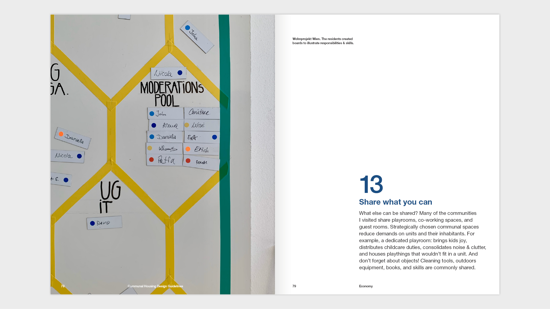
Resiliency & Sustainability
Every day, we wake up to troubling headlines about climate change. Unfortunately, many high-performance buildings rely on high-embodied carbon materials like foam insulation to achieve operational energy savings. What if we could replace those materials with ones that perform well, draw in and store carbon, naturally regenerate, and grow nearby?The Courtyard Rowhomes are made from straw-filled prefabricated panels manufactured in a shop and brought to the site. Each panel has two rows of 2”x4” studs (a “double stud” wall), is filled with 12” of straw, and is wrapped with sheathing and weather control layers.
Other sustainability features include:
- Concrete is reduced to a grade beam infilled by an insulated double-layer plywood “slab,” which significantly reduces carbon emissions
- Ceiling heights are kept to 8’ to utilize standard lumber and maximize drywall yields
- Downspouts feed below-grade cisterns to minimize runoff
- Each room has at least two operable windows for cross-ventilation
- Plumbing fixtures are near the water heater to lower energy use and
- Solar panels could be installed on the flat-seam metal roof when the orientation merits it.
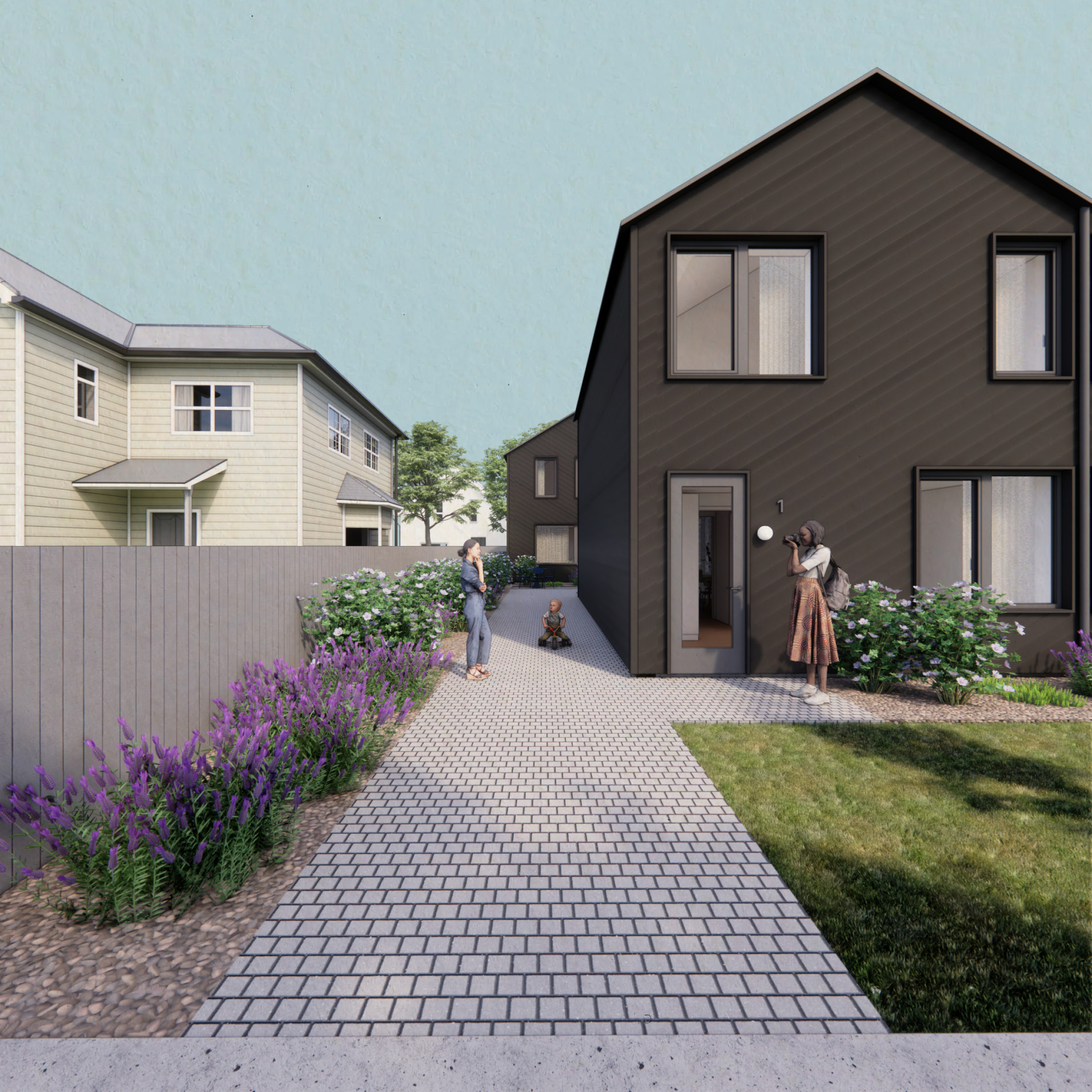 Pathway from the street to the courtyard
 The siding follows the pitch of the roof
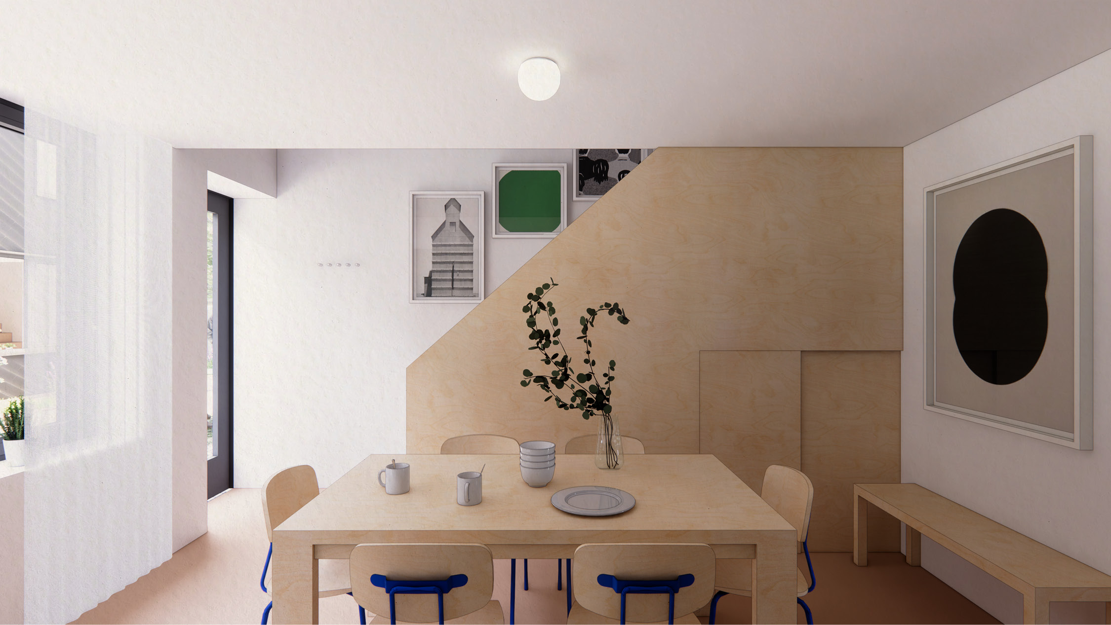
The space beneath the stairs can be used for storage

View through the kitchen to the living space and the rear entry
Universal Design & Aging-In-Place
The Courtyard Rowhomes incorporates Universal Design best practices like:- An on-grade entry
- Zero or minimal thresholds at doors and flooring changes
- Generous maneuvering clearances and knee space in kitchens and bathrooms
- Wide doorways and hallways
- Bathroom grab bars, and
- Reachable controls throughout
Typically, these accommodations require more square feet (SF), which can be challenging when building footprints need to be smaller. To solve this problem, we worked diligently to overlap maneuvering clearances with circulation pathways.
One example: the 4’ x 4’ maneuvering clearance at the entry coincides with the landing at the bottom of the stairs. This consolidates the clearances, forms a generous entry, and creates a mudroom-like buffer into the main living space. Design moves like this help to create an accessible 867 net SF house that lives much larger than its small footprint would suggest.
One example: the 4’ x 4’ maneuvering clearance at the entry coincides with the landing at the bottom of the stairs. This consolidates the clearances, forms a generous entry, and creates a mudroom-like buffer into the main living space. Design moves like this help to create an accessible 867 net SF house that lives much larger than its small footprint would suggest.
The kitchen connects to the courtyard; residents can use their shades to convey how social they’re feeling
Client
PrivateStatus
On HoldLocation
Brockton, MassachusettsServices
- Architectural Design
-
Interior Design
-
Furniture Selection
- Zoning Analysis
Tags
Affordable, Communal, Housing, Carbon Smart, Prefab, Missing MiddleStats
- 2-stories
-
10 units: 2 or 3 bedrooms (depending on resident)
-
Lot Size: 12,260 sf (0.28 acres)
- Dwellings per Acre: 35.5
- Bedrooms per Acre: 71-107 (depending on resident)
-
Amenities: Shared Courtyard, Bike Parking
Related Work

Shifted Stack Housing
_Attainable, sustainable, and communal living in Sacramento
Like many cities around the country, Sacramento is revising its zoning to spur multifamily housing development. Our client asked us to create a communal, sustainable, and cost-effective housing proposal for his typically-sized lot. Because it will be one of the first projects under the new zoning, he wants it to be a positive example of “gentle density” to help pave the way for similar projects in the future.
The existing neighborhood is a mix of low-slung single-family homes with pitched roofs. Creating a contextual building with five times the units was a clear challenge! To solve this, we split the building’s mass into two volumes: a shorter, smaller one toward the front to draw the eye and a taller, larger one toward the back to house the bulk of the units. Aligning the building’s face with its neighbors and matching their width further roots the building in the context.
The existing neighborhood is a mix of low-slung single-family homes with pitched roofs. Creating a contextual building with five times the units was a clear challenge! To solve this, we split the building’s mass into two volumes: a shorter, smaller one toward the front to draw the eye and a taller, larger one toward the back to house the bulk of the units. Aligning the building’s face with its neighbors and matching their width further roots the building in the context.

5-units on a typical single-family lot, with shared amenities and straw-filled exterior walls

The two-story volume at the street ties the building to the scale of the neighboring homes, while the rear volume creates the density needed for a vibrant, sustainable community

Ground Floor Plan, from left:
- Rear yard with communal gardens, clotheslines, and patio
- 2-bed unit
- Communal laundry, stair, and lobby
- 1-bed unit
- Entry path with bike parking

The back yard is for gathering, gardening, and drying clothes
 The South-facing entry is a welcoming place for chance encounters
Residents access the rear yard through a communal laundry room

Vertical battens provide a place for plants to grow
Location
PrivateStatus
On HoldLocation
Sacramento, CaliforniaServices
- Architectural Design
-
Feasibility Study
-
Zoning Analysis
Team
- Design partnership with Object Projects
- Croft, Prefab Consultant & Straw Panel Provider
Tags
Attainable, Communal, Housing, Carbon Smart, Prefab, Missing MiddleStats
- 3-stories
- 5 units:
2 one-beds
1 two-bed
2 three-beds -
Lot Size: 5,310 sf (0.12 acres)
- Dwellings per Acre: 42
- Bedrooms per Acre: 84
-
Amenities: Shared Laundry, Communal Garden, Bike Parking
Related Work
House with a Curved Stair
_How do you modernize a traditional home on a budget?
Primary Projects + Chris Johnson
In 2018, the client purchased an unfinished, lake-side house in the Berkshires. The house had been framed and clad in 2006, but had sat empty and unfinished for over ten years. At the time of purchase, the house was a shell with no interior walls, no plumbing, no heating, and no electricity.
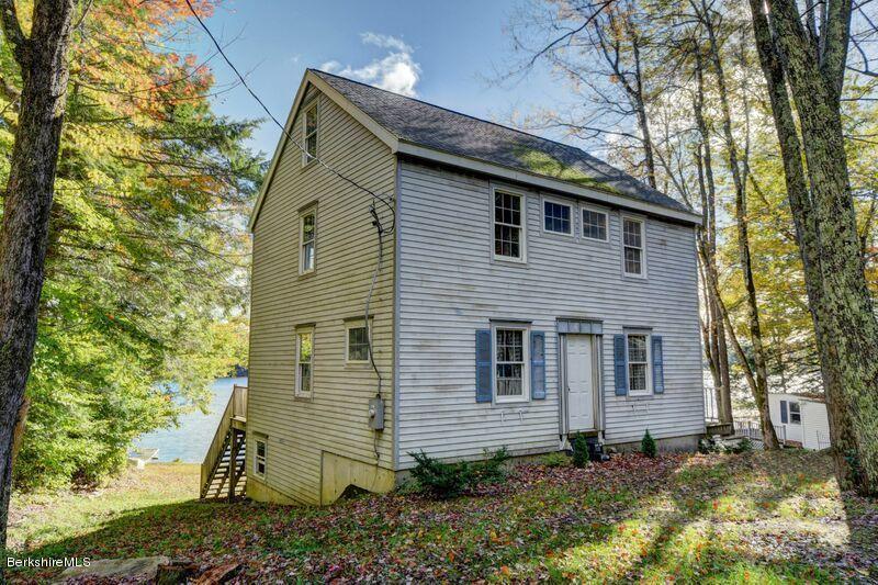
An Abandoned House
From the Real Estate Posting: “This is a really intriguing property. The shell of the house, deck, roof, electric and foundation were done circa 2006. And then the work slowed...or stopped...[A] septic needs to be installed along with the plumbing, walls, kitchen and bathroom.”
Challenge
In the existing condition, you could only access the third floor through the primary bedroom...

Solution
We discovered that a switchback stair with a curved landing would:- Allow direct access to the third floor
- Increase the size of the adjacent bedrooms
- Preserve the existing window locations
- Create new storage opportunities

Second Floor Plan
The curved landing seen from below...

...and above
 The placement of the stair allowed the owner to preserve an existing window in their bedroom
The stair creates a cozy reading nook in the nursery

A section through the curved stair
Challenge
Originally, the third floor was meant to be used as an attic. The ceilings were too low, and there were no views of the lake.

Solution
Adding four dormers and raising the collar ties:- Creates two useable bedrooms with adequate ceiling heights
-
Opens up the views to the lake
- Adds light & allows for cross ventilation

Third Floor Plan

A view from one of the dormers...

A section through the new dormers
Challenge
The first floor couldn’t comfortably accommodate a generous living room and a traditional dining space.Solution
We worked with the owner to create a 13- foot long island that comfortably seats seven, and combines additional storage with face-to-face dining on the lake-side
First Floor Plan
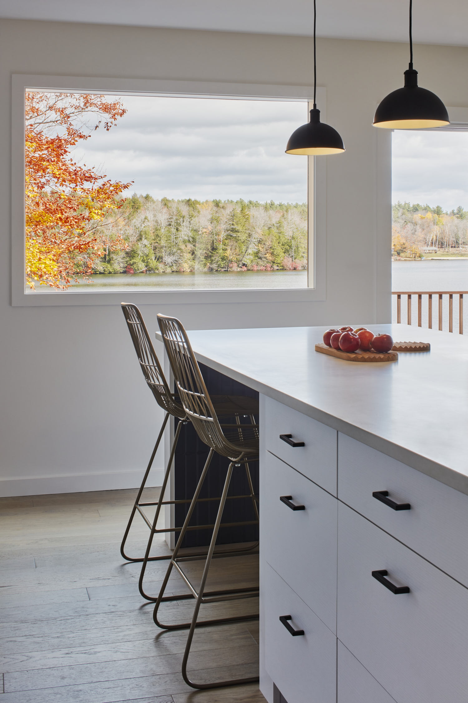
Directly across from the island, we reused a large window the owner found in the basement to open up a new view to the lake

The bent-metal awning at the entry provides a respite from the elements as you enter
We worked with the owner on the design, finish, and fixture selections for the house’s four bathrooms
Client
PrivateLocation
Becket, MassachusettsServices
- Architectural Design
-
Interior Design
Credits
- Sacred Oak Homes,
General Contractor -
Jane Messinger,
Photographer
Tags
House, Renovation

Geometric Boutique
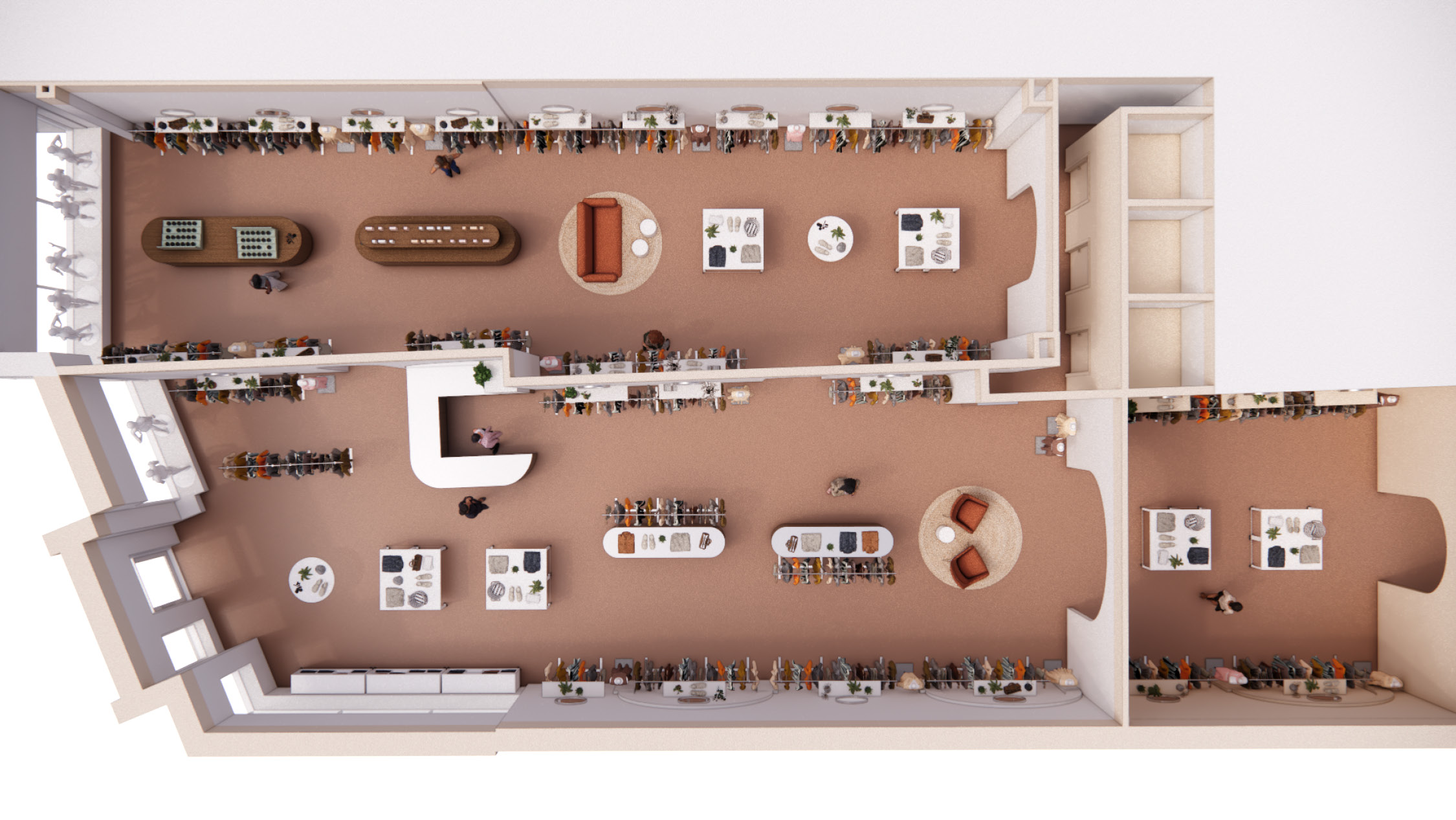
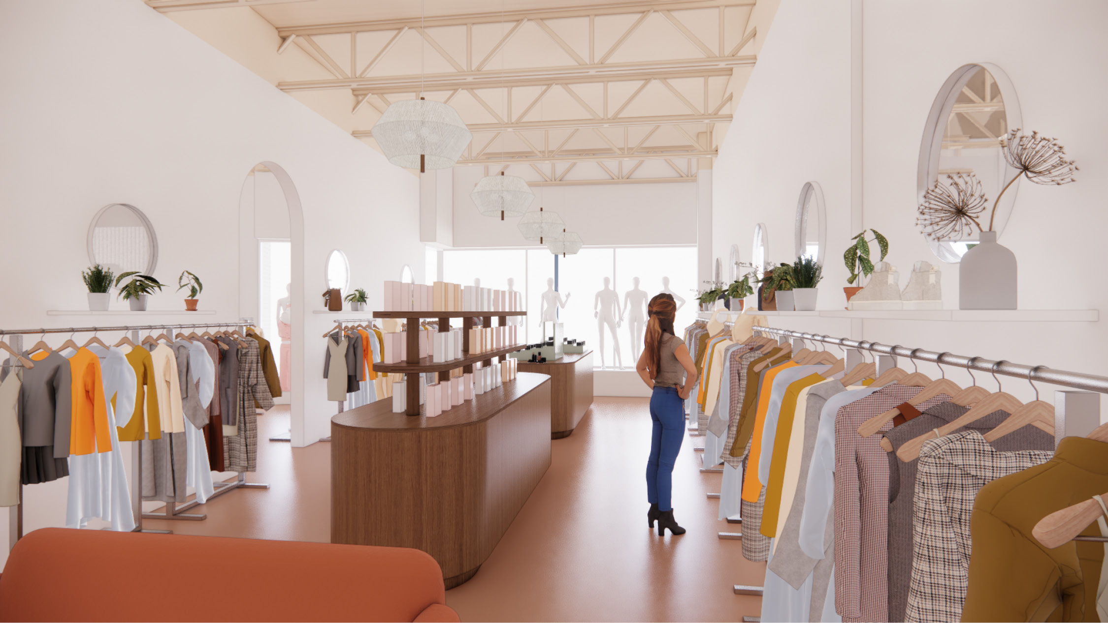
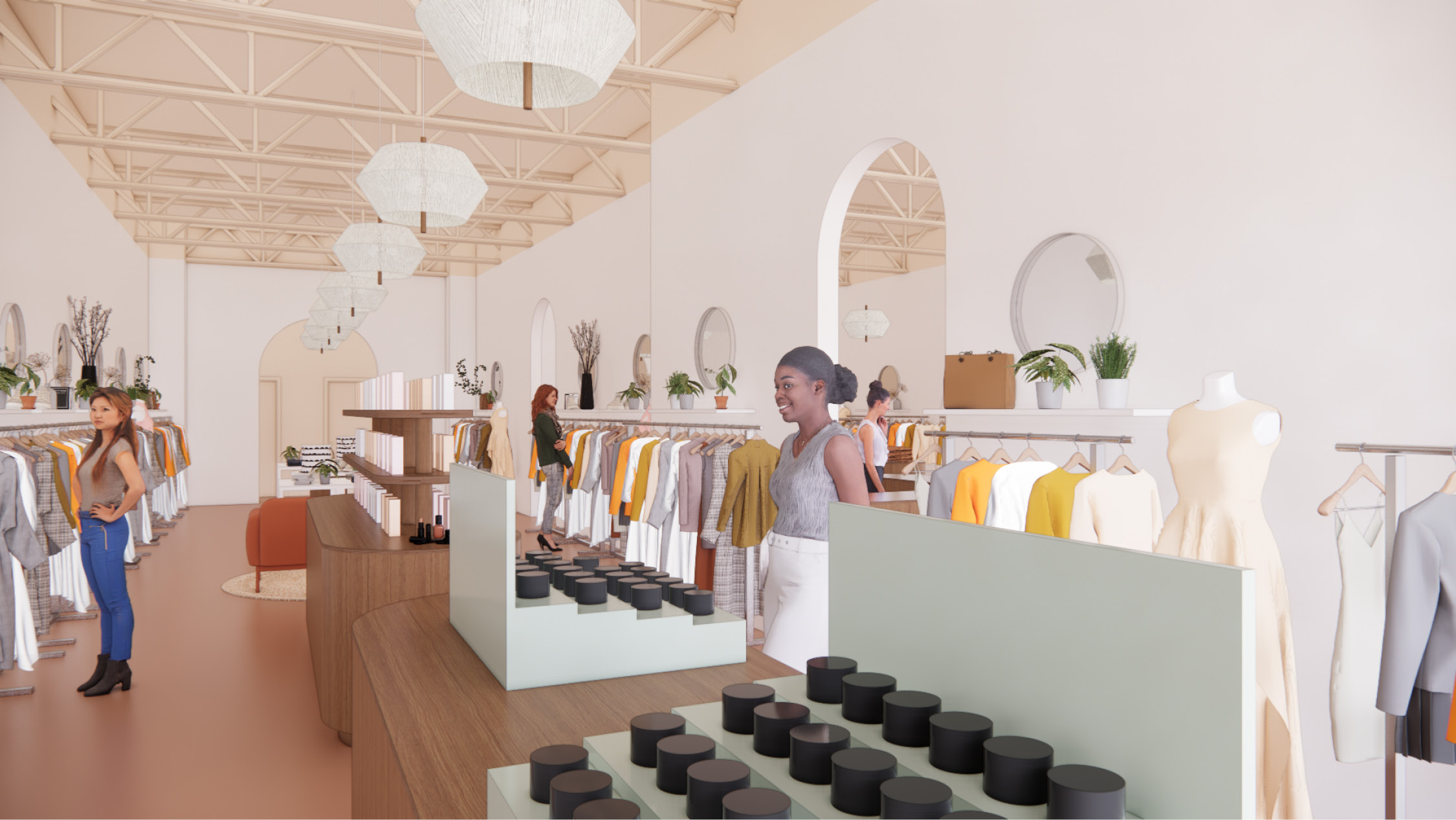
_How to consolidate a womens’ clothing store into a smaller footprint without losing display area.
Over thirty years, a successful women’s fashion store tripled in size, growing into what had been two neighboring stores. Narrow doorways between the three zones made it hard for staff to serve shoppers and for shoppers to easily find their way; multiple entries required more staff to greet customers and prevent theft; and different spatial characteristics in each zone eroded the store’s identity.
We were hired by the landlord to help the retailer understand how a spatial refresh within a consolidated footprint could help increase their return on investment. The retailer was concerned about losing display space and merchandising flexibility. Thus, the design challenge was to maintain display volume and flexibility within a smaller space.
We were hired by the landlord to help the retailer understand how a spatial refresh within a consolidated footprint could help increase their return on investment. The retailer was concerned about losing display space and merchandising flexibility. Thus, the design challenge was to maintain display volume and flexibility within a smaller space.


We added a wall with an arched opening near the back of the space to give the retailer flexibility. This space can be a "shop in shop," home to a unique offering like accessories or intimates, a lounge for trunk shows, or whatever they need!

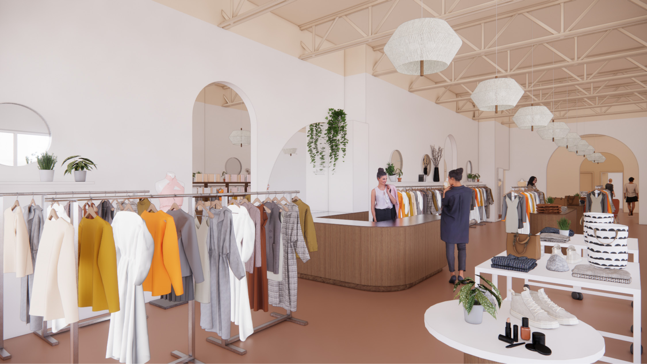
We split the main room into three zones to scale the space & create richer merchandising opportunities. The arches between zones and the progression of paint tones adds drama while tying back to an existing arch motif in the store.
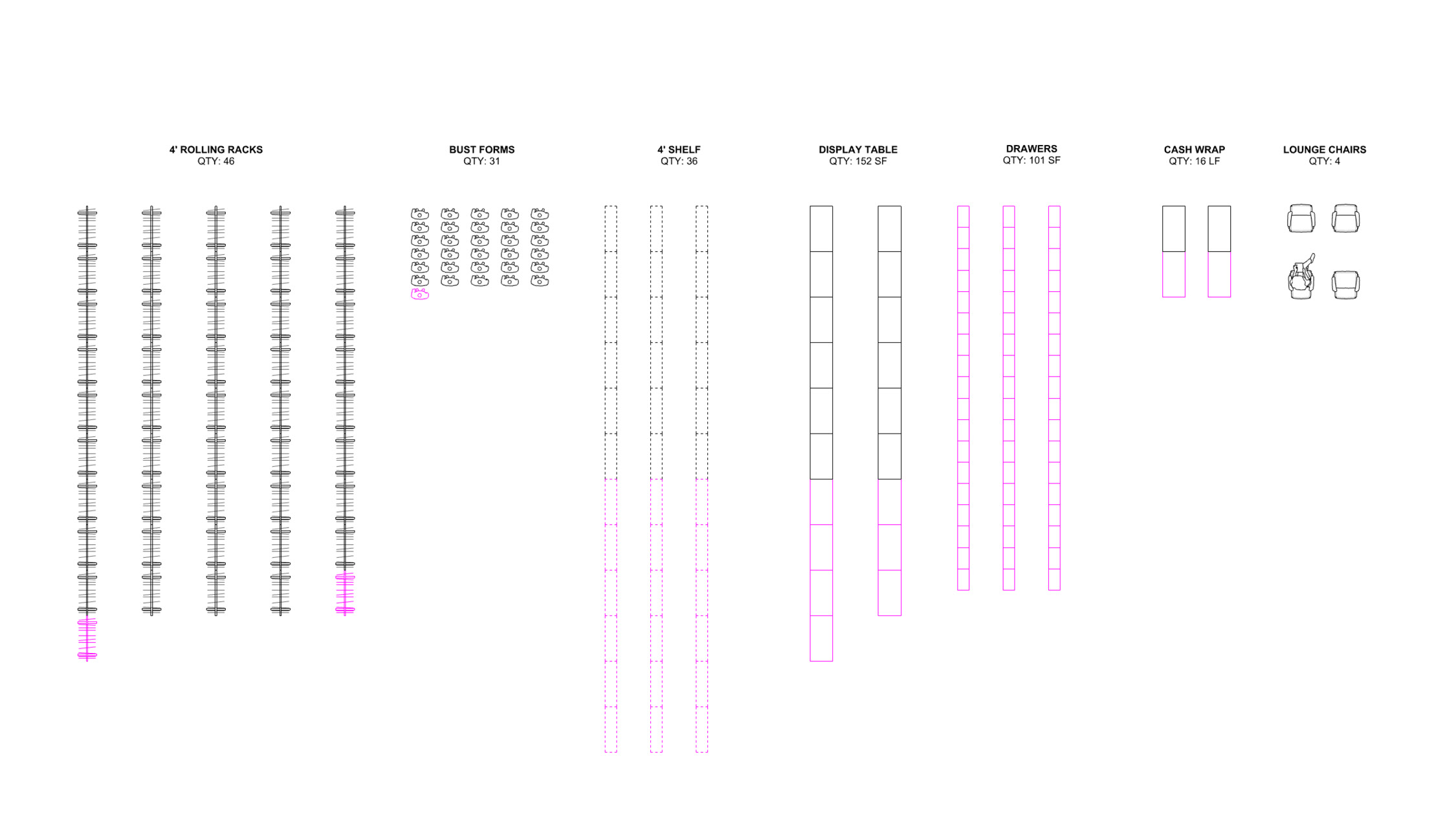
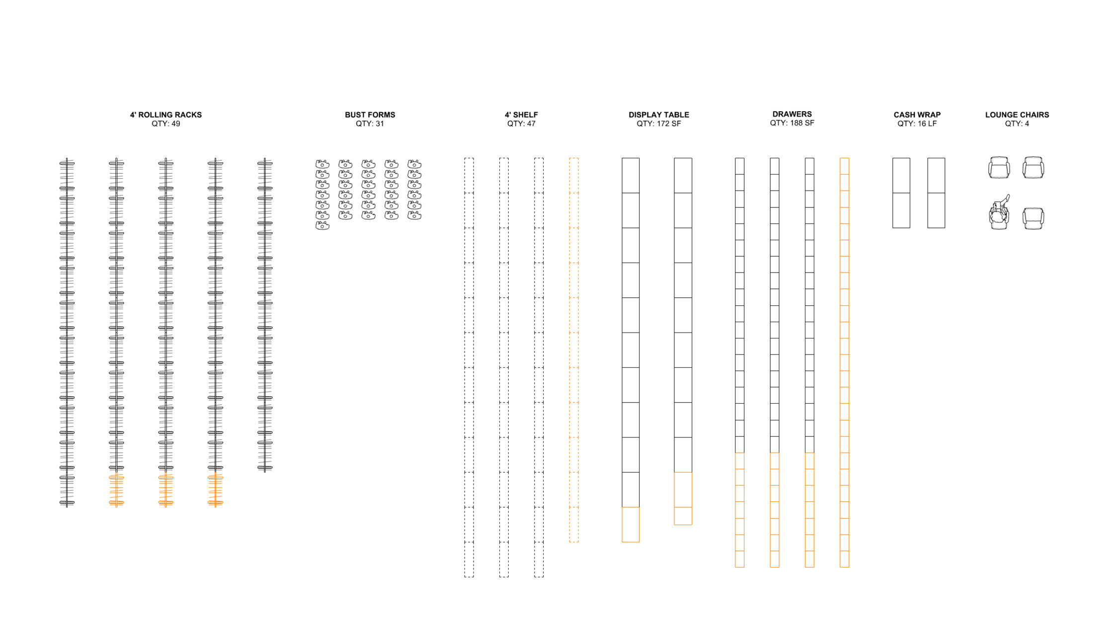
We counted every fixture in the existing store to stay accountable to the owner’s desire to maintain their merchandise counts in less space.
The pink represents fixtures that needed to be relocated from the space they were losing, while the orange represents additional fixtures we were able to fit in the new design. 💁♀️
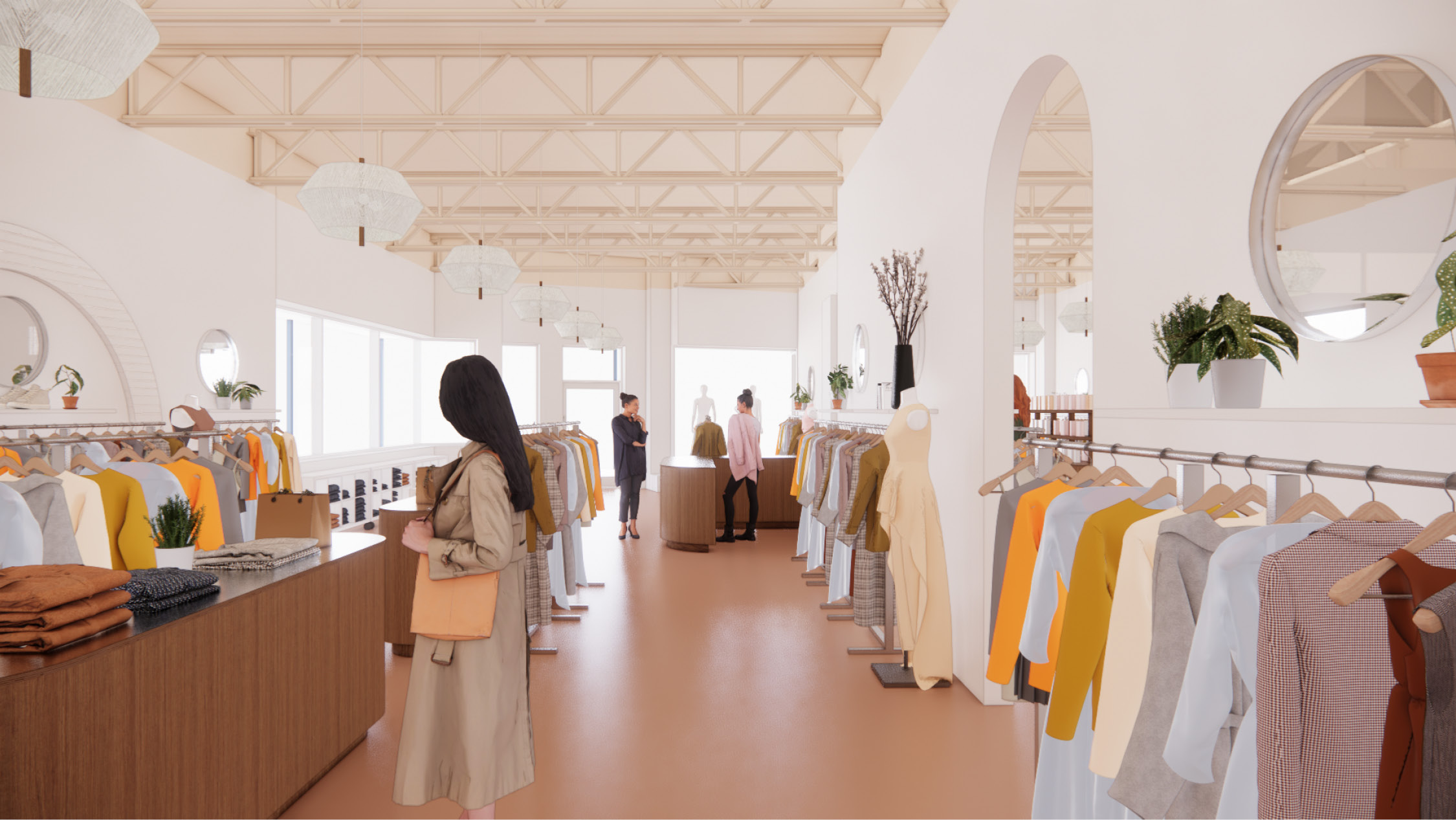
The owner stocks many brands and styles, so the store's palette needed to complement, not compete. We chose a camel-colored linoleum, wood fixtures, and a range of warm neutral paints to add coziness without fuss.
Beauty, a category that’d been sidelined in the previous store, is the central focus in one of the store’s bays.
Location
Albany, NYServices
- Architectural Design
-
Interior Design
-
Furniture Selection
-
Programming
Credits
- WS Development,
Client - Private,
Retailer -
BLW Engineers,
MEP-FP Engineering -
Pieszak Lighting Design,
Lighting Designer
Tags
Retail, Small Business, Interior DesignRelated Work

Data Port
_How could we reimagine the data center as a civic amenity?
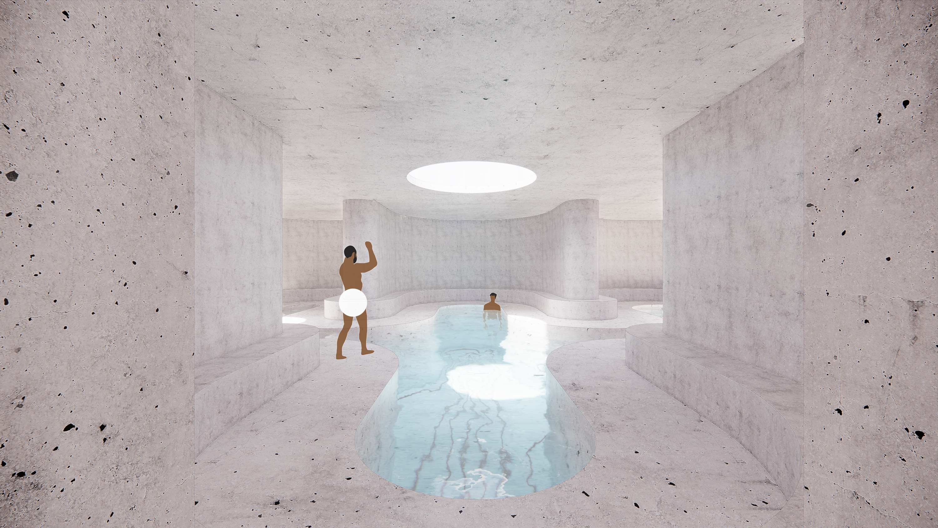
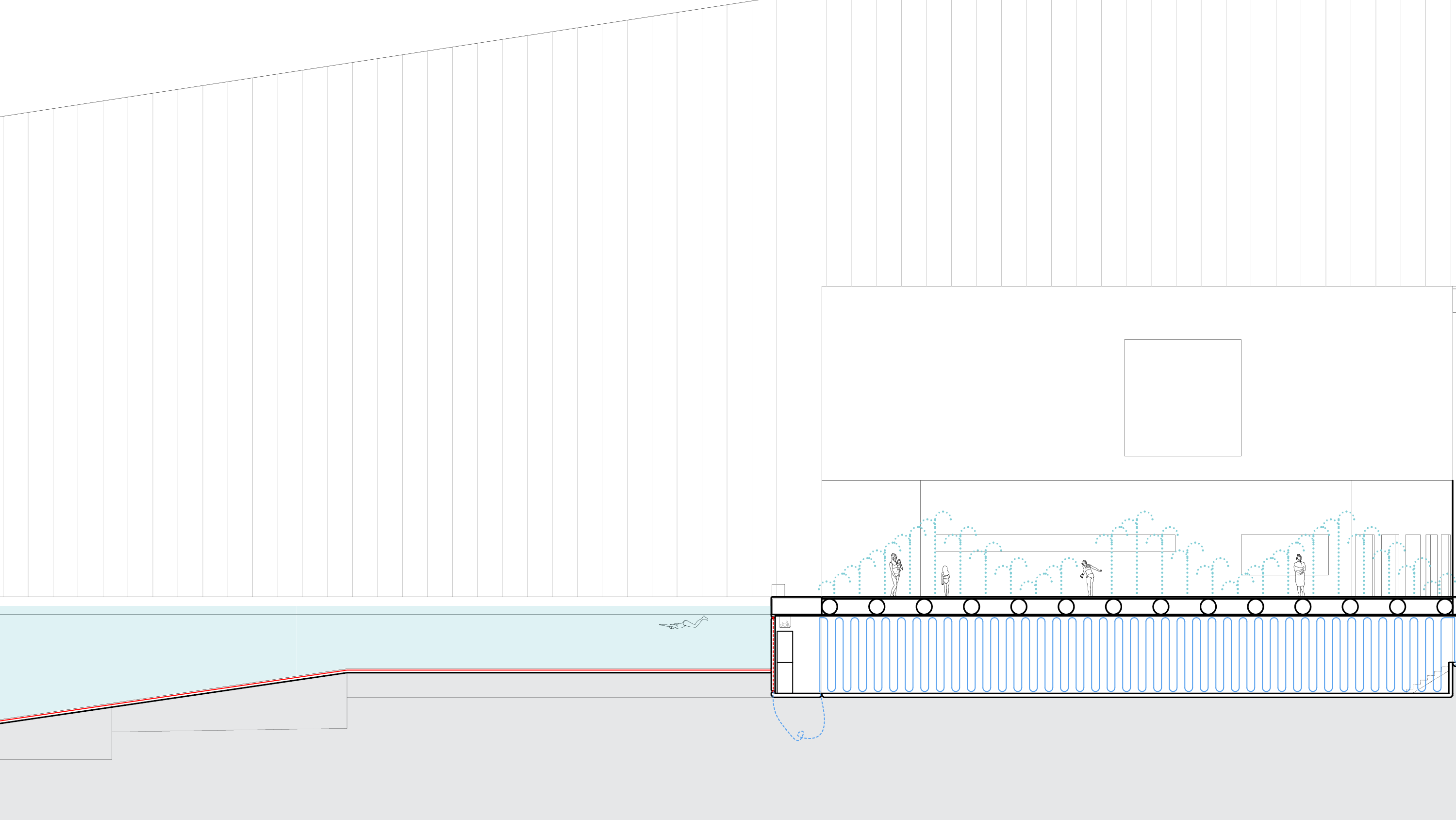
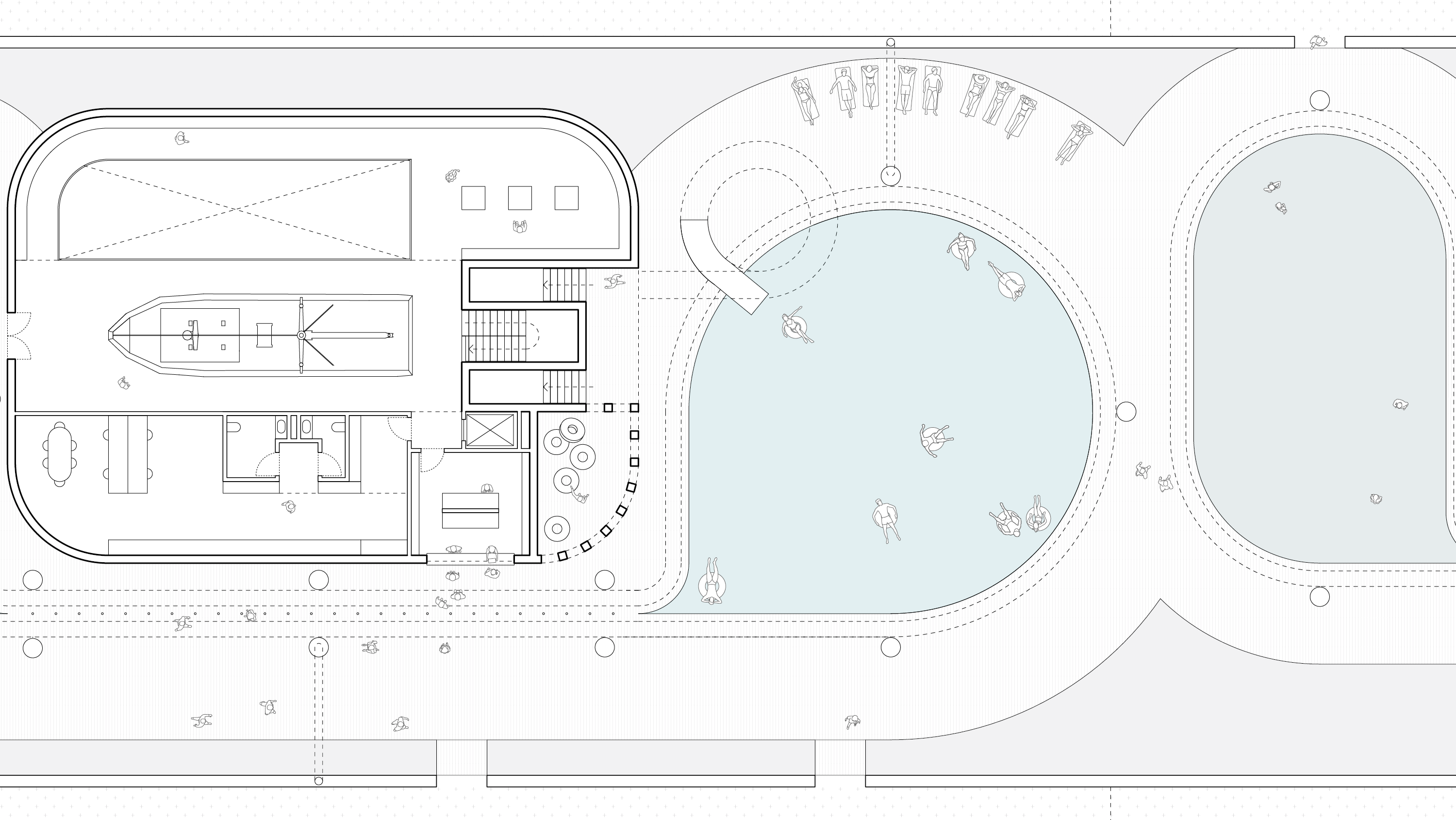
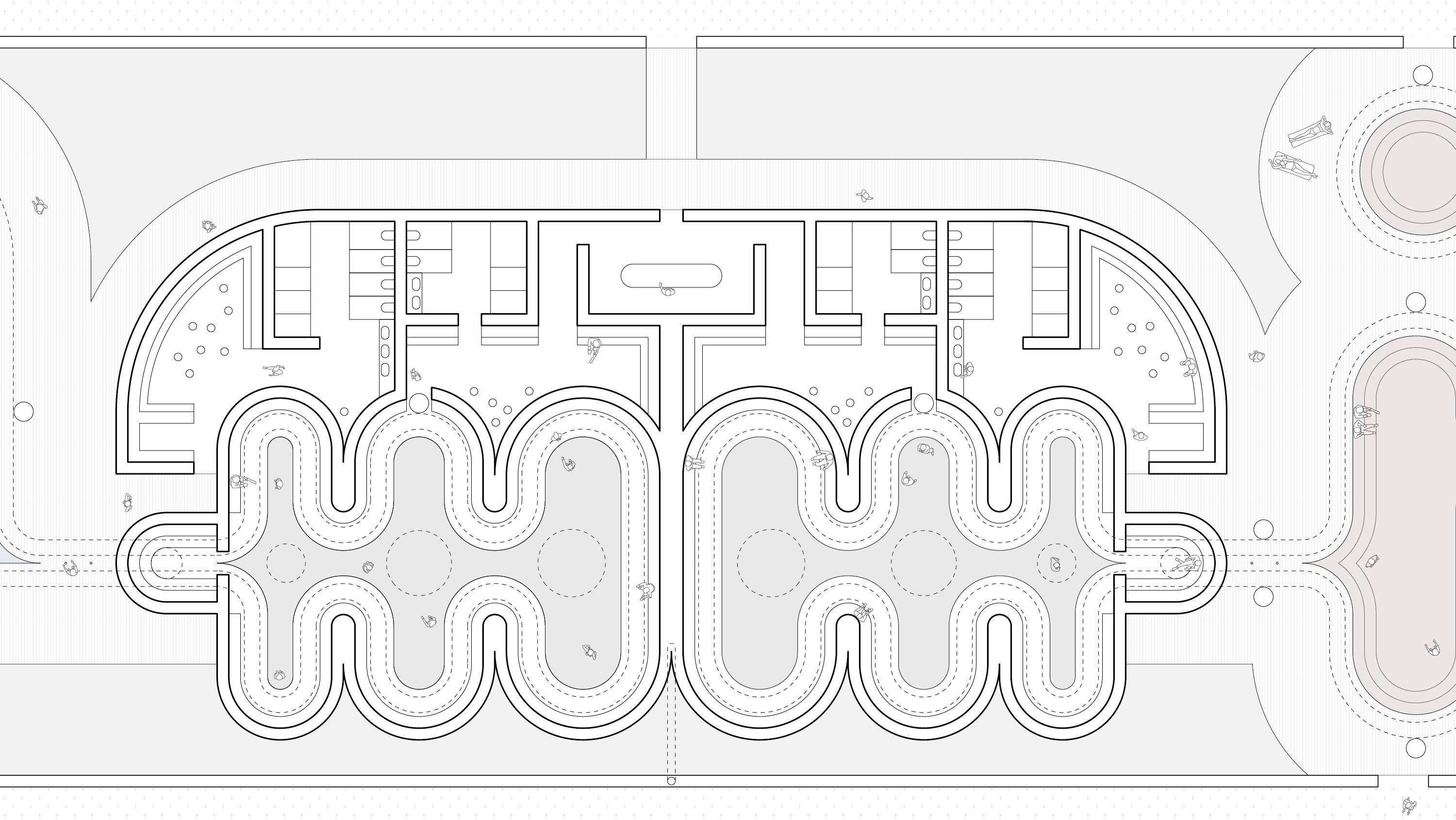
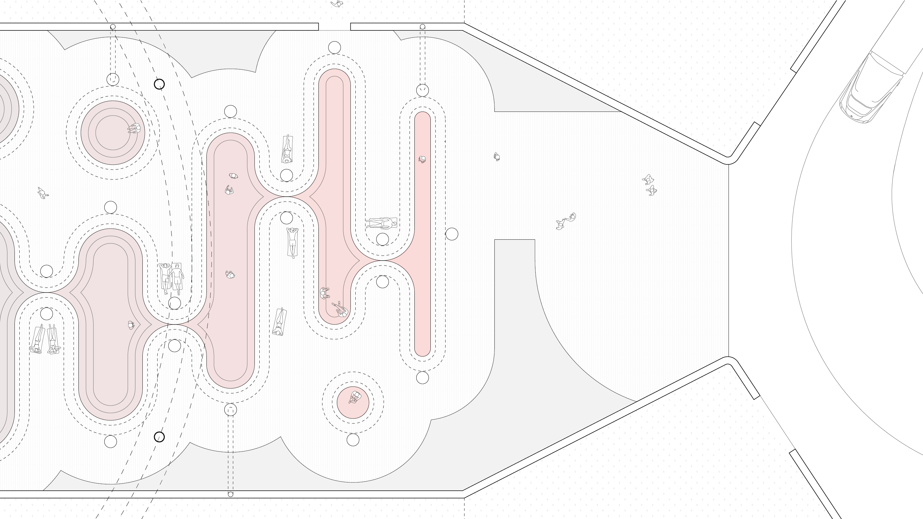
This project reimagines the data center typology to maximize its ability to shed heat. What would typically be expelled as “waste heat” is repurposed to sponsor a range of civic activities & one of a kind experiences. The site—the only break in the Harbor Walk from its start in Charlestown—is transformed into a destination with a global reach, like the data it houses. Visit the desert. Visit the tropics. Soak up the hot springs. Luxuriate in the thermal baths. Jump on the splash pad. Whoosh down the waterslide. Swim like an olympian. Run like a marathoner. Experience a geyser. Learn about data.
All of these experiences are made possible by the heat from the servers, which literally float across the historic dry dock as a single, meandering row. The pools are used as a heat sink, via a closed loop radiant system—“Direct to Chip Cooling” using non-flammable dielectric fluid—whose flexible piping is set into deep grooves in the flooring & walls of the pools; visible to its users, but out of reach. This technique utilizes the heat-carrying capacity of liquid, which is 3,500 times greater than air, to cool the racks. This is the one time in Architecture where a maximal building envelope is the environmentally friendly, cost-effective choice! Although this approach minimizes the waste heat as air, one can never completely eradicate it, so why not utilize it to inflate a one-hundred-foot tall pneumatic greenhouse? The constancy of the waste air, typically a problem, allows for a monumental gesture on the scale of the Seaport. (And because the structure is year-round, even in the hot months, it raises the question, “What happens when you have too much air?” Answer: you power an artificial geyser as an evaporative cooling homage to the whales.)
All of these experiences are made possible by the heat from the servers, which literally float across the historic dry dock as a single, meandering row. The pools are used as a heat sink, via a closed loop radiant system—“Direct to Chip Cooling” using non-flammable dielectric fluid—whose flexible piping is set into deep grooves in the flooring & walls of the pools; visible to its users, but out of reach. This technique utilizes the heat-carrying capacity of liquid, which is 3,500 times greater than air, to cool the racks. This is the one time in Architecture where a maximal building envelope is the environmentally friendly, cost-effective choice! Although this approach minimizes the waste heat as air, one can never completely eradicate it, so why not utilize it to inflate a one-hundred-foot tall pneumatic greenhouse? The constancy of the waste air, typically a problem, allows for a monumental gesture on the scale of the Seaport. (And because the structure is year-round, even in the hot months, it raises the question, “What happens when you have too much air?” Answer: you power an artificial geyser as an evaporative cooling homage to the whales.)

The data center’s servers float in the former dry dock, releasing waste heat to warm a series of pools and inflate two 100-foot tall pneumatic greenhouses (of course)


The former buoyancy chamber at the center of the dry dock hosts the servers and a series of pools. Greenhouses bracket the pools, and an elevated running track stitches everything together

Soak up the hot springs
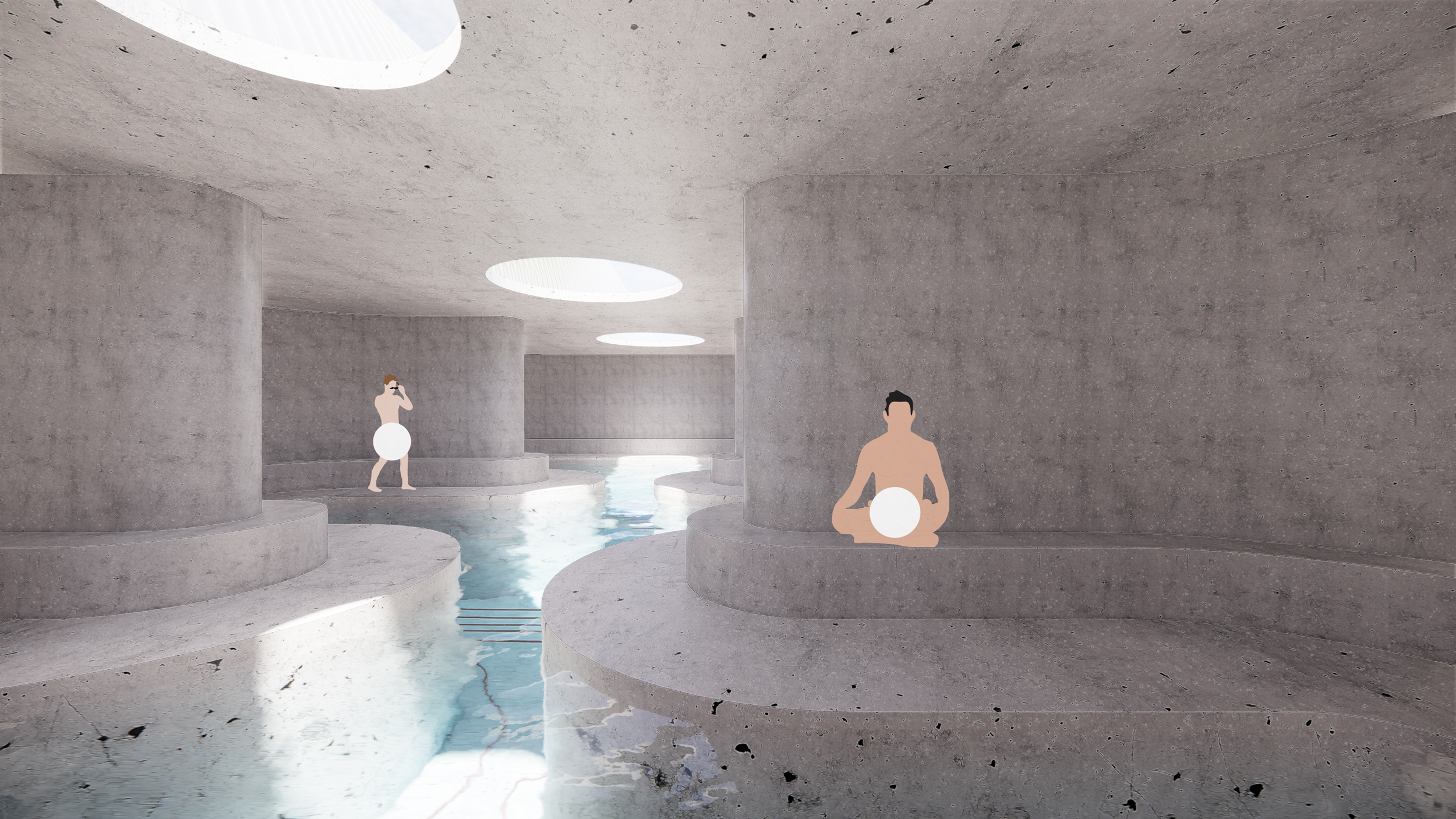

Luxuriate in the thermal baths

Jump on the splash pad & whoosh down the waterslide
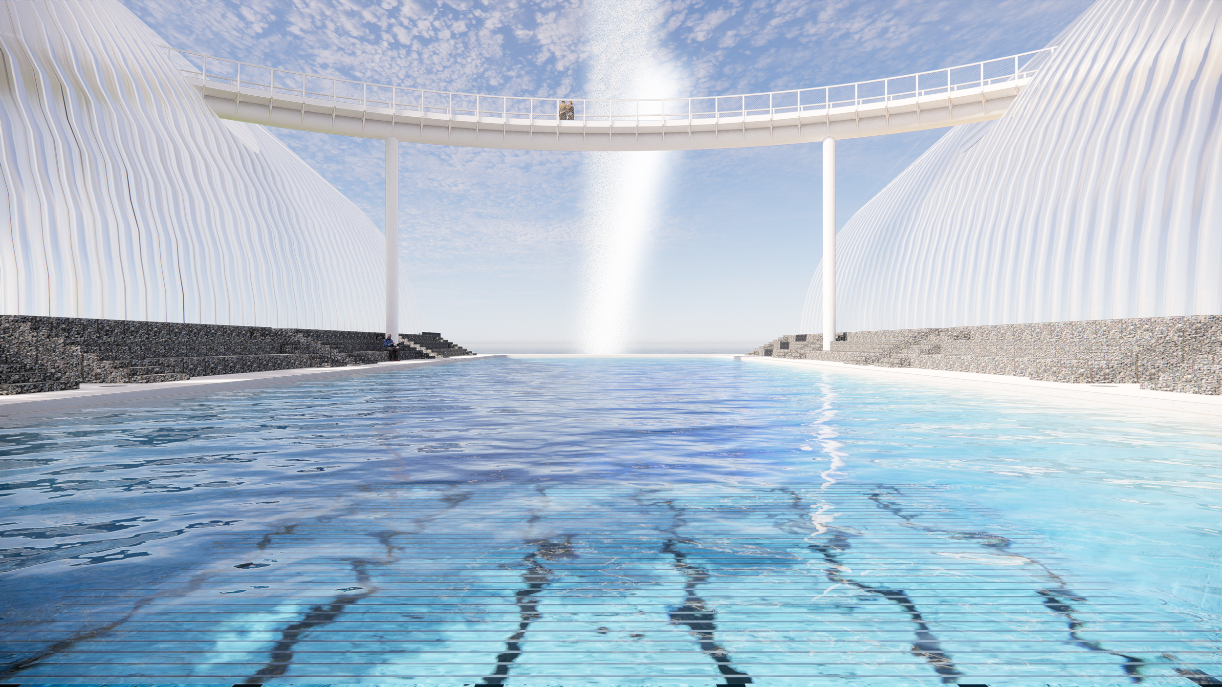
Swim like an Olympian & experience a geyser

Visit the Tropics!
The continuous waste heat from the servers inflates a pneumatic greenhouse. A running track allows visitors to view the plants from the ground, 40 feet in the air, and everywhere in between

Visit the desert!


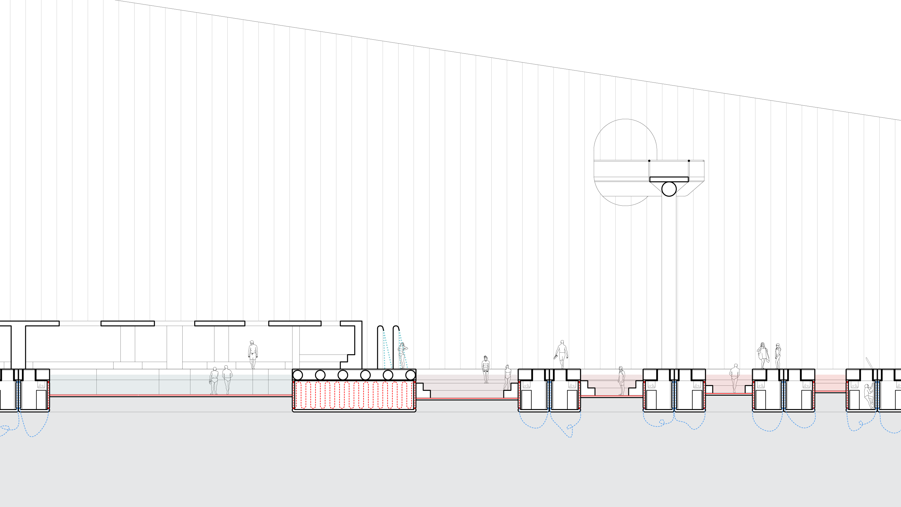
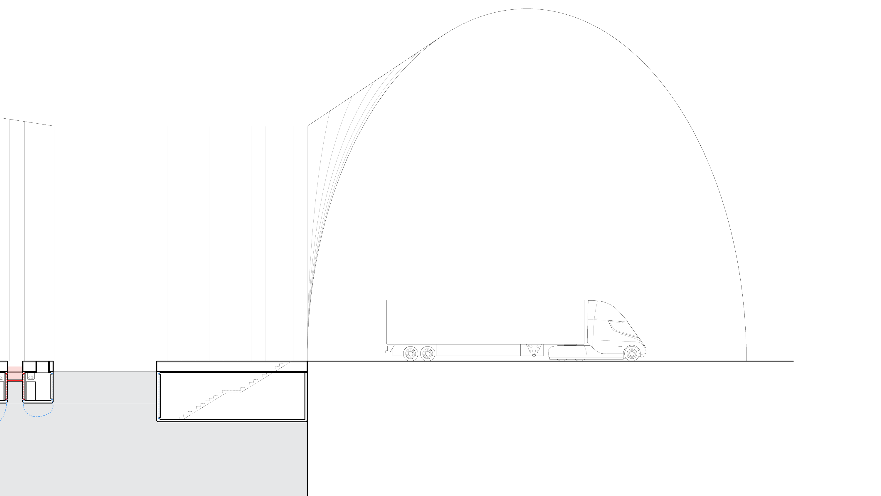
A long section through the pools (click it to navigate)
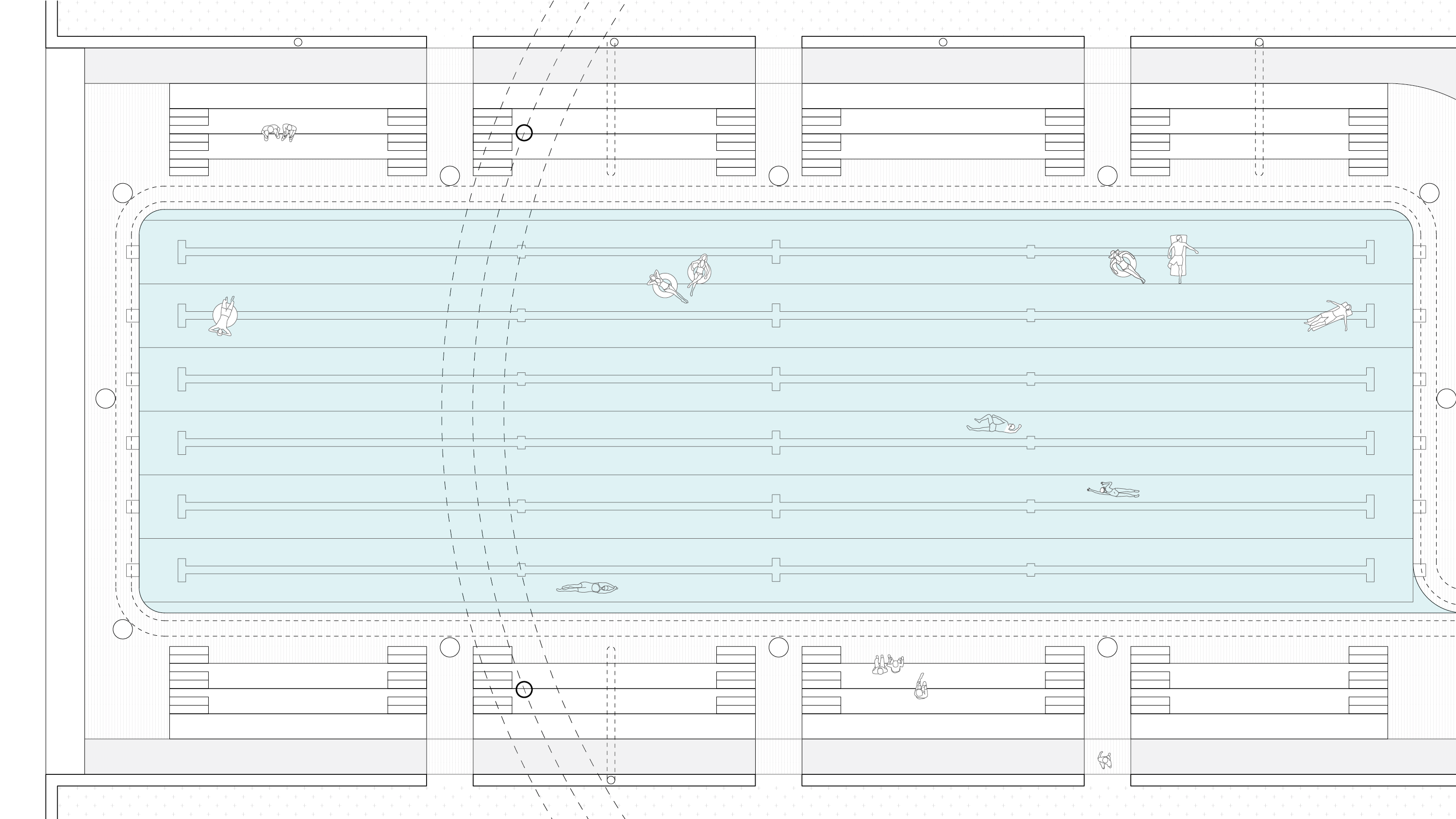
A plan of the pools (click it to navigate)

A view from the museum’s basement through the data center into the swimming pool

Experience the glow of the data
Client
CompetitionTimeline
2021Location
Boston, MassachusettsAward
2021 Rotch Prize WinnerServices
- Architectural Design
-
Interior Design
-
Exhibition Design
- Urban Design
Tags
Civic, Park, Data Center, DreamsRelated Work

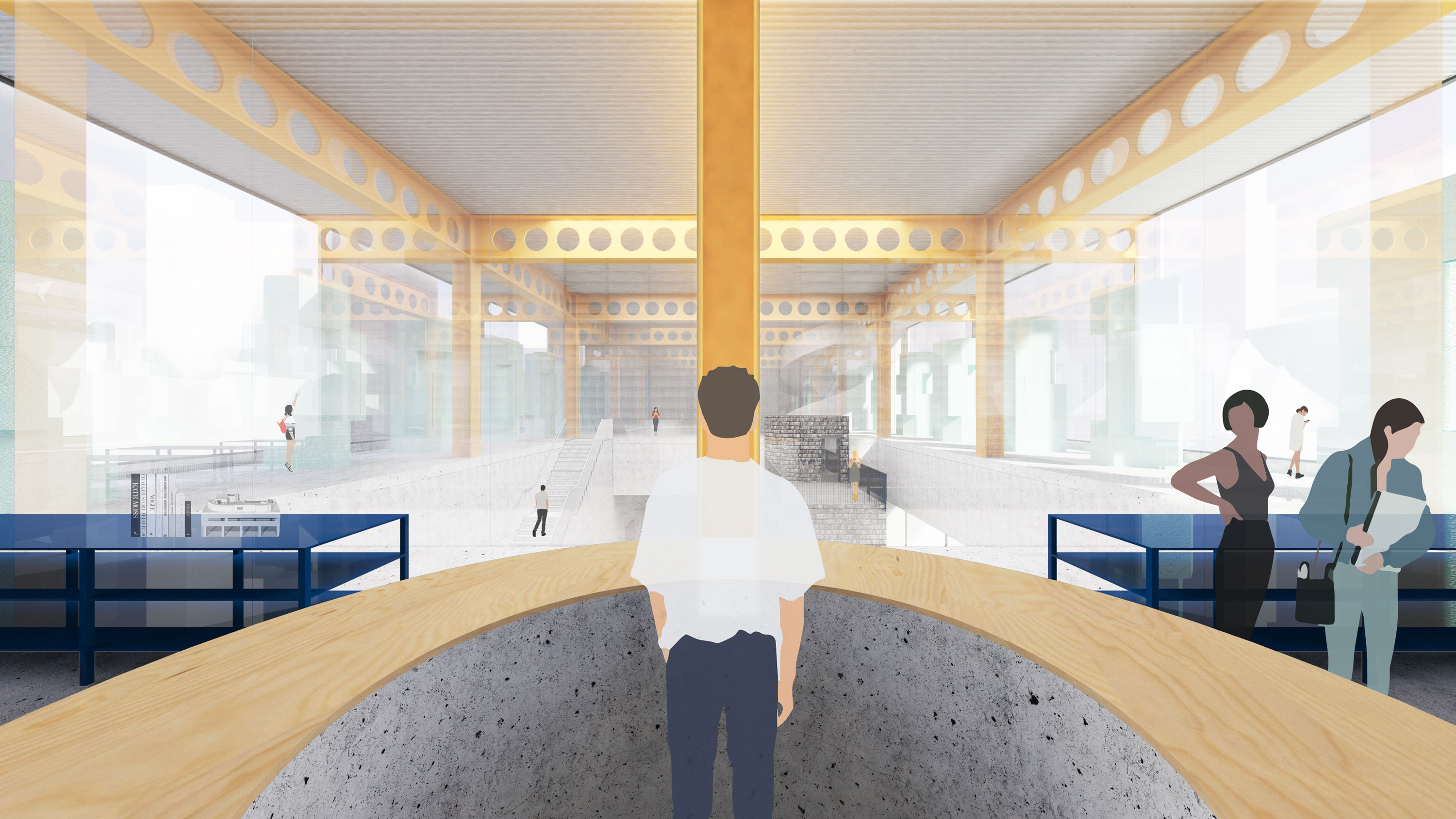
Permanent Collection
_An architecture museum that uses itself to teach people about architecture
An
architecture museum is one of the few buildings that has to
house and display other buildings. From the full-scale prototype to
the microfiche archive, the scalar range of the collection is
immense. This project harnesses the extreme dimensional difference of
the objects in its collection to propose a building with radical
shifts in section. As the ceiling height shrinks from 35’-0” to
11’-0” across five floors, the structural systems shifts to
accommodate larger spans, more columns, etc. With these changes comes
the opportunity to recall five canonical plan organizations: the free
plan, the ring (with atrium), the hypostyle hall, the forest, and the
villa. As the visitor ascends—either through the glass elevator or
the spiral stair—they experience pronounced material, structural and
spatial shifts, sampling a history of Architecture on their way.


Level 1 - Infrastructural Clear Span
![]()

Level 2 - Castellated Atrium


Level 3 - Waffle Hypostyle


Level 4 - Column Forest

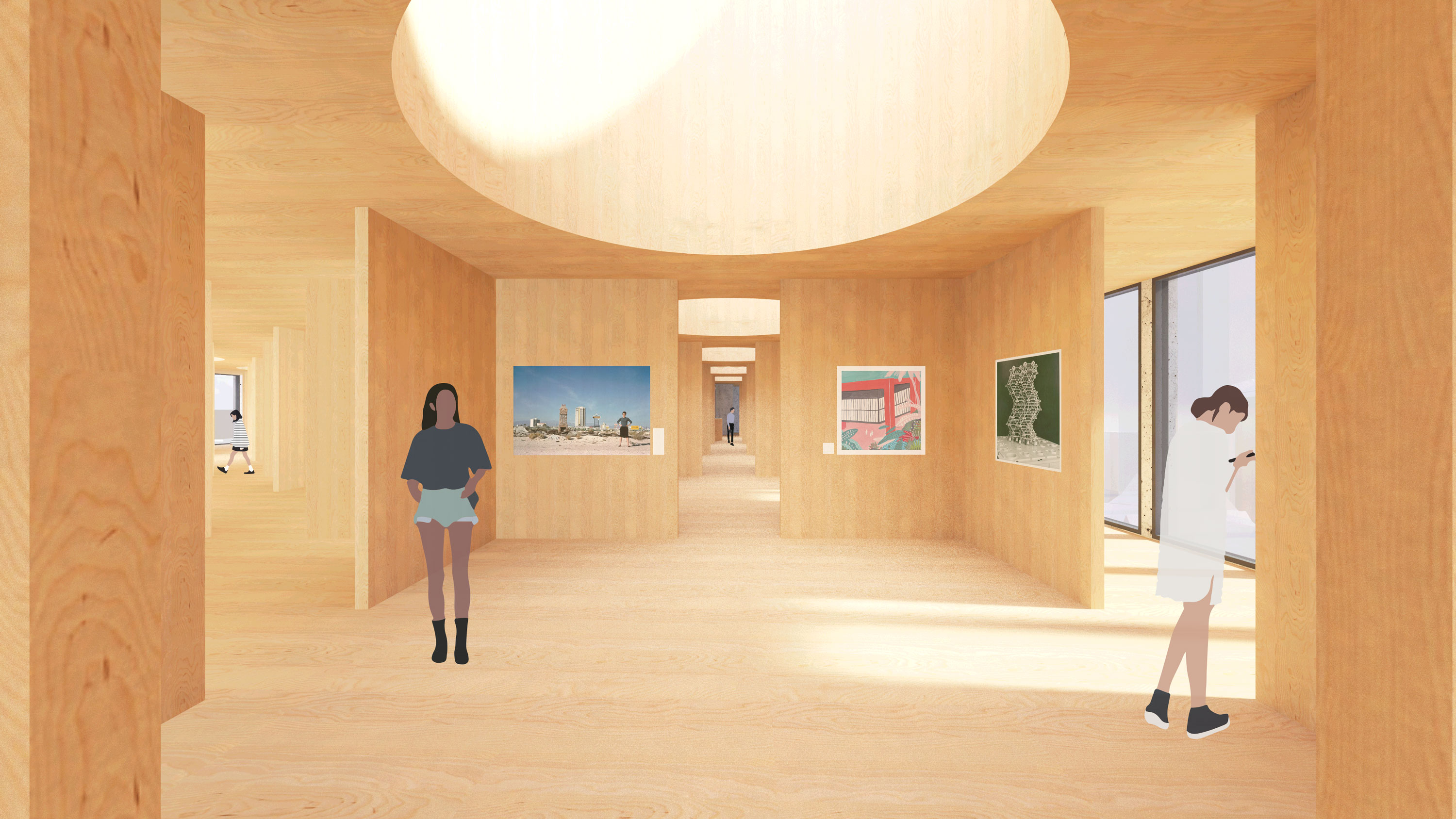
Level 5 - Mass Timber Renaissance


Roof Top - Field of Figures

Client
CompetitionTimeline
2020Location
Boston, MassachusettsAward
2020 Rotch Prize, Runner-UpServices
- Architectural Design
-
Interior Design
- Exhibition Design
Tags
Civic, Museum, DreamsRelated Work
Model Homes
_A test bed for new models of communal living
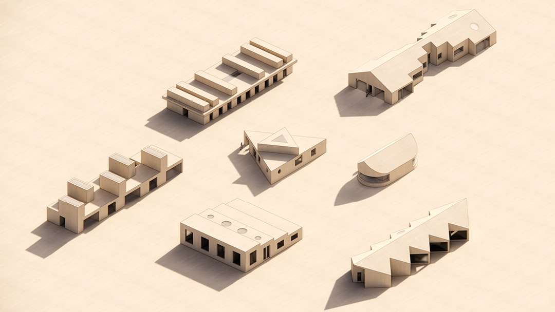
Model Homes is an ongoing project to test ideas that haven’t found a project yet. It’s a way of pushing ourselves to think beyond the known models of collective housing.
All of these begin with the combination of:
When working on them we jump between plan, section, and model. We often work on several at a time, and we’ve found the multiplicity of options within a house and across houses simultaneously to be freeing. It’s helped us to shed preciousness and embrace the aspects of architecture we love: embedding the concept into the core of the architecture (structure, organization, light) and imagining new modes of living.
All of these begin with the combination of:
-
a common demographic:
cohabitating adult friends, two families with young children, intergenerational families, etc,
-
and
a simple spatial idea:
typically something grid-based to simplify construction
When working on them we jump between plan, section, and model. We often work on several at a time, and we’ve found the multiplicity of options within a house and across houses simultaneously to be freeing. It’s helped us to shed preciousness and embrace the aspects of architecture we love: embedding the concept into the core of the architecture (structure, organization, light) and imagining new modes of living.
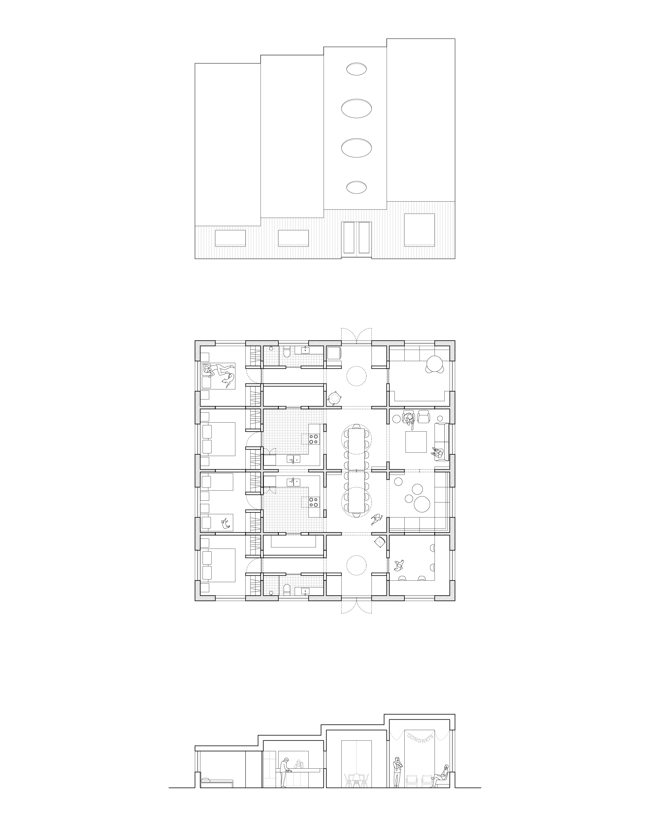
Grid House ︎︎︎
What happens when you combine cohousing & grids? This house can be used as two
standalone homes that share a wall, or as one large, luxurious space for cohabitation. Borrow sugar through the “window” in the kitchen. Dine like Thanksgiving any night of
the year. Get that good, good laundry smell every day. Sneak off to your own private
living space, or throw a rager in the dining / living area. #NotForSquares
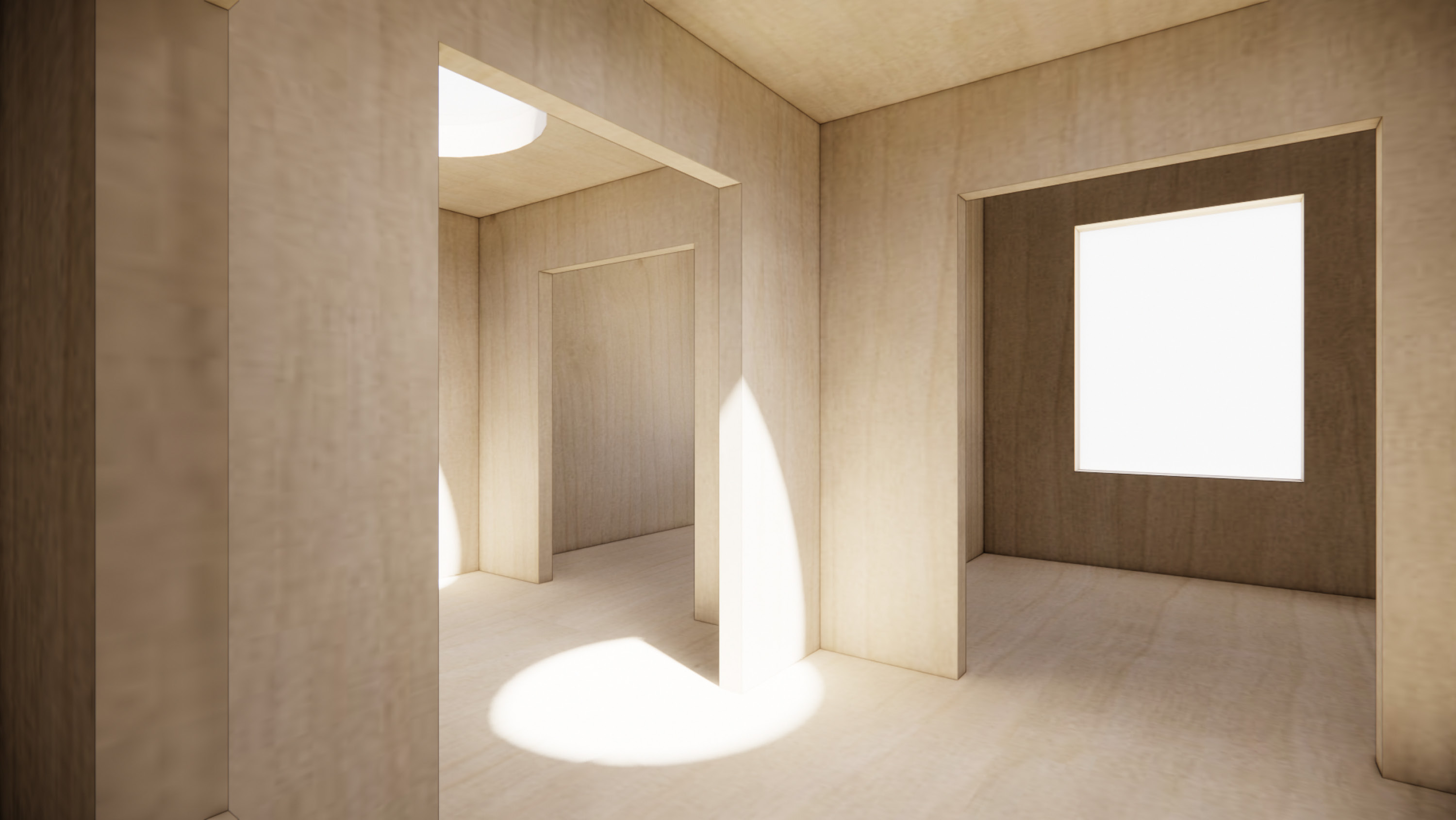
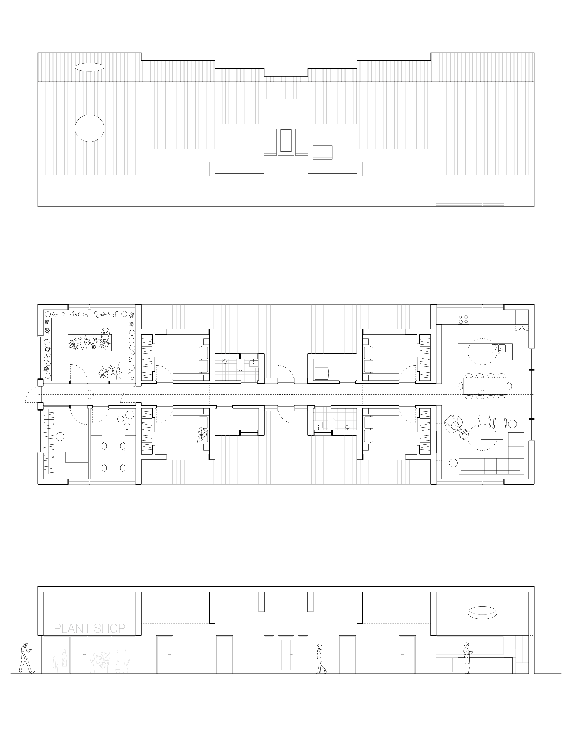
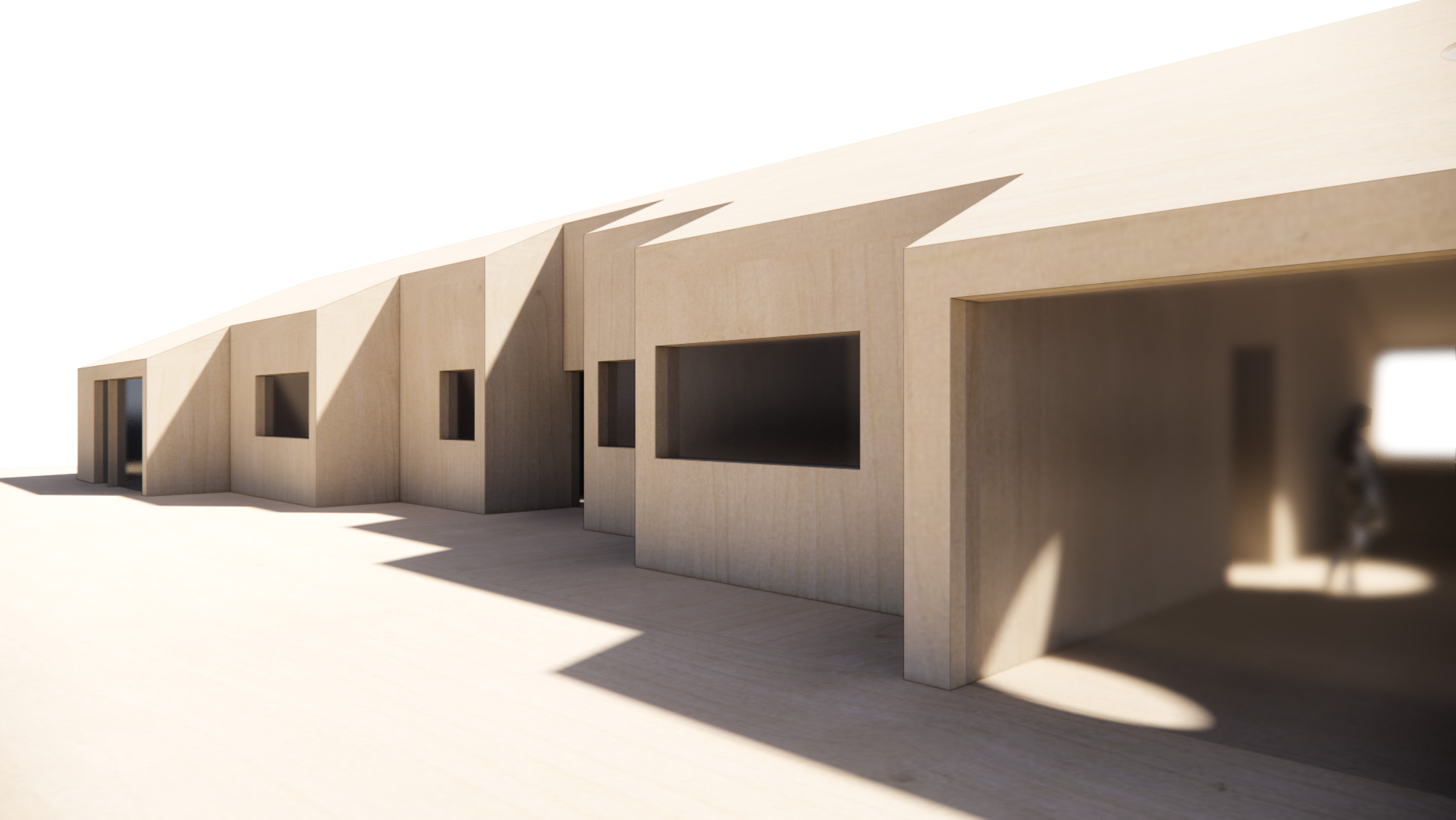
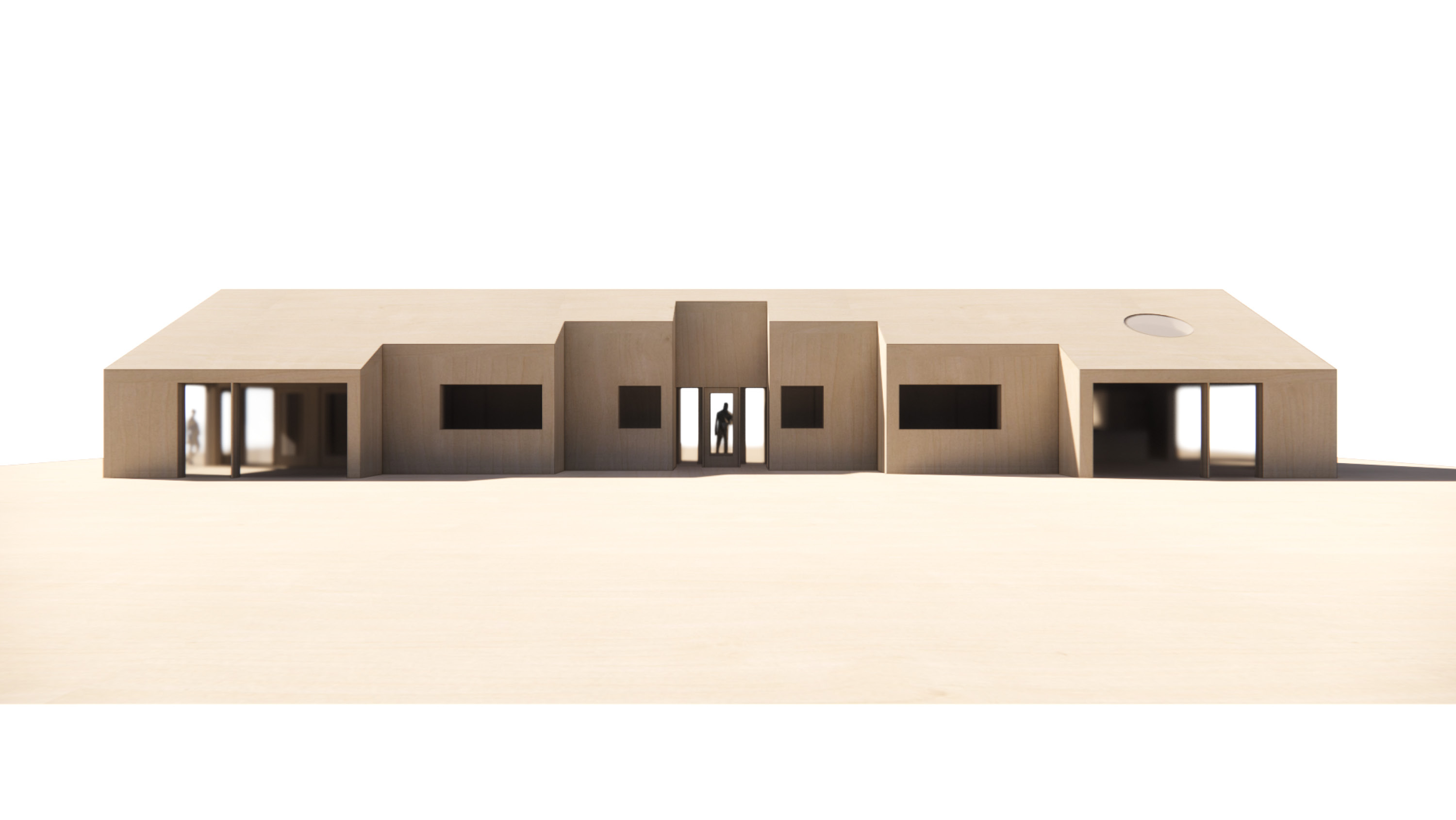
Telescoping House ︎︎︎
Gables on gables on gables, each one housing a different type of space.
A house for four+ friends who want to cohabitate and co-locate their
businesses. The beds & baths are bracketed by a large living area and a
divisible business-from-home space. Launch your plant shop. Run your
accounting firm. Curate your vintage shop. The possibilities are endless! #BusinessInTheFront
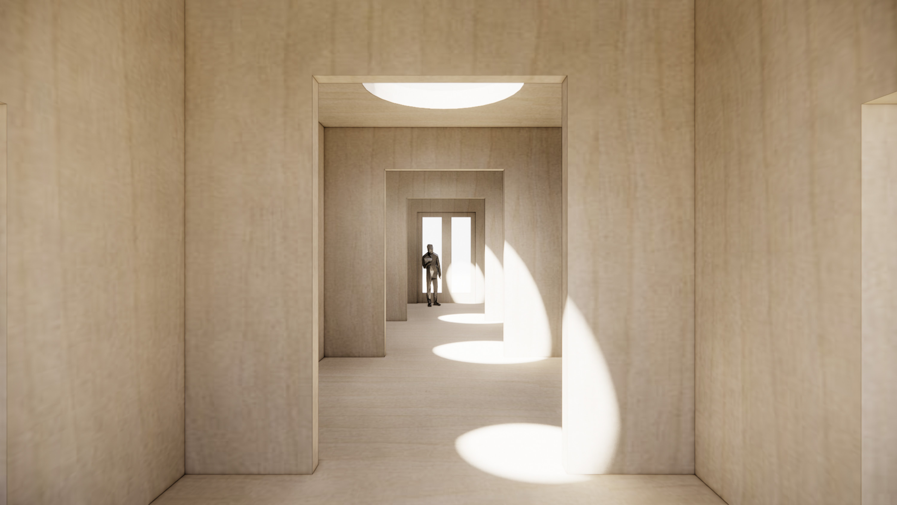
Tube House ︎︎︎
We always say that the only thing better than skylights is tall skylights.
Designed for the needs of a multi-generational family, this house is made
up of a series of alternating living & sleeping spaces. Whether it’s the den,
patio, reading nook, home office, TV room, or eat-in kitchen, each person can choose the space that suits their mood. #LetTheLightShineIn
Pier House ︎︎︎
Formed from six “service” piers, this two-family co-house uses half-levels to create
privacy between the living and private zones. The central living / kitchen / laundry
area is the social hub. Moving out from there are each family’s bedrooms and private spaces (shown here as a nursery and a home office). #MeetMeInTheMiddle
Zig Zag House ︎︎︎
In this house for four+ friends, we wanted to test what would happen if we
combined two of our favorite things: a sawtooth plan and a gable section. The result
is a large central living / kitchen / laundry area, bracketed by private living areas that can be contiguous or not, based on user preference. The bedrooms bookend the building and have access to a shared patio through their private entries. #DiamondsAreForever